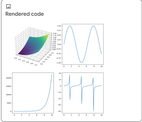
## 2x2 Grid of Mathematical Plots: Rendered Code
### Overview
The image displays a 2x2 grid of four distinct mathematical plots under the main title "Rendered code". The plots are arranged in a clean, white-background layout with clear separation between them. The collection appears to be a demonstration of different data visualization or computational output types, likely generated by a plotting library.
### Components/Axes
* **Main Title:** "Rendered code" (top-left, above the grid).
* **Plot 1 (Top-Left):** A 3D surface plot.
* **X-axis:** Linear scale, labeled from 0.0 to 1.0 in increments of 0.2.
* **Y-axis:** Linear scale, labeled from 0.0 to 1.0 in increments of 0.2.
* **Z-axis (Vertical):** Linear scale, labeled from 0.00 to 2.00 in increments of 0.25.
* **Surface:** A smooth, curved surface colored with a gradient from dark blue (low Z) to bright yellow (high Z).
* **Plot 2 (Top-Right):** A 2D line plot.
* **X-axis:** Linear scale, labeled from 0 to 10 in increments of 2.
* **Y-axis:** Linear scale, labeled from -1.00 to 1.00 in increments of 0.25.
* **Data Series:** A single, smooth, blue line forming a wave pattern.
* **Plot 3 (Bottom-Left):** A 2D line plot.
* **X-axis:** Linear scale, labeled from 0 to 10 in increments of 2.
* **Y-axis:** Linear scale, labeled from 0 to 20000 in increments of 5000.
* **Data Series:** A single, smooth, blue line showing a curve that starts near zero and rises sharply.
* **Plot 4 (Bottom-Right):** A 2D line plot.
* **X-axis:** Linear scale, labeled from 0 to 10 in increments of 2.
* **Y-axis:** Linear scale, labeled from -40 to 20 in increments of 10.
* **Data Series:** A single, smooth, blue line showing a complex pattern with sharp peaks and troughs.
### Detailed Analysis
**Plot 1 (3D Surface):**
* **Trend:** The surface slopes upward from the corner near (X=0, Y=0) towards the opposite corner near (X=1, Y=1). The highest point (yellow) is at the far corner (X≈1, Y≈1, Z≈2.0). The lowest point (dark blue) is at the near corner (X≈0, Y≈0, Z≈0.0).
* **Data Points (Approximate):** The surface suggests a function like Z = X + Y or Z = 2*X*Y, where the value increases as both X and Y increase.
**Plot 2 (2D Wave):**
* **Trend:** The line forms a periodic, sinusoidal wave.
* **Key Points:**
* Starts at (X=0, Y≈0).
* First peak at approximately (X=2, Y=1.0).
* Crosses zero at approximately (X=3.5, Y=0).
* Trough at approximately (X=5, Y=-1.0).
* Crosses zero at approximately (X=6.5, Y=0).
* Second peak at approximately (X=8, Y=1.0).
* Ends at approximately (X=10, Y≈0).
**Plot 3 (Exponential Growth):**
* **Trend:** The line shows a classic exponential or high-order polynomial growth curve. It remains close to the X-axis for the first half of the domain before increasing at an accelerating rate.
* **Key Points:**
* Value is near 0 from X=0 to X≈5.
* At X=6, Y is approximately 1000.
* At X=8, Y is approximately 5000.
* At X=10, Y reaches its maximum of approximately 20,000.
**Plot 4 (Complex Oscillation):**
* **Trend:** The line exhibits sharp, narrow peaks and deep, narrow troughs, suggesting a function with resonant frequencies or a sum of multiple sine waves with different frequencies.
* **Key Points:**
* First major peak at approximately (X=2, Y=18).
* First major trough at approximately (X=2.5, Y=-38).
* Second major peak at approximately (X=5, Y=18).
* Second major trough at approximately (X=5.5, Y=-38).
* Third major peak at approximately (X=8, Y=18).
* Third major trough at approximately (X=8.5, Y=-38).
* The pattern repeats with a period of approximately 3 units on the X-axis.
### Key Observations
1. **Consistent Styling:** All four plots use the same blue color for lines in the 2D plots and a consistent, clean axis style.
2. **Diverse Function Types:** The grid showcases four fundamentally different mathematical behaviors: a 3D surface, a simple periodic wave, exponential growth, and a complex oscillatory pattern.
3. **Scale Variation:** The Y-axes have vastly different scales, from -1 to 1 (Plot 2) to 0 to 20,000 (Plot 3), demonstrating the range of outputs being visualized.
4. **No Overplotting:** Each plot is clear and uncluttered, with no overlapping data series or legends, making them easy to interpret individually.
### Interpretation
This image serves as a technical demonstration of plotting capabilities. It is not presenting a single dataset but rather a portfolio of visualization types. The "Rendered code" title strongly suggests these are outputs from a computational script or notebook (e.g., Python with Matplotlib, MATLAB).
* **What it demonstrates:** The ability to render both 2D and 3D plots, handle different data scales (from unit intervals to tens of thousands), and visualize various mathematical functions (linear combinations, trigonometric, exponential, and complex periodic).
* **Relationship between elements:** The four plots are independent examples grouped together to show versatility. There is no direct data relationship between them; their connection is their origin as outputs from the same code-rendering process.
* **Notable patterns:** The most striking visual patterns are the smooth, predictable curves in the first three plots contrasted with the sharp, almost discontinuous spikes in the fourth plot (bottom-right). This contrast highlights the difference between well-behaved functions and those with high-frequency components or singularities.
* **Underlying purpose:** The image likely functions as a figure in a technical document, tutorial, or report to illustrate successful code execution and the variety of insights that can be gained from different visualization techniques. It answers the question, "What can our code produce?" with a clear, visual answer.