## Heatmap: Rendered Code
### Overview
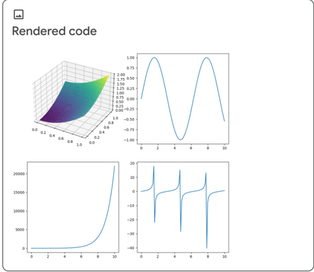
The image displays a 3D heatmap with a color gradient ranging from purple to yellow, representing different values. The heatmap is overlaid on a grid, and the x-axis and y-axis are labeled with numerical values. The z-axis is not labeled.
### Components/Axes
- **X-axis**: Labeled with numerical values ranging from 0 to 10.
- **Y-axis**: Labeled with numerical values ranging from 0 to 10.
- **Z-axis**: Not labeled.
- **Grid**: A grid pattern is overlaid on the heatmap, providing a reference for the values.
### Detailed Analysis or ### Content Details
The heatmap shows a clear trend of increasing values from the bottom-left to the top-right. The color gradient indicates that the values are highest in the top-right quadrant and decrease as you move towards the bottom-left. The heatmap is overlaid on a grid, which helps in understanding the spatial distribution of the values.
### Key Observations
- The heatmap shows a clear trend of increasing values from the bottom-left to the top-right.
- The color gradient indicates that the values are highest in the top-right quadrant and decrease as you move towards the bottom-left.
- The grid overlaid on the heatmap provides a reference for the values.
### Interpretation
The heatmap suggests that the values represented are highest in the top-right quadrant and decrease as you move towards the bottom-left. This could indicate a positive correlation between the x and y variables in the underlying data. The grid overlaid on the heatmap helps in understanding the spatial distribution of the values. The color gradient provides a visual representation of the values, making it easier to identify patterns and trends.