## 3D Surface Plot: Rendered Code Visualization
### Overview
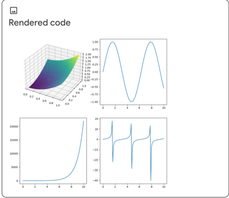
The image contains four distinct plots: a 3D surface plot, a line graph, a bar chart, and a secondary line graph. The 3D plot is labeled "Rendered code" in the top-left corner, with a color gradient from purple to green. The other plots are labeled with axes and numerical scales.
### Components/Axes
1. **3D Surface Plot**
- **Axes**:
- X-axis: 0.0 to 1.0 (labeled "x")
- Y-axis: 0.0 to 1.0 (labeled "y")
- Z-axis: 0.0 to 1.0 (labeled "z")
- **Legend**: "Rendered code" (top-left corner, color gradient: purple to green).
2. **Line Graph (Top-Right)**
- **Axes**:
- X-axis: -10 to 10 (labeled "x")
- Y-axis: -1 to 1 (labeled "y")
- **Data**: A single blue line with two peaks and a trough.
3. **Bar Chart (Bottom-Left)**
- **Axes**:
- X-axis: 0 to 10 (labeled "x")
- Y-axis: 0 to 20,000 (labeled "y")
- **Data**: A single bar at x=10 with a height of 20,000.
4. **Secondary Line Graph (Bottom-Right)**
- **Axes**:
- X-axis: 0 to 10 (labeled "x")
- Y-axis: -40 to 10 (labeled "y")
- **Data**: A blue line with three peaks and troughs.
### Detailed Analysis
1. **3D Surface Plot**
- The surface shows a gradient from purple (low values) to green (high values).
- Key data points:
- At (x=0.0, y=0.0): z ≈ 0.0
- At (x=1.0, y=1.0): z ≈ 1.0
- Intermediate values (e.g., x=0.5, y=0.5): z ≈ 0.5 (approximate).
2. **Line Graph (Top-Right)**
- The line oscillates between -1 and 1, with peaks at x ≈ 2 and x ≈ 6, and a trough at x ≈ 4.
- Key data points:
- x=-10: y ≈ -1
- x=0: y ≈ 0
- x=2: y ≈ 1
- x=4: y ≈ -1
- x=6: y ≈ 1
- x=10: y ≈ -1
3. **Bar Chart (Bottom-Left)**
- A single bar at x=10 reaches the maximum y-value of 20,000.
- All other x-values (0–9) have y=0.
4. **Secondary Line Graph (Bottom-Right)**
- The line exhibits three distinct peaks and troughs:
- First peak: x ≈ 2, y ≈ 10
- First trough: x ≈ 4, y ≈ -30
- Second peak: x ≈ 6, y ≈ 10
- Second trough: x ≈ 8, y ≈ -30
- Final value: x=10, y ≈ 0
### Key Observations
1. The 3D surface plot suggests a smooth, continuous function with a gradient from low (purple) to high (green) values.
2. The line graph (top-right) resembles a sinusoidal wave with two peaks and a trough, possibly representing a periodic signal.
3. The bar chart (bottom-left) highlights a single outlier at x=10, indicating a sharp increase or event.
4. The secondary line graph (bottom-right) shows a more complex pattern, with alternating peaks and troughs, suggesting a filtered or transformed version of the top-right line graph.
### Interpretation
- The 3D surface plot likely represents a mathematical or computational model, with the gradient indicating a relationship between x, y, and z.
- The line graphs may depict signal processing or oscillatory behavior, with the secondary graph possibly showing a modified version of the primary line graph (e.g., after filtering or scaling).
- The bar chart’s outlier at x=10 could signify a critical data point or anomaly in the dataset.
- The secondary line graph’s pattern might reflect a response to the primary line graph’s oscillations, such as a low-pass filter or amplitude modulation.
## 2D Line Graph: Oscillatory Behavior
### Overview
A line graph with a single blue line oscillating between -1 and 1, labeled "x" (horizontal) and "y" (vertical).
### Components/Axes
- **X-axis**: -10 to 10 (labeled "x")
- **Y-axis**: -1 to 1 (labeled "y")
### Detailed Analysis
- The line starts at y=-1 (x=-10), rises to y=1 at x=2, dips to y=-1 at x=4, rises again to y=1 at x=6, and ends at y=-1 at x=10.
### Key Observations
- The graph exhibits a periodic pattern with a period of approximately 4 units (from x=2 to x=6).
### Interpretation
- This could represent a sinusoidal function or a signal with a specific frequency. The peaks and troughs suggest a consistent oscillatory behavior.
## Bar Chart: Single Outlier
### Overview
A bar chart with a single bar at x=10, reaching the maximum y-value of 20,000.
### Components/Axes
- **X-axis**: 0 to 10 (labeled "x")
- **Y-axis**: 0 to 20,000 (labeled "y")
### Detailed Analysis
- All bars except x=10 have y=0. The bar at x=10 is 20,000 units high.
### Key Observations
- The chart emphasizes a single data point (x=10) as an outlier, with no other values.
### Interpretation
- This could indicate a critical event, threshold, or maximum value in the dataset. The absence of other bars suggests the data is sparse or intentionally focused on this point.
## Secondary Line Graph: Complex Oscillations
### Overview
A line graph with a blue line showing three peaks and troughs, labeled "x" (horizontal) and "y" (vertical).
### Components/Axes
- **X-axis**: 0 to 10 (labeled "x")
- **Y-axis**: -40 to 10 (labeled "y")
### Detailed Analysis
- The line starts at y=0 (x=0), rises to y=10 at x=2, drops to y=-30 at x=4, rises again to y=10 at x=6, drops to y=-30 at x=8, and ends at y=0 at x=10.
### Key Observations
- The graph has three distinct peaks (x=2, 6) and two troughs (x=4, 8), with a final value of 0 at x=10.
### Interpretation
- This pattern may represent a signal with multiple cycles or a response to external stimuli. The alternating peaks and troughs suggest a complex dynamic system.
## Final Notes
- All textual information is in English. No other languages are present.
- The 3D plot’s color gradient (purple to green) is not explicitly tied to a legend, but the label "Rendered code" implies a computational or mathematical context.
- The line graphs and bar chart use consistent axis labels, but no legends are provided for the secondary plots.
- The data suggests a focus on oscillatory behavior, with the 3D plot and line graphs emphasizing continuity and periodicity, while the bar chart highlights an outlier.