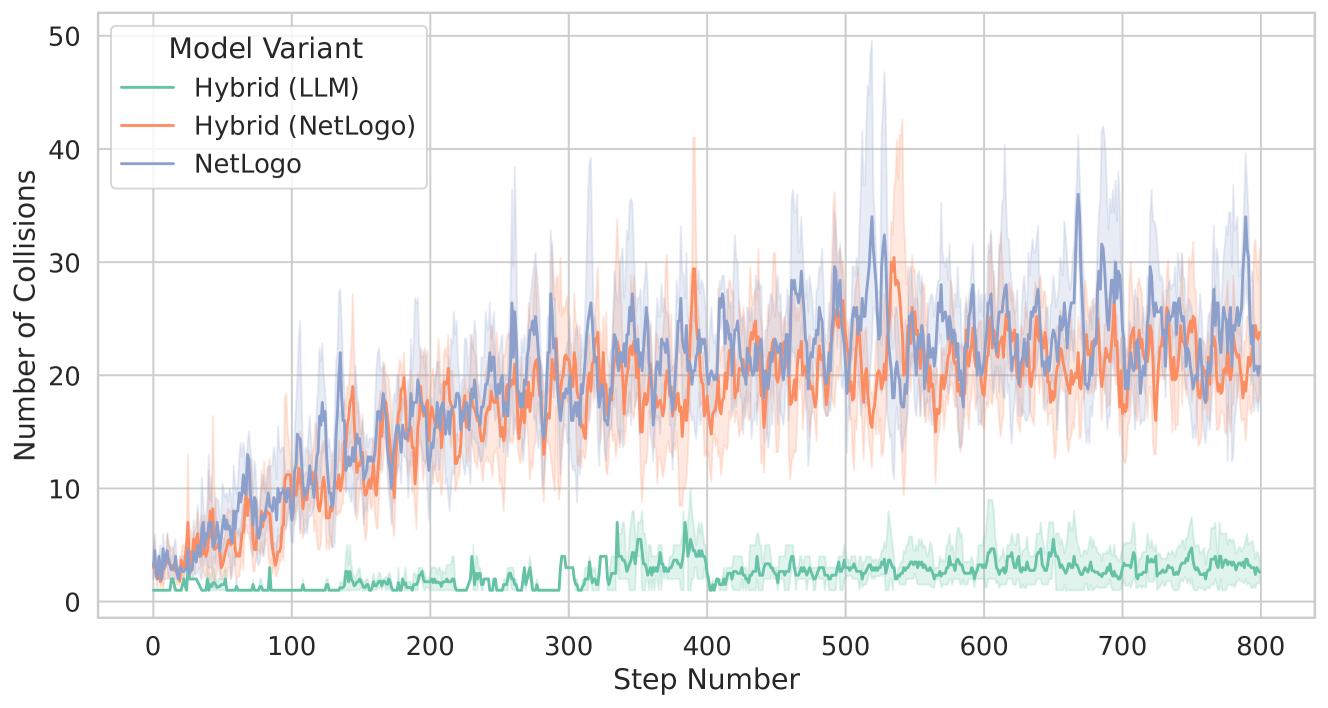
## Line Chart: Number of Collisions Over Simulation Steps for Three Model Variants
### Overview
The image is a line chart displaying the performance of three different model variants over the course of a simulation. The chart tracks the "Number of Collisions" on the vertical axis against the "Step Number" on the horizontal axis. Each model variant is represented by a distinct colored line, with a shaded region around each line indicating variability (likely standard deviation or confidence intervals). The overall trend shows two models with a rising number of collisions over time, while one model maintains a consistently low collision count.
### Components/Axes
* **Chart Type:** Line chart with shaded error bands.
* **X-Axis (Horizontal):**
* **Label:** "Step Number"
* **Scale:** Linear, from 0 to 800.
* **Major Tick Marks:** 0, 100, 200, 300, 400, 500, 600, 700, 800.
* **Y-Axis (Vertical):**
* **Label:** "Number of Collisions"
* **Scale:** Linear, from 0 to 50.
* **Major Tick Marks:** 0, 10, 20, 30, 40, 50.
* **Legend:**
* **Position:** Top-left corner of the chart area.
* **Title:** "Model Variant"
* **Entries (from top to bottom):**
1. **Hybrid (LLM)** - Represented by a **green** line.
2. **Hybrid (NetLogo)** - Represented by an **orange** line.
3. **NetLogo** - Represented by a **blue** line.
### Detailed Analysis
**1. Hybrid (LLM) - Green Line:**
* **Trend:** The line remains very close to the bottom of the chart throughout the entire simulation. It exhibits minor fluctuations but no significant upward or downward trend.
* **Data Points (Approximate):**
* Starts near 0 collisions at Step 0.
* Fluctuates primarily between 0 and 5 collisions.
* Has occasional small spikes, with the highest peaks reaching approximately 7-8 collisions (e.g., around steps 350, 400, 600).
* Ends near 2-3 collisions at Step 800.
* **Variability (Shaded Region):** The shaded green band is narrow, indicating low variance in the number of collisions for this model variant across different runs or measurements.
**2. Hybrid (NetLogo) - Orange Line:**
* **Trend:** Shows a clear upward trend. The number of collisions increases steadily from the start of the simulation, with high volatility.
* **Data Points (Approximate):**
* Starts near 0 collisions at Step 0.
* Rises to approximately 10 collisions by Step 100.
* Continues to increase, reaching a range of 15-25 collisions between Steps 200 and 400.
* From Step 400 onward, it fluctuates heavily between approximately 15 and 30 collisions.
* Ends in the range of 20-25 collisions at Step 800.
* **Variability (Shaded Region):** The shaded orange band is moderately wide, indicating significant variance. The line has many sharp peaks and troughs.
**3. NetLogo - Blue Line:**
* **Trend:** Also shows a strong upward trend, very similar in shape and magnitude to the Hybrid (NetLogo) model. It appears to have slightly higher peaks and greater overall variability.
* **Data Points (Approximate):**
* Starts near 0 collisions at Step 0.
* Rises to approximately 10-15 collisions by Step 100.
* Shows a steep increase, reaching 20-30 collisions by Step 300.
* From Step 300 onward, it fluctuates dramatically, with values commonly between 20 and 35 collisions.
* Contains the highest peaks on the chart, with several spikes exceeding 40 collisions (e.g., around steps 520, 540, 680).
* Ends near 20-30 collisions at Step 800.
* **Variability (Shaded Region):** The shaded blue band is the widest of the three, indicating the highest variance. The line is the most volatile.
### Key Observations
1. **Performance Dichotomy:** There is a stark and consistent performance gap between the **Hybrid (LLM)** model and the other two models. The green line is isolated at the bottom of the chart, while the orange and blue lines are intertwined in the upper region.
2. **Similarity of Non-LLM Models:** The **Hybrid (NetLogo)** and **NetLogo** models exhibit remarkably similar trends in both average value and volatility. Their lines cross frequently, and their shaded regions overlap extensively.
3. **Increasing Volatility:** For the two higher-collision models (orange and blue), the variance (width of the shaded region) appears to increase as the step number increases, suggesting the simulation outcomes become less predictable over time.
4. **Peak Collisions:** The absolute highest number of collisions recorded in the simulation (approximately 48-50) belongs to the **NetLogo** (blue) model, occurring around step 520.
### Interpretation
The data strongly suggests that the integration of a Large Language Model (LLM) into the hybrid system (**Hybrid (LLM)**) results in a dramatic and sustained reduction in the number of collisions compared to both the pure NetLogo simulation and the hybrid model that does not use an LLM. This implies the LLM component is highly effective at optimizing agent behavior or system rules to avoid collisions.
The near-identical performance of the **Hybrid (NetLogo)** and pure **NetLogo** models indicates that, in this specific simulation setup, the hybrid architecture without the LLM does not confer a collision-avoidance advantage over the standard NetLogo implementation. The high volatility in these models suggests their collision-avoidance strategies are less robust or more sensitive to initial conditions or stochastic elements in the simulation.
The chart effectively demonstrates the value of the LLM integration for this specific metric (collision count). The key takeaway is not just that the LLM model is better, but that it is *qualitatively different*—operating in a completely different performance regime with minimal variance, while the other models struggle with both high average collisions and high unpredictability.