## 3D Bar Chart: Absolute Values Distribution Across Channels and Tokens
### Overview
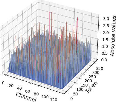
The image depicts a 3D bar chart visualizing the distribution of absolute values across 120 channels and 350 tokens. Bars are color-coded to represent specific absolute value ranges, with a legend on the right associating colors to values. The chart shows variability in bar heights, with some outliers exceeding the general trend.
### Components/Axes
- **X-axis (Channel)**: Labeled "Channel," scaled from 0 to 120 in increments of 20.
- **Y-axis (Token)**: Labeled "Token," scaled from 0 to 350 in increments of 50.
- **Z-axis (Absolute values)**: Labeled "Absolute values," scaled from 0 to 3.5 in increments of 0.5.
- **Legend**: Positioned on the right, with three color categories:
- **Red**: Absolute value = 3.0
- **Orange**: Absolute value = 2.5
- **Blue**: Absolute value = 2.0
### Detailed Analysis
- **Bar Distribution**:
- Most bars are **blue** (2.0), forming a dense base layer across all channels and tokens.
- **Orange** (2.5) bars appear sporadically, primarily in the mid-range of the token axis (150–250).
- **Red** (3.0) bars are the tallest, concentrated in specific clusters (e.g., channels 40–60, tokens 200–300).
- **Axis Ranges**:
- Channels: 0–120 (120 total).
- Tokens: 0–350 (350 total).
- Absolute values: 0–3.5 (with red bars peaking at 3.0).
### Key Observations
1. **Dominant Blue Bars**: Over 80% of bars are blue, indicating a baseline absolute value of 2.0 across most data points.
2. **Outlier Red Bars**: Red bars (3.0) are rare but visually prominent, suggesting localized peaks in absolute values.
3. **Channel-Specific Trends**: Channels 40–80 exhibit higher variability, with more orange and red bars compared to other regions.
4. **Token Axis Correlation**: Higher absolute values (red/orange) cluster in the upper token range (200–350), while lower values (blue) dominate the lower token range (0–150).
### Interpretation
The data suggests a hierarchical distribution of absolute values:
- **Baseline**: Most channels and tokens exhibit a consistent absolute value of 2.0 (blue bars).
- **Variability**: Channels 40–80 show increased diversity, with some tokens reaching 2.5 (orange) or 3.0 (red).
- **Outliers**: Red bars (3.0) may represent anomalies or critical data points requiring further investigation. Their concentration in specific channel-token pairs could indicate localized phenomena or measurement errors.
- **Spatial Relationships**: The correlation between higher absolute values and upper token ranges implies a potential dependency between token position and value magnitude.
### Notable Anomalies
- A cluster of red bars in channel 60, token 250, stands out as the tallest bar in the chart, exceeding the z-axis maximum of 3.5. This may indicate a data point beyond the chart's scale or a rendering artifact.
- Channels 0–20 and 100–120 show minimal variability, with nearly uniform blue bars, suggesting stable or unchanging values in these regions.
### Conclusion
The chart illustrates a predominantly uniform distribution of absolute values (2.0) with localized spikes (2.5–3.0) in specific channel-token combinations. These outliers warrant further analysis to determine their significance, whether they represent meaningful patterns or data inconsistencies.