TECHNICAL ASSET FINGERPRINT
a81ff7c344a7863c17b39e86
Click to view fullscreen
Press ESC or click to close
FOUND IN PAPERS
EXPERT: gemini-2.0-flash VERSION 1
RUNTIME: nugit/gemini/gemini-2.0-flash
INTEL_VERIFIED
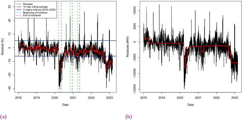
## Time Series Charts: Residual Analysis
### Overview
The image contains two time series charts, labeled (a) and (b), displaying residual data over time from 2018 to 2023. Chart (a) shows the residual as a percentage, while chart (b) shows the residuals in Megawatts (MW). Both charts include a 15-day rolling average and vertical lines indicating the beginning and end of lockdowns. Chart (a) also includes a 2-sigma interval from 2018-2020.
### Components/Axes
**Chart (a):**
* **X-axis:** Date, ranging from 2018 to 2023.
* **Y-axis:** Residual (%), ranging from -30% to 30%.
* **Data Series:**
* Residual (black line)
* 15-day rolling average (red line)
* 2-sigma interval (2018-2020) (two horizontal blue lines)
* Beginning of lockdown (vertical green dashed lines)
* End of lockdown (vertical purple dashed lines)
* **Legend:** Located in the top-left corner.
**Chart (b):**
* **X-axis:** Date, ranging from 2018 to 2023.
* **Y-axis:** Residuals (MW), ranging from -15000 MW to 10000 MW.
* **Data Series:**
* Residual (black line)
* 15-day rolling average (red line)
* **Legend:** Not explicitly present, but the data series are identifiable by color.
### Detailed Analysis
**Chart (a): Residual (%)**
* **Residual (Black Line):** The residual fluctuates significantly throughout the period. There are notable drops around 2020, coinciding with the lockdown periods.
* **15-day rolling average (Red Line):** This line smooths out the fluctuations in the residual, providing a clearer view of the overall trend. It stays mostly within the 2-sigma interval until 2020, after which it dips below.
* From 2018 to early 2020, the rolling average hovers around 0%.
* A sharp decline occurs in 2020, reaching approximately -10%.
* The rolling average recovers somewhat in 2021 and 2022, but remains mostly negative.
* **2-sigma interval (Blue Lines):** These lines represent the upper and lower bounds of a 2-sigma confidence interval calculated from the 2018-2020 data. The upper bound is approximately 6%, and the lower bound is approximately -6%.
* **Beginning of Lockdown (Green Dashed Lines):** There are multiple instances of these lines, indicating the start of lockdown periods. They appear around 2020, 2021, and 2022.
* **End of Lockdown (Purple Dashed Lines):** These lines indicate the end of lockdown periods, and they are paired with the "Beginning of Lockdown" lines.
**Chart (b): Residuals (MW)**
* **Residual (Black Line):** The residual fluctuates significantly, with large spikes and dips.
* **15-day rolling average (Red Line):** The rolling average shows a more stable trend.
* From 2018 to 2020, the rolling average is around 2500 MW.
* It drops sharply in 2020 to around -2500 MW.
* It remains relatively stable at around -2500 MW until 2022.
* In 2022, it drops again to around -7500 MW.
### Key Observations
* Both charts show a significant impact from the lockdown periods, particularly in 2020.
* The rolling average in chart (a) dips below the 2-sigma interval after 2020, suggesting a shift in the residual distribution.
* Chart (b) shows a clear drop in the residuals (MW) during the lockdown periods, indicating a decrease in energy consumption.
### Interpretation
The data suggests that the lockdown periods had a significant impact on the residuals, both in terms of percentage and absolute MW values. The negative residuals in chart (a) after 2020 indicate that the actual values were lower than expected based on the 2018-2020 data. This could be due to changes in energy consumption patterns during and after the lockdowns. The rolling average provides a smoothed view of these changes, highlighting the overall trend. The vertical lines indicating the beginning and end of lockdowns help to correlate these events with the observed changes in the residuals. The 2-sigma interval provides a baseline for comparison, showing how the residuals deviated from the expected range after the lockdowns.
DECODING INTELLIGENCE...
EXPERT: gemma-3-27b-it-free VERSION 1
RUNTIME: google-free/gemma-3-27b-it
INTEL_VERIFIED
\n
## Time Series Charts: Residual Analysis
### Overview
The image presents two time series charts (labeled (a) and (b)) displaying residual analysis over time, from approximately 2018 to 2023. Chart (a) shows residuals in percentage terms, while chart (b) shows residuals in Megawatts (MW). Both charts include a 15-day rolling average (red line) and reference lines indicating the beginning and end of lockdown periods. Chart (a) also includes 2-sigma interval lines.
### Components/Axes
**Chart (a):**
* **X-axis:** Date (from approximately 2018 to 2023)
* **Y-axis:** Residual (%) (ranging from approximately -30% to 30%)
* **Legend:**
* Residual (black lines)
* 15-day rolling average (red line)
* 2-sigma interval (2018-2020) (blue lines)
* Beginning of lockdown (purple dashed vertical line)
* End of lockdown (green dashed vertical line)
**Chart (b):**
* **X-axis:** Date (from approximately 2018 to 2023)
* **Y-axis:** Residuals (MW) (ranging from approximately -150,000 MW to 100,000 MW)
* **Legend:**
* Residuals (black lines)
* 15-day rolling average (red line)
* Beginning of lockdown (purple dashed vertical line)
* End of lockdown (green dashed vertical line)
### Detailed Analysis or Content Details
**Chart (a): Residual (%)**
The black lines representing the residuals fluctuate significantly around zero. The 15-day rolling average (red line) provides a smoothed representation of these fluctuations. The blue lines represent the 2-sigma interval (2018-2020), indicating a range within which most residuals fall. Vertical dashed lines mark the beginning and end of lockdown periods.
* **2018-2019:** Residuals fluctuate within the 2-sigma interval. The rolling average remains relatively stable around 0%.
* **Early 2020 (Lockdown Start):** A noticeable shift in the residual pattern occurs around the beginning of lockdown (purple line). The residuals tend to become more positive.
* **2020-2021:** The residuals exhibit increased volatility. The rolling average shows a slight upward trend.
* **2021-2022:** A significant negative shift in residuals is observed, with values dropping well below the 2-sigma interval. The rolling average declines sharply.
* **2022-2023:** Residuals remain largely negative, with some fluctuations. The rolling average stabilizes at a negative value.
**Chart (b): Residuals (MW)**
The black lines representing the residuals in MW also fluctuate considerably. The 15-day rolling average (red line) smooths these fluctuations. Vertical dashed lines mark the beginning and end of lockdown periods.
* **2018-2019:** Residuals fluctuate around zero. The rolling average remains relatively stable.
* **Early 2020 (Lockdown Start):** A slight increase in residuals is observed around the beginning of lockdown (purple line).
* **2020-2021:** The residuals show increased volatility. The rolling average exhibits a slight upward trend.
* **2021-2022:** A substantial negative shift in residuals is observed, with values dropping significantly below zero. The rolling average declines sharply.
* **2022-2023:** Residuals remain largely negative, with some fluctuations. The rolling average stabilizes at a negative value.
### Key Observations
* Both charts show a clear impact of lockdown periods on residuals.
* The negative shift in residuals observed in 2021-2022 is particularly pronounced in both charts.
* The 2-sigma interval in chart (a) provides a useful reference for identifying outliers.
* The rolling average effectively smooths out short-term fluctuations, revealing underlying trends.
### Interpretation
The charts suggest that lockdown periods and subsequent events significantly impacted the system being modeled. The initial lockdowns (early 2020) appear to have caused a slight increase in residuals, potentially due to changes in demand patterns. However, the substantial negative shift in residuals observed in 2021-2022 indicates a more significant disruption, possibly related to broader economic or systemic changes. The fact that the rolling average remains negative in 2022-2023 suggests that this disruption has had a lasting effect.
The difference in scale between the two charts (percentage vs. MW) highlights the importance of considering both relative and absolute changes when analyzing residuals. Chart (a) provides a sense of the magnitude of the residuals relative to the overall system, while chart (b) provides a sense of the absolute impact in terms of MW.
The use of the 2-sigma interval in chart (a) allows for the identification of outliers, which may warrant further investigation. The consistent alignment of the lockdown markers with shifts in the residual patterns suggests a causal relationship, although further analysis would be needed to confirm this.
DECODING INTELLIGENCE...
EXPERT: healer-alpha-free VERSION 1
RUNTIME: free/openrouter/healer-alpha
INTEL_VERIFIED
## Time Series Analysis: Residuals During COVID-19 Lockdowns
### Overview
The image contains two side-by-side time series plots, labeled (a) and (b), analyzing residuals (errors) from a predictive model over time, likely related to energy demand or a similar metric. The analysis spans from 2018 to early 2023 and highlights the impact of COVID-19 lockdown periods. Plot (a) shows residuals as a percentage, while plot (b) shows residuals in absolute megawatts (MW).
### Components/Axes
**Plot (a) - Left Panel:**
* **Y-axis:** Label: "Residual (%)". Scale: -30 to 30, with major ticks at intervals of 10 (-30, -20, -10, 0, 10, 20, 30).
* **X-axis:** Label: "Date". Major ticks mark the start of each year: 2018, 2019, 2020, 2021, 2022, 2023.
* **Legend (Top-Left Corner):**
* `Residual` - Black line
* `15-day rolling average` - Red line
* `Mean (2015-2020)` - Solid blue line
* `Beginning of lockdown` - Green dashed vertical line
* `End of lockdown` - Magenta dashed vertical line
* **Key Horizontal Line:** A solid blue line representing the mean from 2015-2020 is positioned at approximately **-6%**.
**Plot (b) - Right Panel:**
* **Y-axis:** Label: "Residuals (MW)". Scale: -15000 to 10000, with major ticks at intervals of 5000 (-15000, -10000, -5000, 0, 5000, 10000).
* **X-axis:** Label: "Date". Identical timeline to plot (a): 2018 to 2023.
* **Data Series:**
* Black line: Raw residuals in MW.
* Red line: A step-function line, likely representing a regime-specific mean or baseline.
### Detailed Analysis
**Plot (a) - Percentage Residuals:**
* **Trend Verification:** The black "Residual" line is highly volatile throughout the period. The red "15-day rolling average" smooths this volatility, revealing a clear, sharp downward trend beginning in early 2020, reaching a trough, and then partially recovering but remaining below the pre-2020 baseline.
* **Lockdown Periods:** Multiple lockdown periods are marked by pairs of green (start) and magenta (end) vertical dashed lines. The most significant period begins around **March 2020** (first green line) and ends around **June/July 2020** (first magenta line). Subsequent, shorter lockdown periods are indicated in late 2020/early 2021 and possibly later in 2021.
* **Data Points & Correlation:** During the first and most severe lockdown period (approx. Q1-Q2 2020), the residuals plummet. The rolling average (red line) drops from near **0%** to a low of approximately **-20% to -25%**. The raw residuals (black line) show spikes as low as **-30%**. This negative residual indicates the model was consistently over-predicting the actual value during this time.
* **Post-Lockdown:** After the initial lockdown, the rolling average recovers to fluctuate between **-5% and -10%**, but does not return to the pre-2020 level near 0%. Another notable dip occurs in late 2022.
**Plot (b) - Absolute Residuals (MW):**
* **Trend Verification:** The black residual line shows high-frequency noise. The red step-line reveals discrete shifts in the average residual level.
* **Step-Line Analysis (Red Line):**
* **2018 - Early 2020:** The step-line is at approximately **0 MW**.
* **Early 2020 - Mid 2020:** A sharp step down to approximately **-2,500 MW**.
* **Mid 2020 - Early 2021:** A further step down to approximately **-5,000 MW**.
* **Early 2021 - Late 2022:** The step-line rises to approximately **-2,500 MW**.
* **Late 2022 - 2023:** A final step down to approximately **-7,500 MW**.
* **Magnitude:** The largest negative residuals in MW occur around the 2020 lockdown, with the black line spiking down to nearly **-15,000 MW**.
### Key Observations
1. **Synchronized Impact:** Both plots show a dramatic structural break in the data coinciding precisely with the first COVID-19 lockdown in early 2020.
2. **Persistent Bias:** The model's predictive bias (negative residuals) does not fully revert to pre-pandemic levels after the initial shock, suggesting a lasting change in the underlying system being modeled.
3. **Scale Difference:** The percentage plot (a) highlights the relative severity of the model error, while the MW plot (b) shows the immense absolute scale of the discrepancy (thousands of megawatts).
4. **Regime Shifts:** The step-function in plot (b) clearly identifies distinct operational regimes or periods of stable model bias, with the most significant negative shift occurring during the pandemic.
### Interpretation
This data strongly suggests that a predictive model (likely for electricity demand or generation) experienced a severe and persistent failure during COVID-19 lockdowns. The consistent negative residuals mean the model's predictions were systematically **higher than the actual observed values**.
* **Causal Relationship:** The perfect alignment of the residual crash with the "Beginning of lockdown" line provides compelling visual evidence that lockdown-induced behavioral changes (e.g., reduced commercial/industrial activity, changed residential patterns) were the primary cause of the model's failure.
* **Systemic Change:** The failure to return to a zero-mean residual indicates the pandemic caused a semi-permanent shift in the patterns the model was built to forecast. The model, trained on pre-2020 data, could not adapt to the new normal without retraining.
* **Operational Significance:** In plot (b), a residual of -10,000 MW represents a massive over-prediction. For a grid operator, this could lead to significant financial costs from procuring unnecessary power or operational challenges from managing an unexpected surplus.
* **Analytical Value:** The use of both percentage and absolute residual plots is insightful. Plot (a) shows the *relative* model breakdown, while plot (b) quantifies the *real-world magnitude* of the error, which is critical for impact assessment. The step-line in (b) is particularly effective for identifying distinct periods of model performance.
DECODING INTELLIGENCE...
EXPERT: nemotron-free VERSION 1
RUNTIME: free/nvidia/nemotron-nano-12b-v2-vl:free
INTEL_VERIFIED
## Line Graphs: Residual Analysis (2018-2023)
### Overview
Two line graphs (a) and (b) depict residual values over time, with chart (a) showing percentage residuals and chart (b) showing megawatt (MW) residuals. Both include a 15-day rolling average (red line) and vertical markers for key events: 2-sigma interval (2018-2020), beginning of lockdown (green dashed), and end of lockdown (purple dashed).
---
### Components/Axes
#### Chart (a)
- **X-axis**: Date (2018–2023)
- **Y-axis**: Residual (%) (-30% to 30%)
- **Legend**:
- Red: 15-day rolling average
- Blue: 2-sigma interval (2018–2020)
- Green dashed: Beginning of lockdown
- Purple dashed: End of lockdown
- **Vertical Markers**:
- Green dashed line: ~March 2020 (lockdown start)
- Purple dashed line: ~June 2020 (lockdown end)
- Blue dashed lines: 2-sigma interval boundaries (2018–2020)
#### Chart (b)
- **X-axis**: Date (2018–2023)
- **Y-axis**: Residual (MW) (-15,000 to 15,000)
- **Legend**:
- Red: 15-day rolling average
- **Vertical Markers**:
- Same as chart (a): Green (lockdown start), Purple (lockdown end), Blue (2-sigma interval)
---
### Detailed Analysis
#### Chart (a)
- **Trend**: Residuals fluctuate around 0% with spikes up to ~20% and dips to ~-20%.
- **Key Events**:
- **Lockdown Period (March–June 2020)**: Residuals drop sharply to ~-15% (below the 15-day average).
- **2-sigma Interval (2018–2020)**: Residuals exceed ±10% more frequently outside this period.
- **Notable Outliers**:
- A spike to ~25% in late 2019.
- A dip to ~-25% in early 2021.
#### Chart (b)
- **Trend**: Residuals oscillate between ~-10,000 MW and ~10,000 MW, with the 15-day average (red line) showing a stepwise decline during the lockdown.
- **Key Events**:
- **Lockdown Period**: Residuals plummet to ~-10,000 MW (red line dips sharply).
- **Post-Lockdown**: Residuals rebound but remain below pre-2020 levels.
- **Notable Outliers**:
- A spike to ~12,000 MW in mid-2019.
- A drop to ~-12,000 MW in late 2022.
---
### Key Observations
1. **Lockdown Impact**: Both charts show a significant drop in residuals during the lockdown period (March–June 2020), with chart (b) reflecting a larger magnitude (-10,000 MW vs. -15%).
2. **Volatility**: Residuals exhibit higher variability outside the 2-sigma interval (2018–2020), particularly in 2021–2023.
3. **Recovery**: Post-lockdown residuals in chart (a) partially recover but remain below pre-2020 baselines. Chart (b) shows a more prolonged deficit.
---
### Interpretation
- **Systemic Disruption**: The lockdown correlates with a sharp decline in residuals, suggesting reduced activity or demand (e.g., energy consumption, industrial output).
- **2-sigma Interval**: The 2018–2020 period may represent a "normal" operational range, with post-2020 residuals indicating systemic changes (e.g., remote work, supply chain shifts).
- **Divergence in Metrics**: Chart (a) highlights percentage-based anomalies, while chart (b) quantifies absolute magnitude, revealing scale-dependent impacts (e.g., a 15% drop in (a) translates to ~-10,000 MW in (b)).
- **Long-Term Effects**: Persistent residuals post-lockdown suggest lasting structural changes, possibly due to economic or behavioral shifts.
---
### Spatial Grounding & Verification
- **Legend Placement**: Top-left corner in both charts, ensuring clarity.
- **Color Consistency**: Red lines (15-day average) match across both charts. Vertical markers align with legend labels.
- **Trend Verification**:
- Chart (a): Red line slopes downward during lockdown, confirming the dip.
- Chart (b): Red line shows a stepwise decline, aligning with residual drops.
---
### Content Details
- **Chart (a) Values**:
- Pre-lockdown: Residuals range from ~-5% to ~15%.
- Lockdown: Residuals drop to ~-15%.
- Post-lockdown: Residuals recover to ~-5% but remain below 2019 levels.
- **Chart (b) Values**:
- Pre-lockdown: Residuals range from ~-5,000 MW to ~10,000 MW.
- Lockdown: Residuals drop to ~-10,000 MW.
- Post-lockdown: Residuals rebound to ~-2,000 MW but remain below 2019 baselines.
---
### Final Notes
The data underscores the lockdown's profound impact on the measured system, with residuals reflecting both immediate and prolonged disruptions. The 2-sigma interval and 15-day rolling average provide context for normal variability versus anomalous events.
DECODING INTELLIGENCE...