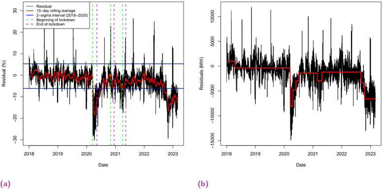
## Time Series Charts: Residual Analysis
### Overview
The image contains two time series charts, labeled (a) and (b), displaying residual data over time from 2018 to 2023. Chart (a) shows the residual as a percentage, while chart (b) shows the residuals in Megawatts (MW). Both charts include a 15-day rolling average and vertical lines indicating the beginning and end of lockdowns. Chart (a) also includes a 2-sigma interval from 2018-2020.
### Components/Axes
**Chart (a):**
* **X-axis:** Date, ranging from 2018 to 2023.
* **Y-axis:** Residual (%), ranging from -30% to 30%.
* **Data Series:**
* Residual (black line)
* 15-day rolling average (red line)
* 2-sigma interval (2018-2020) (two horizontal blue lines)
* Beginning of lockdown (vertical green dashed lines)
* End of lockdown (vertical purple dashed lines)
* **Legend:** Located in the top-left corner.
**Chart (b):**
* **X-axis:** Date, ranging from 2018 to 2023.
* **Y-axis:** Residuals (MW), ranging from -15000 MW to 10000 MW.
* **Data Series:**
* Residual (black line)
* 15-day rolling average (red line)
* **Legend:** Not explicitly present, but the data series are identifiable by color.
### Detailed Analysis
**Chart (a): Residual (%)**
* **Residual (Black Line):** The residual fluctuates significantly throughout the period. There are notable drops around 2020, coinciding with the lockdown periods.
* **15-day rolling average (Red Line):** This line smooths out the fluctuations in the residual, providing a clearer view of the overall trend. It stays mostly within the 2-sigma interval until 2020, after which it dips below.
* From 2018 to early 2020, the rolling average hovers around 0%.
* A sharp decline occurs in 2020, reaching approximately -10%.
* The rolling average recovers somewhat in 2021 and 2022, but remains mostly negative.
* **2-sigma interval (Blue Lines):** These lines represent the upper and lower bounds of a 2-sigma confidence interval calculated from the 2018-2020 data. The upper bound is approximately 6%, and the lower bound is approximately -6%.
* **Beginning of Lockdown (Green Dashed Lines):** There are multiple instances of these lines, indicating the start of lockdown periods. They appear around 2020, 2021, and 2022.
* **End of Lockdown (Purple Dashed Lines):** These lines indicate the end of lockdown periods, and they are paired with the "Beginning of Lockdown" lines.
**Chart (b): Residuals (MW)**
* **Residual (Black Line):** The residual fluctuates significantly, with large spikes and dips.
* **15-day rolling average (Red Line):** The rolling average shows a more stable trend.
* From 2018 to 2020, the rolling average is around 2500 MW.
* It drops sharply in 2020 to around -2500 MW.
* It remains relatively stable at around -2500 MW until 2022.
* In 2022, it drops again to around -7500 MW.
### Key Observations
* Both charts show a significant impact from the lockdown periods, particularly in 2020.
* The rolling average in chart (a) dips below the 2-sigma interval after 2020, suggesting a shift in the residual distribution.
* Chart (b) shows a clear drop in the residuals (MW) during the lockdown periods, indicating a decrease in energy consumption.
### Interpretation
The data suggests that the lockdown periods had a significant impact on the residuals, both in terms of percentage and absolute MW values. The negative residuals in chart (a) after 2020 indicate that the actual values were lower than expected based on the 2018-2020 data. This could be due to changes in energy consumption patterns during and after the lockdowns. The rolling average provides a smoothed view of these changes, highlighting the overall trend. The vertical lines indicating the beginning and end of lockdowns help to correlate these events with the observed changes in the residuals. The 2-sigma interval provides a baseline for comparison, showing how the residuals deviated from the expected range after the lockdowns.