\n
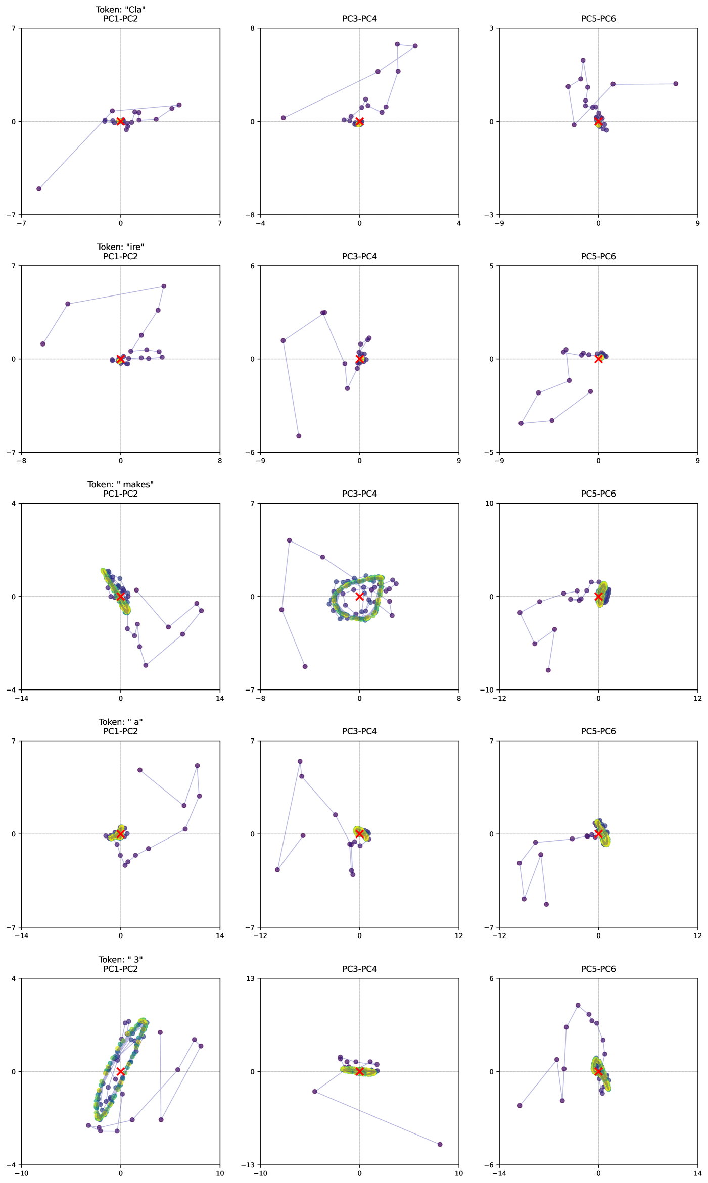
## Scatter Plot Matrix: Principal Component Analysis
### Overview
The image presents a scatter plot matrix visualizing Principal Component Analysis (PCA) results for five different tokens: "cla", "re", "makes", "a", and "3". Each token is represented across three different 2D scatter plots, showing relationships between different principal components (PC). The plots are arranged in a 5x3 grid, with each row corresponding to a token and each column representing a different pair of principal components.
### Components/Axes
Each individual plot within the matrix has the following components:
* **X-axis:** Represents one principal component (PC1, PC3, or PC5).
* **Y-axis:** Represents another principal component (PC2, PC4, or PC6).
* **Data Points:** Purple dots represent individual data points projected onto the principal component space.
* **Highlighted Point:** A red 'x' marks a specific data point within each plot, likely representing a centroid or a point of interest.
* **Connecting Lines:** Lines connect consecutive data points, suggesting a trajectory or order within the data.
* **Titles:** Each plot is titled with the token name and the principal components being displayed (e.g., "Token: “cla” PC1-PC2").
* **Axis Labels:** Axis labels indicate the principal component numbers (PC1, PC2, PC3, PC4, PC5, PC6).
* **Axis Scales:** The scales vary for each plot, ranging approximately from -14 to 14, -8 to 8, and -5 to 5.
### Detailed Analysis or Content Details
Here's a breakdown of each token's representation across the three plots:
**1. Token: “cla”**
* **PC1-PC2:** Data points are scattered around the origin, with a slight upward trend. Approximate range: PC1 (-3 to 3), PC2 (-2 to 7). The red 'x' is near (0, 0).
* **PC3-PC4:** Data points form a roughly horizontal line with some scatter. Approximate range: PC3 (-8 to 8), PC4 (-2 to 2). The red 'x' is near (0, 0).
* **PC5-PC6:** Data points are clustered in the upper-right quadrant. Approximate range: PC5 (-3 to 3), PC6 (0 to 3). The red 'x' is near (0, 0).
**2. Token: “re”**
* **PC1-PC2:** Data points are scattered, with a slight positive correlation. Approximate range: PC1 (-7 to 7), PC2 (-7 to 5). The red 'x' is near (0, 0).
* **PC3-PC4:** Data points form a roughly horizontal line with some scatter. Approximate range: PC3 (-6 to 6), PC4 (-2 to 4). The red 'x' is near (0, 0).
* **PC5-PC6:** Data points are scattered, with a slight positive correlation. Approximate range: PC5 (-5 to 5), PC6 (-5 to 5). The red 'x' is near (0, 0).
**3. Token: “makes”**
* **PC1-PC2:** Data points are widely scattered, with a negative correlation. Approximate range: PC1 (-14 to 4), PC2 (-8 to 4). The red 'x' is near (-2, 2).
* **PC3-PC4:** Data points form a circular cluster around the origin. Approximate range: PC3 (-7 to 7), PC4 (-7 to 7). The red 'x' is near (0, 0).
* **PC5-PC6:** Data points are scattered, with a slight positive correlation. Approximate range: PC5 (-10 to 12), PC6 (-12 to 10). The red 'x' is near (0, 0).
**4. Token: “a”**
* **PC1-PC2:** Data points are widely scattered, with a negative correlation. Approximate range: PC1 (-14 to 7), PC2 (-14 to 7). The red 'x' is near (0, 0).
* **PC3-PC4:** Data points form a roughly horizontal line with some scatter. Approximate range: PC3 (-12 to 12), PC4 (-12 to 12). The red 'x' is near (0, 0).
* **PC5-PC6:** Data points are scattered, with a slight positive correlation. Approximate range: PC5 (-12 to 12), PC6 (-12 to 12). The red 'x' is near (0, 0).
**5. Token: “3”**
* **PC1-PC2:** Data points form a circular cluster around the origin. Approximate range: PC1 (-4 to 4), PC2 (-4 to 4). The red 'x' is near (0, 0).
* **PC3-PC4:** Data points form a roughly horizontal line with some scatter. Approximate range: PC3 (-13 to 13), PC4 (-13 to 13). The red 'x' is near (0, 0).
* **PC5-PC6:** Data points are scattered, with a slight positive correlation. Approximate range: PC5 (-14 to 6), PC6 (-14 to 6). The red 'x' is near (0, 0).
### Key Observations
* The red 'x' consistently appears near the origin (0,0) in most plots, suggesting it represents a central tendency or baseline.
* The "makes" and "a" tokens exhibit the most scattered data points in the PC1-PC2 plots, indicating higher variance or less clear separation in these components.
* The PC3-PC4 plots for all tokens tend to show a more linear arrangement of data points.
* The PC5-PC6 plots generally show more scattered data, with some positive correlation.
### Interpretation
This scatter plot matrix visualizes the results of a Principal Component Analysis (PCA) applied to data associated with five different tokens. PCA is a dimensionality reduction technique used to identify the principal components – the directions of maximum variance in the data. Each plot represents a projection of the data onto a different pair of principal components.
The arrangement of data points in each plot reveals how well the data is separated or clustered in that particular component space. Tokens with more scattered data points (like "makes" and "a") may be more difficult to distinguish based on those components alone. The linear arrangements in the PC3-PC4 plots suggest a strong correlation between these components for all tokens.
The consistent placement of the red 'x' near the origin suggests it represents a central point or average for each token's projection onto the principal components. This could be used as a reference point for comparing the relative positions of individual data points.
The overall pattern suggests that the first few principal components (PC1, PC2, PC3) capture a significant portion of the variance in the data, while the later components (PC5, PC6) may represent more subtle variations. The specific interpretation of these components would depend on the original features used to generate the PCA. The lines connecting the points suggest a temporal or sequential relationship within the data, but without further context, the nature of this relationship remains unclear.