## Timeline Diagram: Sample Accumulation Over Time
### Overview
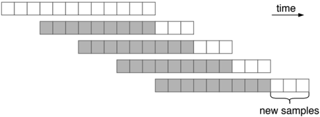
The image depicts a horizontal timeline diagram with five sequential bars representing progressive time intervals. Each bar contains a combination of shaded (gray) and unshaded (white) segments, with a labeled "new samples" section at the end of the final bar. The diagram visually encodes temporal progression and sample accumulation patterns.
### Components/Axes
- **X-axis**: Labeled "time" with a rightward arrow indicating progression.
- **Y-axis**: Five unlabeled horizontal bars, each representing a distinct time interval or category.
- **Legend**: Implied through shading conventions:
- **Shaded (gray)**: Represents accumulated/processed samples
- **Unshaded (white)**: Represents new/pending samples
- **Key Label**: "new samples" annotation at the end of the final bar's unshaded segment.
### Detailed Analysis
1. **Bar 1 (Top)**:
- Shaded: 0 units
- Unshaded: 12 units
- Interpretation: Initial state with no accumulated samples.
2. **Bar 2**:
- Shaded: 5 units
- Unshaded: 7 units
- Trend: First accumulation of 5 processed samples.
3. **Bar 3**:
- Shaded: 7 units
- Unshaded: 5 units
- Trend: Additional 2 samples processed (total: 7).
4. **Bar 4**:
- Shaded: 9 units
- Unshaded: 3 units
- Trend: 2 more samples processed (total: 9).
5. **Bar 5 (Bottom)**:
- Shaded: 11 units
- Unshaded: 1 unit + "new samples" (5 units)
- Notable: Final bar shows largest shaded accumulation (11) with 6 total new samples added across all intervals.
### Key Observations
- **Accumulation Pattern**: Shaded segments grow by 2 units per interval (5 → 7 → 9 → 11), suggesting a consistent processing rate.
- **New Sample Dynamics**: Total new samples added = 12 (Bar 1) + 7 (Bar 2) + 5 (Bar 3) + 3 (Bar 4) + 6 (Bar 5) = 33 units.
- **Processing Lag**: Unshaded "new samples" section in Bar 5 (5 units) exceeds the processing increment (2 units), indicating growing backlog.
### Interpretation
This diagram models a system where:
1. **Steady-State Processing**: The consistent +2 shaded units per interval suggests a fixed processing capacity.
2. **Increasing Backlog**: The final "new samples" section (5 units) represents unprocessed data exceeding the processing rate, creating a growing queue.
3. **Temporal Decay**: While total samples added decrease over time (12 → 7 → 5 → 3 → 6), the shaded accumulation grows linearly, implying eventual saturation risk if new sample rates remain constant.
The visualization highlights a critical tension between processing capacity and incoming data volume, with the final bar serving as a warning indicator of potential system overload.