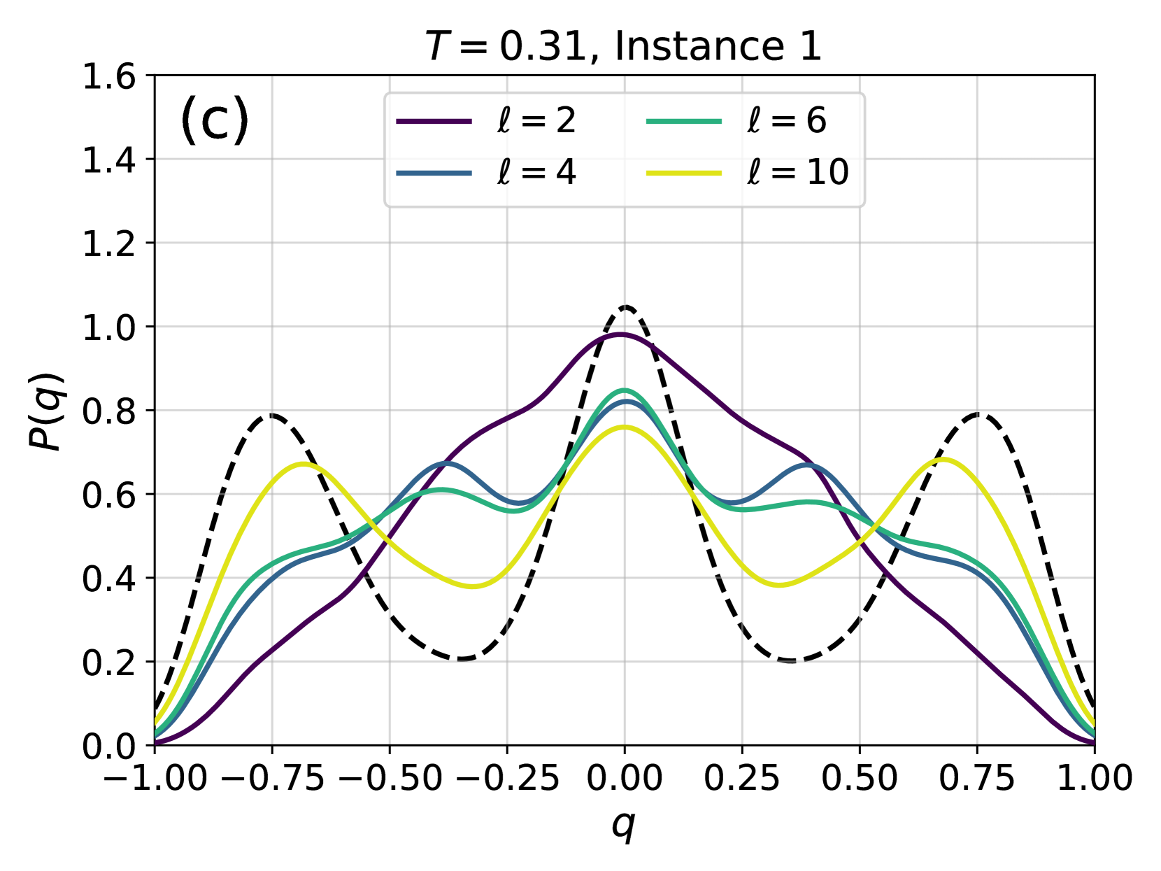
## Line Chart: Probability Distribution P(q) for Different ℓ Values
### Overview
The image displays a line chart showing the probability distribution function \( P(q) \) as a function of the variable \( q \). The plot is labeled as panel "(c)" and corresponds to a specific condition: "T = 0.31, Instance 1". It compares four different distributions, each associated with a distinct value of a parameter \( \ell \), along with an additional dashed black reference curve.
### Components/Axes
* **Title:** "T = 0.31, Instance 1" (centered at the top).
* **Panel Label:** "(c)" (located in the top-left corner of the plot area).
* **X-axis:**
* **Label:** "q" (centered below the axis).
* **Scale:** Linear, ranging from -1.00 to 1.00.
* **Major Ticks:** -1.00, -0.75, -0.50, -0.25, 0.00, 0.25, 0.50, 0.75, 1.00.
* **Y-axis:**
* **Label:** "P(q)" (centered to the left of the axis, rotated 90 degrees).
* **Scale:** Linear, ranging from 0.0 to 1.6.
* **Major Ticks:** 0.0, 0.2, 0.4, 0.6, 0.8, 1.0, 1.2, 1.4, 1.6.
* **Legend:** Positioned in the top-center of the plot area, enclosed in a box. It defines four colored solid lines:
* **Purple line:** \( \ell = 2 \)
* **Blue line:** \( \ell = 4 \)
* **Green line:** \( \ell = 6 \)
* **Yellow line:** \( \ell = 10 \)
* **Additional Element:** A **dashed black line** is present but is not defined in the legend.
### Detailed Analysis
The chart plots five distinct curves. All curves are symmetric about the vertical line \( q = 0.0 \).
1. **Dashed Black Line (Reference):**
* **Trend:** This curve exhibits three prominent, sharp peaks.
* **Data Points (Approximate):**
* Central peak: Located at \( q = 0.0 \), with a maximum \( P(q) \approx 1.05 \).
* Side peaks: Located symmetrically at \( q \approx -0.75 \) and \( q \approx 0.75 \), each with a maximum \( P(q) \approx 0.80 \).
* Minima: Deep minima occur at \( q \approx -0.35 \) and \( q \approx 0.35 \), with \( P(q) \approx 0.20 \).
2. **Purple Line (\( \ell = 2 \)):**
* **Trend:** This is the broadest and smoothest of the colored curves, featuring a single, dominant central peak.
* **Data Points (Approximate):**
* Central peak: Located at \( q = 0.0 \), with a maximum \( P(q) \approx 0.98 \).
* The curve decays smoothly towards zero as \( |q| \) approaches 1.00.
3. **Blue Line (\( \ell = 4 \)):**
* **Trend:** This curve shows a more complex structure than \( \ell = 2 \), with a central peak and two smaller side humps.
* **Data Points (Approximate):**
* Central peak: Located at \( q = 0.0 \), with a maximum \( P(q) \approx 0.82 \).
* Side humps: Located at \( q \approx -0.40 \) and \( q \approx 0.40 \), with \( P(q) \approx 0.68 \).
* Local minima between peaks: At \( q \approx \pm 0.20 \), with \( P(q) \approx 0.58 \).
4. **Green Line (\( \ell = 6 \)):**
* **Trend:** Similar in shape to the blue line (\( \ell = 4 \)) but with slightly lower peak values and more pronounced side features.
* **Data Points (Approximate):**
* Central peak: Located at \( q = 0.0 \), with a maximum \( P(q) \approx 0.85 \).
* Side humps: Located at \( q \approx -0.40 \) and \( q \approx 0.40 \), with \( P(q) \approx 0.60 \).
* Local minima between peaks: At \( q \approx \pm 0.20 \), with \( P(q) \approx 0.56 \).
5. **Yellow Line (\( \ell = 10 \)):**
* **Trend:** This curve most closely resembles the shape of the dashed black reference line, exhibiting three distinct peaks.
* **Data Points (Approximate):**
* Central peak: Located at \( q = 0.0 \), with a maximum \( P(q) \approx 0.76 \).
* Side peaks: Located at \( q \approx -0.70 \) and \( q \approx 0.70 \), each with a maximum \( P(q) \approx 0.68 \).
* Minima: Located at \( q \approx \pm 0.35 \), with \( P(q) \approx 0.38 \).
### Key Observations
* **Peak Evolution:** As the parameter \( \ell \) increases from 2 to 10, the distribution evolves from a single central peak (\( \ell=2 \)) to a triple-peak structure (\( \ell=10 \)).
* **Convergence to Reference:** The shape of the \( \ell = 10 \) (yellow) curve qualitatively matches the dashed black reference curve, suggesting that higher \( \ell \) values may approach a limiting distribution.
* **Central Peak Height:** The height of the central peak at \( q=0.0 \) generally decreases as \( \ell \) increases (from ~0.98 for \( \ell=2 \) to ~0.76 for \( \ell=10 \)).
* **Symmetry:** All plotted distributions are perfectly symmetric around \( q = 0.0 \).
### Interpretation
This plot likely illustrates the probability distribution of an order parameter \( q \) (common in statistical physics or machine learning, e.g., in spin glasses or neural networks) for a system at a fixed temperature \( T=0.31 \). The parameter \( \ell \) could represent a system size, a length scale, or a level of coarse-graining.
The data suggests a **transition in the system's behavior** as \( \ell \) increases. For small \( \ell \) (2), the system has a single, most probable state at \( q=0 \). As \( \ell \) grows, the distribution develops side peaks, indicating the emergence of additional metastable or probable states away from \( q=0 \). The dashed black line may represent a theoretical prediction or the distribution in the thermodynamic limit (\( \ell \to \infty \)). The fact that the \( \ell=10 \) curve approaches this reference suggests that the system's statistical properties converge with increasing \( \ell \). The symmetry implies the underlying system or Hamiltonian is symmetric under the transformation \( q \to -q \). The specific values of \( T \) and "Instance 1" indicate this is one snapshot from a larger study exploring the phase diagram or disorder realizations.