## Line Chart: P(q) vs. q at T=0.31, Instance 1
### Overview
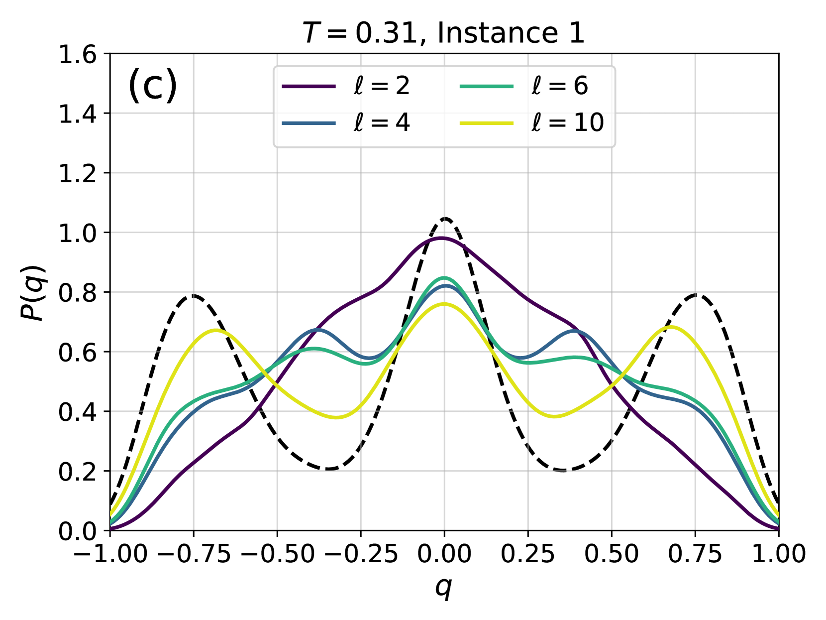
The image is a line chart displaying the relationship between P(q) and q for different values of 'l' at a constant temperature T=0.31 for Instance 1. The chart includes four data series, each representing a different value of 'l' (2, 4, 6, and 10). A dashed black line is also present, but not identified in the legend.
### Components/Axes
* **Title:** T = 0.31, Instance 1
* **X-axis:** q, ranging from -1.00 to 1.00 in increments of 0.25.
* **Y-axis:** P(q), ranging from 0.0 to 1.6 in increments of 0.2.
* **Legend:** Located at the top-right of the chart.
* Purple line: l = 2
* Blue line: l = 4
* Green line: l = 6
* Yellow line: l = 10
* **(c):** Located at the top-left of the chart.
### Detailed Analysis
* **Purple line (l = 2):** Starts at approximately 0.0 at q = -1.00, rises to a peak of approximately 0.7 at q = -0.75, decreases to approximately 0.2 at q = -0.50, rises to a peak of approximately 1.0 at q = 0.00, decreases to approximately 0.2 at q = 0.50, rises to a peak of approximately 0.7 at q = 0.75, and decreases to approximately 0.0 at q = 1.00.
* **Blue line (l = 4):** Starts at approximately 0.0 at q = -1.00, rises to a peak of approximately 0.5 at q = -0.75, decreases to approximately 0.4 at q = -0.50, rises to a peak of approximately 0.8 at q = 0.00, decreases to approximately 0.4 at q = 0.50, rises to a peak of approximately 0.5 at q = 0.75, and decreases to approximately 0.0 at q = 1.00.
* **Green line (l = 6):** Starts at approximately 0.0 at q = -1.00, rises to a peak of approximately 0.5 at q = -0.75, decreases to approximately 0.5 at q = -0.50, rises to a peak of approximately 0.7 at q = 0.00, decreases to approximately 0.5 at q = 0.50, rises to a peak of approximately 0.5 at q = 0.75, and decreases to approximately 0.0 at q = 1.00.
* **Yellow line (l = 10):** Starts at approximately 0.0 at q = -1.00, rises to a peak of approximately 0.7 at q = -0.75, decreases to approximately 0.4 at q = -0.50, rises to a peak of approximately 0.6 at q = 0.00, decreases to approximately 0.4 at q = 0.50, rises to a peak of approximately 0.7 at q = 0.75, and decreases to approximately 0.0 at q = 1.00.
* **Dashed Black line:** Starts at approximately 0.0 at q = -1.00, rises to a peak of approximately 0.8 at q = -0.75, decreases to approximately 0.2 at q = -0.50, rises to a peak of approximately 1.0 at q = 0.00, decreases to approximately 0.2 at q = 0.50, rises to a peak of approximately 0.8 at q = 0.75, and decreases to approximately 0.0 at q = 1.00.
### Key Observations
* All lines start and end at approximately P(q) = 0.0 at q = -1.00 and q = 1.00, respectively.
* All lines exhibit a similar pattern with peaks around q = -0.75, q = 0.00, and q = 0.75.
* The purple line (l = 2) has the highest peak at q = 0.00, while the other lines have lower peaks.
* The dashed black line has the sharpest peaks.
### Interpretation
The chart illustrates the distribution of P(q) for different values of 'l' at a specific temperature and instance. The peaks suggest preferred values of 'q', and the variation in peak height indicates the relative probability of these values for different 'l'. The dashed black line is not identified in the legend, so its meaning is unknown. The data suggests that as 'l' increases, the distribution of P(q) becomes more uniform, with lower peaks at the preferred 'q' values. The peaks at q = -0.75 and q = 0.75 are symmetric around q = 0.00, suggesting a symmetric behavior in the underlying system.