## Donut Chart: Error Type Distribution
### Overview
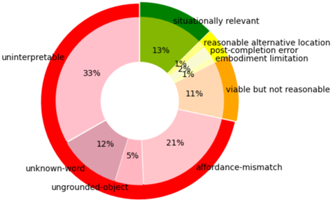
The image is a donut chart illustrating the distribution of different error types. The chart is divided into segments, each representing a specific error category, with the size of the segment proportional to its percentage. The chart is surrounded by a thick red ring.
### Components/Axes
* **Categories:**
* Uninterpretable (light pink)
* Unknown-word (grayish pink)
* Ungrounded-object (light pink)
* Affordance-mismatch (light pink)
* Viable but not reasonable (light orange)
* Reasonable alternative location, post-completion error, embodiment limitation (light yellow)
* Situationally relevant (green)
* **Percentages:** Displayed next to each category.
* **Legend:** The labels for each category are placed next to their corresponding segments.
### Detailed Analysis
* **Uninterpretable:** 33% (light pink) - Located on the left side of the chart.
* **Unknown-word:** 12% (grayish pink) - Located at the bottom-left of the chart.
* **Ungrounded-object:** 5% (light pink) - Located at the bottom of the chart.
* **Affordance-mismatch:** 21% (light pink) - Located at the bottom-right of the chart.
* **Viable but not reasonable:** 11% (light orange) - Located on the right side of the chart.
* **Reasonable alternative location, post-completion error, embodiment limitation:** 1% (light yellow) - Located at the top-right of the chart.
* **Situationally relevant:** 13% (green) - Located at the top of the chart.
### Key Observations
* The "Uninterpretable" category accounts for the largest portion of the errors at 33%.
* "Affordance-mismatch" is the second largest category at 21%.
* "Situationally relevant" accounts for 13% of the errors.
* "Unknown-word" accounts for 12% of the errors.
* "Viable but not reasonable" accounts for 11% of the errors.
* "Ungrounded-object" accounts for 5% of the errors.
* "Reasonable alternative location, post-completion error, embodiment limitation" accounts for the smallest portion of the errors at 1%.
### Interpretation
The donut chart provides a clear visual representation of the distribution of different error types. The high percentage of "Uninterpretable" errors suggests a significant challenge in understanding the nature of these errors. The relatively high percentage of "Affordance-mismatch" errors indicates potential issues with the design or usability of the system. The other categories contribute smaller but still significant portions to the overall error distribution, highlighting the need for a comprehensive approach to error analysis and mitigation. The red ring around the chart does not appear to have any specific meaning related to the data.