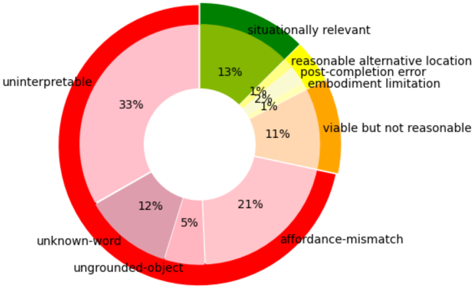
## Donut Chart: Error Category Distribution
### Overview
The image displays a donut chart illustrating the proportional distribution of various error or failure categories. The chart is divided into ten distinct segments, each represented by a unique color and labeled with a category name and a percentage value. The segments are arranged clockwise around the donut.
### Components
* **Chart Type:** Donut Chart.
* **Data Series:** Ten categorical segments representing different error types.
* **Labels & Percentages:** Each segment has an associated text label placed outside the chart, connected by proximity. The percentage value is displayed inside each colored segment.
* **Legend:** The legend is integrated directly into the chart via the external labels. There is no separate legend box.
* **Spatial Layout:** The chart is centered. Labels are positioned around the perimeter of the donut. The largest segment ("uninterpretable") is on the left side.
### Detailed Analysis
The following lists each segment, starting from the top (12 o'clock position) and moving clockwise. The color description is approximate based on visual inspection.
1. **situationally relevant** (Dark Green): ~13%
2. **reasonable alternative location** (Light Yellow-Green): ~1%
3. **post-completion error** (Yellow): ~1%
4. **embodiment limitation** (Light Orange): ~7%
5. **viable but not reasonable** (Orange): ~11%
6. **affordance-mismatch** (Light Pink): ~21%
7. **ungrounded-object** (Medium Pink): ~5%
8. **unknown-word** (Darker Pink/Mauve): ~12%
9. **uninterpretable** (Light Red/Salmon): ~33%
10. **[Unlabeled Segment]** (Bright Red): This is the outer ring of the donut chart itself, not a data segment. It serves as a visual container.
**Trend Verification:** As this is a categorical distribution chart, there is no temporal trend. The relative size of the categories is the primary metric. The visual weight confirms that "uninterpretable" is the largest segment, followed by "affordance-mismatch."
### Key Observations
* **Dominant Category:** The "uninterpretable" category is the largest single segment, accounting for approximately one-third (33%) of the total.
* **Secondary Dominance:** "Affordance-mismatch" is the second-largest category at ~21%.
* **Grouping:** The three pink/red-toned segments ("affordance-mismatch," "ungrounded-object," "unknown-word," "uninterpretable") collectively represent a significant majority (~71%) of the chart.
* **Minor Categories:** Several categories represent very small proportions: "reasonable alternative location" and "post-completion error" are each ~1%, and "ungrounded-object" is ~5%.
* **Color Palette:** The chart uses a warm color gradient from green/yellow through orange and pink to red, potentially indicating a severity or progression scale, though this is not explicitly stated.
### Interpretation
This chart quantifies the frequency or proportion of different failure modes within a specific system or study. The data suggests that issues related to **interpretation** ("uninterpretable" at 33%) and **interaction design** ("affordance-mismatch" at 21%) are the most prevalent problems, together constituting over half of all observed errors.
The significant presence of "unknown-word" (12%) points to challenges in natural language understanding or vocabulary coverage. The very small percentages for "reasonable alternative location" and "post-completion error" indicate these are rare failure modes in this context.
The grouping of categories by color (pinks/reds) might imply a thematic relationship, such as errors stemming from core system misunderstandings versus those related to physical or situational constraints (greens/oranges). Without the chart's title or accompanying text, the exact domain (e.g., robotics, AI dialogue systems, human-computer interaction) is uncertain, but the labels strongly suggest an analysis of errors in an embodied agent or interactive AI system. The chart effectively highlights that improving interpretability and affordance clarity would address the majority of identified issues.