## Pie Chart: Error Categories Distribution
### Overview
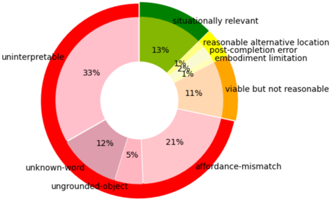
The image is a pie chart illustrating the distribution of error categories in a dataset or system. The chart uses distinct colors to represent different error types, with percentages indicating their relative frequency. The largest segment is labeled "uninterpretable" (33%), while smaller segments include categories like "post-completion error" (1%) and "embodiment limitation" (1%).
### Components/Axes
- **Legend**: Located on the right side of the chart, mapping colors to error categories:
- Red: Uninterpretable
- Light Pink: Affordance-mismatch
- Pink: Unknown-word
- Green: Situationally relevant
- Orange: Viable but not reasonable
- Yellow: Reasonable alternative location
- Light Yellow: Post-completion error
- Very Light Yellow: Embodiment limitation
- **Segments**: Each error category is represented as a wedge with a percentage and label.
### Detailed Analysis
1. **Uninterpretable (33%)**: Largest segment, colored red. Represents the most frequent error type.
2. **Affordance-mismatch (21%)**: Second-largest segment, light pink. Indicates issues where user actions conflict with system expectations.
3. **Unknown-word (12%)**: Pink segment. Suggests errors due to unrecognized terms or inputs.
4. **Situationally relevant (13%)**: Green segment. Errors that occur only in specific contexts.
5. **Viable but not reasonable (11%)**: Orange segment. Actions that are technically possible but ethically or practically questionable.
6. **Reasonable alternative location (2%)**: Yellow segment. Errors involving plausible but suboptimal choices.
7. **Post-completion error (1%)**: Light yellow segment. Mistakes occurring after a task is finalized.
8. **Embodiment limitation (1%)**: Very light yellow segment. Physical or hardware-related constraints causing errors.
9. **Ungrounded-object (5%)**: Dark pink segment. Errors tied to objects lacking contextual relevance.
### Key Observations
- **Dominance of "Uninterpretable" Errors**: At 33%, this category far exceeds others, suggesting significant challenges in system interpretability or user comprehension.
- **High Frequency of Affordance-Mismatch**: 21% highlights a critical usability issue where user intentions clash with system functionality.
- **Small but Notable Segments**: Categories like "post-completion error" and "embodiment limitation" (1% each) may represent edge cases but could be critical in specific applications.
- **Rounding Discrepancy**: Total percentages sum to 99% (33+21+12+5+13+11+2+1+1), likely due to rounding.
### Interpretation
The chart underscores systemic issues in interpretability and usability, with "uninterpretable" and "affordance-mismatch" errors dominating. The prevalence of "unknown-word" (12%) and "situationally relevant" (13%) errors suggests context-dependent challenges, possibly in natural language processing or adaptive systems. The small segments (1-2%) indicate rare but potentially high-impact issues, such as hardware limitations ("embodiment limitation") or ethical concerns ("viable but not reasonable"). The near-total sum (99%) hints at minor data aggregation or rounding errors, which should be investigated for precision. Overall, the data points to a need for improved system transparency, user-centered design, and context-aware error handling.