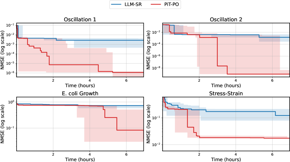
## Line Charts: Performance Comparison of LLM-SR and PIT-PO
### Overview
The image contains four line charts arranged in a 2x2 grid, comparing the performance of two methods, LLM-SR (blue) and PIT-PO (red), across different tasks: Oscillation 1, Oscillation 2, E. coli Growth, and Stress-Strain. The y-axis represents NMSE (Normalized Mean Squared Error) on a logarithmic scale, and the x-axis represents Time (in hours). Each chart also includes shaded regions around the lines, presumably indicating uncertainty or variance.
### Components/Axes
* **Legend:** Located at the top of the image.
* LLM-SR: Blue line
* PIT-PO: Red line
* **X-axis:** Time (hours), ranging from 0 to 6 in all four charts.
* **Y-axis:** NMSE (log scale)
* Oscillation 1: 10^-6 to 10^-1
* Oscillation 2: 10^-8 to 10^-2
* E. coli Growth: 10^-1 to 10^0
* Stress-Strain: 10^-2 to 10^-1
* **Titles:**
* Top-left: Oscillation 1
* Top-right: Oscillation 2
* Bottom-left: E. coli Growth
* Bottom-right: Stress-Strain
### Detailed Analysis
**1. Oscillation 1**
* **LLM-SR (Blue):** The line starts at approximately 10^-2 and remains relatively constant throughout the time period, with a slight decrease.
* Time = 0: NMSE ≈ 10^-2
* Time = 6: NMSE ≈ 10^-2
* **PIT-PO (Red):** The line starts at approximately 10^-2 and decreases in a step-wise fashion, reaching a value of approximately 10^-6.
* Time = 0: NMSE ≈ 10^-2
* Time = 1: NMSE ≈ 10^-3
* Time = 2: NMSE ≈ 10^-4
* Time = 4: NMSE ≈ 10^-5
* Time = 6: NMSE ≈ 10^-6
**2. Oscillation 2**
* **LLM-SR (Blue):** The line starts at approximately 10^-2 and remains relatively constant throughout the time period.
* Time = 0: NMSE ≈ 10^-2
* Time = 6: NMSE ≈ 10^-2
* **PIT-PO (Red):** The line starts at approximately 10^-2, decreases to approximately 10^-8, and then remains constant.
* Time = 0: NMSE ≈ 10^-2
* Time = 1: NMSE ≈ 10^-3
* Time = 2: NMSE ≈ 10^-7
* Time = 6: NMSE ≈ 10^-8
**3. E. coli Growth**
* **LLM-SR (Blue):** The line starts at approximately 10^0 and remains relatively constant throughout the time period.
* Time = 0: NMSE ≈ 10^0
* Time = 6: NMSE ≈ 10^0
* **PIT-PO (Red):** The line starts at approximately 10^0 and decreases in a step-wise fashion, reaching a value of approximately 10^-1.
* Time = 0: NMSE ≈ 10^0
* Time = 4: NMSE ≈ 10^-1
* Time = 6: NMSE ≈ 10^-1
**4. Stress-Strain**
* **LLM-SR (Blue):** The line starts at approximately 10^-1 and decreases slightly over time.
* Time = 0: NMSE ≈ 10^-1
* Time = 6: NMSE ≈ 10^-1
* **PIT-PO (Red):** The line starts at approximately 10^-1 and decreases in a step-wise fashion, reaching a value of approximately 10^-2.
* Time = 0: NMSE ≈ 10^-1
* Time = 1: NMSE ≈ 10^-1
* Time = 2: NMSE ≈ 10^-2
* Time = 6: NMSE ≈ 10^-2
### Key Observations
* In all four tasks, the PIT-PO method (red line) generally achieves lower NMSE values compared to the LLM-SR method (blue line), indicating better performance.
* The PIT-PO method exhibits a step-wise decrease in NMSE over time, while the LLM-SR method remains relatively constant.
* The shaded regions around the lines suggest that there is some variability in the performance of both methods, but the PIT-PO method consistently outperforms the LLM-SR method.
### Interpretation
The data suggests that the PIT-PO method is more effective than the LLM-SR method in reducing the Normalized Mean Squared Error across the four tasks: Oscillation 1, Oscillation 2, E. coli Growth, and Stress-Strain. The step-wise decrease in NMSE for the PIT-PO method indicates that it is learning and improving over time, while the relatively constant NMSE for the LLM-SR method suggests that it may not be as adaptable or effective in these tasks. The shaded regions indicate the variance in the results, but the overall trend consistently favors the PIT-PO method.