## Histogram: TruthQA Explanation Analysis
### Overview
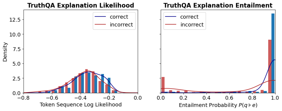
The image contains two histograms comparing the distributions of "correct" and "incorrect" explanations in the TruthQA dataset. The left histogram visualizes the "Token Sequence Log Likelihood," while the right histogram visualizes the "Entailment Probability P(q ≠ e)". Both histograms show the density of correct and incorrect explanations across the respective metrics.
### Components/Axes
**Left Histogram: TruthQA Explanation Likelihood**
* **Title:** TruthQA Explanation Likelihood
* **Y-axis:** Density, ranging from 0.0 to 12.5 in increments of 2.5.
* **X-axis:** Token Sequence Log Likelihood, ranging from -0.8 to 0.0 in increments of 0.2.
* **Legend:** Located in the top-right corner.
* Blue line: "correct"
* Red line: "incorrect"
* **Data Representation:** Histograms with overlaid density curves. Blue bars and curve represent "correct" explanations, while red bars and curve represent "incorrect" explanations.
**Right Histogram: TruthQA Explanation Entailment**
* **Title:** TruthQA Explanation Entailment
* **Y-axis:** Density, ranging from 0.0 to 12.5 in increments of 2.5.
* **X-axis:** Entailment Probability P(q ≠ e), ranging from 0.0 to 1.0 in increments of 0.2.
* **Legend:** Located in the top-right corner.
* Blue line: "correct"
* Red line: "incorrect"
* **Data Representation:** Histograms with overlaid density curves. Blue bars and curve represent "correct" explanations, while red bars and curve represent "incorrect" explanations.
### Detailed Analysis
**Left Histogram: TruthQA Explanation Likelihood**
* **Correct (Blue):** The distribution is approximately normal, centered around -0.4. The density curve peaks around -0.4.
* Density at -0.6: ~2.5
* Density at -0.4: ~4.0
* Density at -0.2: ~3.0
* **Incorrect (Red):** The distribution is also approximately normal, centered around -0.4, but slightly skewed to the left. The density curve peaks around -0.4.
* Density at -0.6: ~2.0
* Density at -0.4: ~4.0
* Density at -0.2: ~2.5
**Right Histogram: TruthQA Explanation Entailment**
* **Correct (Blue):** The distribution is heavily skewed towards 1.0. The density curve rises sharply near 1.0.
* Density at 0.0: ~0.1
* Density at 0.2: ~0.1
* Density at 0.4: ~0.1
* Density at 0.6: ~0.1
* Density at 0.8: ~0.2
* Density at 1.0: ~4.0
* **Incorrect (Red):** The distribution is skewed towards 1.0, but less so than the "correct" distribution. The density curve rises near 1.0, but not as sharply.
* Density at 0.0: ~1.0
* Density at 0.2: ~0.3
* Density at 0.4: ~0.2
* Density at 0.6: ~0.2
* Density at 0.8: ~0.5
* Density at 1.0: ~2.0
### Key Observations
* In the "Token Sequence Log Likelihood" histogram, the distributions of "correct" and "incorrect" explanations are very similar, suggesting that this metric alone is not a strong discriminator.
* In the "Entailment Probability" histogram, the "correct" explanations are much more likely to have a high entailment probability (close to 1.0) compared to the "incorrect" explanations. This suggests that entailment probability is a better indicator of explanation quality.
### Interpretation
The data suggests that the "Entailment Probability P(q ≠ e)" is a more effective metric for distinguishing between correct and incorrect explanations in the TruthQA dataset than the "Token Sequence Log Likelihood." The higher density of correct explanations at high entailment probabilities indicates that correct explanations are more likely to be logically entailed by the question. The similarity in "Token Sequence Log Likelihood" distributions suggests that the overall likelihood of the token sequence is not as indicative of correctness as the entailment relationship.