## Dual-panel Density Plot with Histograms: TruthQA Explanation Likelihood and Entailment Distributions
### Overview
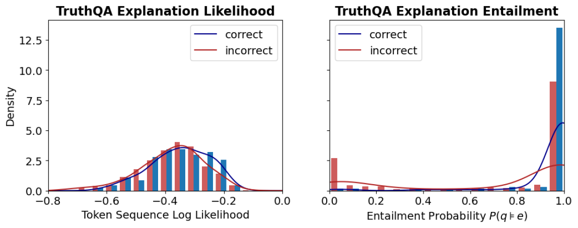
The image displays two side-by-side statistical plots analyzing the properties of "explanations" in a dataset or model evaluation called "TruthQA." The plots compare distributions for explanations labeled as "correct" (blue) versus "incorrect" (red). The left panel focuses on the likelihood of the explanation text itself, while the right panel focuses on the logical entailment probability between a question and its explanation.
### Components/Axes
**Common Elements:**
* **Legend:** Located in the top-right corner of each plot.
* Blue line/bar: `correct`
* Red line/bar: `incorrect`
* **Y-axis (Shared Label):** `Density` (applies to both plots). The scale runs from 0.0 to approximately 13.5, with major ticks at 0.0, 2.5, 5.0, 7.5, 10.0, and 12.5.
**Left Plot: "TruthQA Explanation Likelihood"**
* **Title:** `TruthQA Explanation Likelihood`
* **X-axis Label:** `Token Sequence Log Likelihood`
* **X-axis Scale:** Ranges from -0.8 to 0.0, with major ticks at -0.8, -0.6, -0.4, -0.2, and 0.0.
**Right Plot: "TruthQA Explanation Entailment"**
* **Title:** `TruthQA Explanation Entailment`
* **X-axis Label:** `Entailment Probability P(q|e)`
* **X-axis Scale:** Ranges from 0.0 to 1.0, with major ticks at 0.0, 0.2, 0.4, 0.6, 0.8, and 1.0.
### Detailed Analysis
**Left Plot: Explanation Likelihood (Token Sequence Log Likelihood)**
* **Trend Verification:** Both the blue (`correct`) and red (`incorrect`) density curves show a unimodal, roughly bell-shaped distribution. The blue curve is shifted slightly to the right (higher likelihood) compared to the red curve.
* **Data Points & Distributions:**
* The peak density for `correct` explanations (blue curve) is approximately 3.5, occurring at a log likelihood of roughly **-0.3**.
* The peak density for `incorrect` explanations (red curve) is slightly higher, approximately 4.0, occurring at a log likelihood of roughly **-0.4**.
* The histograms (bars) show overlapping distributions. The highest concentration of `correct` explanation bars is between -0.5 and -0.2. The highest concentration of `incorrect` explanation bars is between -0.6 and -0.3.
* Both distributions taper off towards -0.8 and 0.0, with very low density at the extremes.
**Right Plot: Explanation Entailment (Entailment Probability P(q|e))**
* **Trend Verification:** The distributions are dramatically different. The blue (`correct`) curve shows a sharp, extreme peak near 1.0. The red (`incorrect`) curve is relatively flat with a minor peak near 0.0.
* **Data Points & Distributions:**
* The density for `correct` explanations (blue) spikes to its maximum of approximately **13.5** at an entailment probability very close to **1.0**. The associated histogram bar at 1.0 is the tallest in the entire figure.
* The density for `incorrect` explanations (red) has a small peak of approximately **2.5** near an entailment probability of **0.0**. The associated histogram bar at 0.0 is notably tall for the red series.
* Between 0.2 and 0.8, the density for both series is very low (near 0), indicating few explanations have mid-range entailment probabilities.
* There is a secondary, much smaller peak in the red density curve near 1.0 (density ~2.0), and a corresponding small red histogram bar, indicating a subset of incorrect explanations still have high entailment probability.
### Key Observations
1. **Discriminative Power:** The `Entailment Probability` (right plot) shows a far clearer separation between `correct` and `incorrect` explanations than the `Token Sequence Log Likelihood` (left plot).
2. **Bimodality in Entailment:** The entailment distribution for `incorrect` explanations is bimodal, with clusters at very low (~0.0) and very high (~1.0) probability.
3. **High Likelihood Overlap:** Many `incorrect` explanations have log likelihoods similar to `correct` ones, suggesting the model assigns plausible likelihood to factually wrong explanations.
4. **Extreme Values:** The most striking data point is the massive concentration of `correct` explanations at the maximum entailment probability (1.0).
### Interpretation
This data suggests that for the TruthQA task, **logical entailment (P(q|e)) is a much stronger signal for identifying correct explanations than the raw likelihood of the explanation text.**
* **What it demonstrates:** A correct explanation is highly likely to logically entail the question it is answering (probability ≈ 1.0). An incorrect explanation is most often either completely unrelated (entailment ≈ 0.0) or, in a smaller subset of cases, deceptively plausible (entailment ≈ 1.0). The log likelihood metric fails to make this clean distinction, as both correct and incorrect explanations can be written in similarly fluent, high-probability language.
* **Relationship between elements:** The two plots together argue that evaluating an explanation's *truthfulness* requires checking its logical relationship to the question, not just its linguistic coherence. The right plot's sharp peak is the key finding.
* **Notable Anomaly:** The secondary peak of `incorrect` explanations at high entailment probability (right plot, red curve near 1.0) is critical. It represents a failure mode where explanations are logically consistent with the question but are factually wrong—these are likely the most challenging cases for a model or human evaluator to detect.
* **Peircean Investigation:** From a semiotic perspective, the `correct` explanations function as strong "indices" (direct evidence) for the question, hence the high entailment. The `incorrect` explanations are either unrelated "symbols" (low entailment) or misleading "icons" (high entailment but false). The likelihood plot only measures the "iconic" fluency, which is insufficient for truth evaluation.