\n
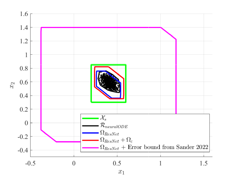
## 2D Plot: Comparison of Set Bounds and Data Distribution
### Overview
The image is a 2D scatter plot with overlaid geometric shapes representing different sets or bounds. It appears to compare the coverage or containment of a data distribution (represented by a scatter of points) against various theoretical or computed regions. The plot is set against a white background with a light gray grid.
### Components/Axes
* **Axes:**
* **Horizontal Axis (x1):** Labeled `x1`. Scale ranges from approximately -0.5 to 1.5, with major tick marks at -0.5, 0, 0.5, 1, and 1.5.
* **Vertical Axis (x2):** Labeled `x2`. Scale ranges from approximately -0.4 to 1.6, with major tick marks at -0.4, -0.2, 0, 0.2, 0.4, 0.6, 0.8, 1, 1.2, 1.4, and 1.6.
* **Legend:** Located at the bottom-center of the plot area. It contains five entries, each with a colored line sample and a label:
1. **Green Line:** `X_s`
2. **Black Line:** `R_{neuralODE}`
3. **Blue Line:** `Ω_{ResNet}`
4. **Red Line:** `Ω_{ResNet} + Ω_ε`
5. **Magenta Line:** `Ω_{ResNet} + Error bound from Sander 2022`
* **Data Series & Shapes:**
* **Scatter Points:** A dense cluster of black points, with a smaller number of blue points interspersed, concentrated in the central region of the plot.
* **Geometric Shapes (from outermost to innermost):**
1. **Magenta Polygon:** A large, irregular hexagon forming the outermost boundary.
2. **Green Rectangle:** A smaller, axis-aligned rectangle nested inside the magenta shape.
3. **Red Polygon:** An irregular pentagon/hexagon nested inside the green rectangle.
4. **Blue Polygon:** A smaller irregular shape nested inside the red polygon.
5. **Black Polygon:** The innermost irregular shape, closely surrounding the main cluster of scatter points.
### Detailed Analysis
* **Spatial Layout & Containment:** The shapes exhibit a clear nested hierarchy. The magenta polygon is the largest and contains all other elements. The green rectangle is fully contained within the magenta polygon. The red, blue, and black polygons are successively nested within the green rectangle, with the black polygon being the innermost bound.
* **Approximate Coordinates of Shape Vertices (Estimated from Grid):**
* **Magenta Polygon (`Ω_{ResNet} + Error bound...`):** Vertices are approximately at (-0.4, -0.3), (-0.2, -0.3), (-0.4, 1.4), (1.0, 1.4), (1.2, 1.2), and (1.2, 0.2).
* **Green Rectangle (`X_s`):** Appears to be an axis-aligned rectangle with corners approximately at (0.2, 0.3) and (0.6, 0.8).
* **Red Polygon (`Ω_{ResNet} + Ω_ε`):** Vertices are approximately at (0.25, 0.35), (0.25, 0.75), (0.35, 0.8), (0.55, 0.7), (0.55, 0.4), and (0.45, 0.35).
* **Blue Polygon (`Ω_{ResNet}`):** Vertices are approximately at (0.3, 0.4), (0.3, 0.7), (0.4, 0.75), (0.5, 0.65), (0.5, 0.45), and (0.4, 0.4).
* **Black Polygon (`R_{neuralODE}`):** Vertices are approximately at (0.35, 0.45), (0.35, 0.65), (0.45, 0.7), (0.5, 0.6), (0.5, 0.5), and (0.45, 0.45).
* **Scatter Point Distribution:** The black points form a dense, roughly elliptical cluster centered near (0.4, 0.6). The blue points are scattered within and slightly around this main cluster, with a few appearing near the boundary of the blue polygon.
### Key Observations
1. **Containment Hierarchy:** There is a strict visual containment: Magenta ⊃ Green ⊃ Red ⊃ Blue ⊃ Black ≈ Data Cluster.
2. **Tightness of Bounds:** The black polygon (`R_{neuralODE}`) appears to be the tightest bound around the primary data cluster. The blue polygon (`Ω_{ResNet}`) is slightly larger, the red polygon (`Ω_{ResNet} + Ω_ε`) larger still, and the green rectangle (`X_s`) is a much looser, axis-aligned bound. The magenta polygon is a very loose, outer bound.
3. **Legend-Color Correspondence:** The colors in the legend match the shapes in the plot exactly. The magenta line corresponds to the outermost polygon, the green line to the rectangle, and so on, down to the black line for the innermost polygon.
4. **Data vs. Bounds:** The majority of the black scatter points are contained within the innermost black polygon. The blue scatter points are also mostly within the black and blue polygons, though a few are near or slightly outside the blue boundary.
### Interpretation
This plot likely visualizes and compares different methods for computing **invariant sets, reachable sets, or error bounds** for a dynamical system or a neural network model (suggested by terms like `ResNet` and `neuralODE`).
* **`X_s` (Green):** Represents a simple, possibly predefined, safe set or state space region (an axis-aligned box).
* **`Ω_{ResNet}` (Blue):** Represents a set computed or guaranteed by a Residual Network (ResNet) based method. It is tighter than `X_s`.
* **`Ω_{ResNet} + Ω_ε` (Red):** Likely represents the ResNet set augmented with an additional error term (`Ω_ε`), resulting in a slightly larger, more conservative bound.
* **`R_{neuralODE}` (Black):** Represents a set computed by a Neural Ordinary Differential Equation (Neural ODE) method. It provides the tightest fit to the empirical data distribution (the scatter points), suggesting it may be a more accurate model of the system's true behavior or reachable states.
* **`Ω_{ResNet} + Error bound...` (Magenta):** Represents a very conservative, possibly theoretical, error bound from a cited work (Sander 2022) applied to the ResNet set. Its large size indicates it is a loose, worst-case guarantee.
**The core message** is a comparison of **set computation techniques**. The Neural ODE method (`R_{neuralODE}`) produces a set that most closely matches the observed data distribution, while the ResNet-based methods (`Ω_{ResNet}`) produce larger, more conservative sets. The plot demonstrates the trade-off between the tightness of a computed bound and its conservatism, with the Neural ODE approach appearing superior in this specific case for approximating the data's support. The magenta bound serves as a reference for a known, highly conservative theoretical limit.