## Chart: 2D Region Plot - Uncertainty Quantification
### Overview
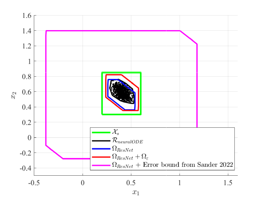
The image presents a 2D plot illustrating regions defined by different methods, likely representing uncertainty bounds or confidence intervals in a two-dimensional space defined by variables x1 and x2. The plot compares the regions generated by several models and error estimations.
### Components/Axes
* **X-axis:** Labeled "x₁", ranging approximately from -0.5 to 1.5.
* **Y-axis:** Labeled "x₂", ranging approximately from -0.4 to 1.6.
* **Legend:** Located in the bottom-left corner, containing the following labels and corresponding colors:
* "xₛ" (Light Green)
* "RneuralODE" (Black)
* "ΩResNet" (Blue)
* "ΩResNet + Ωₑ" (Red)
* "ΩResNet + Error bound from Sander 2022" (Magenta)
* **Grid:** A light gray grid is overlaid on the plot area.
### Detailed Analysis
The plot displays five distinct regions, each defined by a closed curve.
1. **xₛ (Light Green):** This region is a square, with vertices approximately at (-0.1, 0.7), (0.4, 0.7), (0.4, 1.2), and (-0.1, 1.2). It is the smallest and most contained region.
2. **RneuralODE (Black):** This region is a more complex polygon, enclosing the green region. It has vertices approximately at (-0.2, 0.0), (1.3, 0.0), (1.3, 1.5), and (-0.2, 1.5). The shape is roughly rectangular but with some inward curves.
3. **ΩResNet (Blue):** This region is a polygon, contained within the black region, and appears to be similar in shape to the black region but slightly smaller and more irregular. It has vertices approximately at (0.0, 0.3), (0.8, 0.3), (0.8, 1.3), and (0.0, 1.3).
4. **ΩResNet + Ωₑ (Red):** This region is a polygon, contained within the blue region, and appears to be similar in shape to the blue region but slightly smaller and more irregular. It has vertices approximately at (0.1, 0.4), (0.7, 0.4), (0.7, 1.1), and (0.1, 1.1).
5. **ΩResNet + Error bound from Sander 2022 (Magenta):** This region is the largest and most encompassing, containing all other regions. It is a polygon with vertices approximately at (-0.3, -0.2), (1.4, -0.2), (1.4, 1.6), and (-0.3, 1.6).
The regions are nested, with xₛ being the innermost and the Sander 2022 error bound being the outermost. The shapes are not perfectly regular, suggesting the underlying data or model is complex.
### Key Observations
* The regions represent increasing levels of uncertainty or confidence intervals.
* The "xₛ" region is the most precise, while the Sander 2022 error bound provides the broadest estimate.
* The difference between the regions suggests that adding error bounds significantly expands the estimated uncertainty.
* The shapes of the regions are not simple, indicating non-linear relationships or complex dependencies.
### Interpretation
This chart likely visualizes the results of an uncertainty quantification study. The different regions represent the estimated range of possible values for the variables x₁ and x₂, as determined by different models or methods.
* **xₛ:** Could represent a ground truth or a highly accurate estimate.
* **RneuralODE:** Represents the region estimated by a Neural ODE model.
* **ΩResNet:** Represents the region estimated by a ResNet model.
* **ΩResNet + Ωₑ:** Represents the ResNet model's estimate with an additional error component (Ωₑ).
* **ΩResNet + Error bound from Sander 2022:** Represents the ResNet model's estimate with an error bound calculated using the method proposed by Sander in 2022.
The increasing size of the regions as more error terms are added indicates that the uncertainty in the estimate grows as more factors are considered. The Sander 2022 error bound provides the most conservative (largest) estimate, likely reflecting a higher level of confidence or a more thorough assessment of potential errors. The chart demonstrates the importance of considering uncertainty when making predictions or decisions based on these models. The nested structure highlights how different methods contribute to the overall uncertainty estimate.