## Line Chart: Log Probability Difference vs. Number of Layers
### Overview
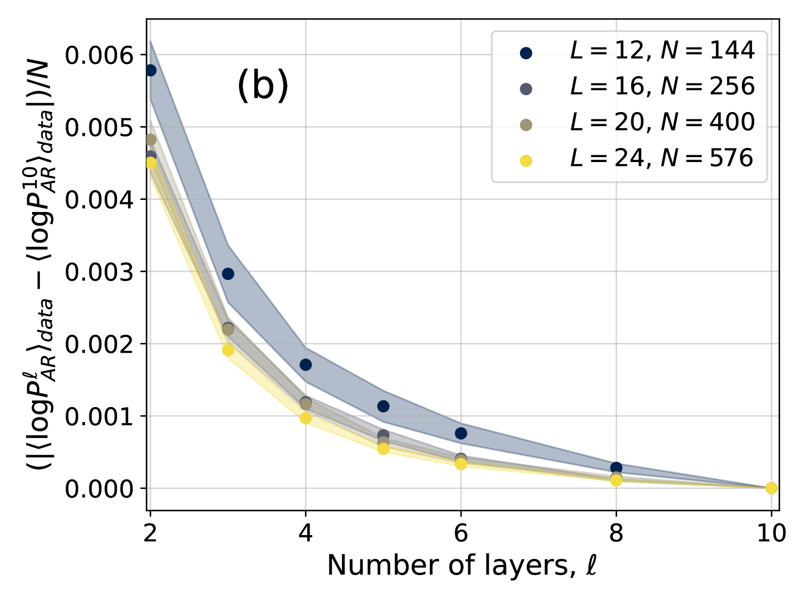
The image is a line chart that plots the difference between the absolute value of the log probability of AR data and the average log probability of AR data, normalized by N, against the number of layers, l. There are four data series, each representing a different value of L and N. The chart includes a legend, axis labels, and gridlines. The data series all show a decreasing trend as the number of layers increases.
### Components/Axes
* **Title:** None explicitly present, but the chart is labeled "(b)" in the top-center.
* **X-axis:** "Number of layers, l". The axis ranges from 2 to 10, with tick marks at every increment of 2 (2, 4, 6, 8, 10).
* **Y-axis:** "(|⟨logP<sub>AR</sub><sup>l</sup>⟩<sub>data</sub> - ⟨logP<sub>AR</sub><sup>10</sup>⟩<sub>data</sub>|)/N". The axis ranges from 0.000 to 0.006, with tick marks at every increment of 0.001 (0.000, 0.001, 0.002, 0.003, 0.004, 0.005, 0.006).
* **Legend:** Located in the top-right corner. It identifies the four data series:
* Dark Blue: L = 12, N = 144
* Dark Gray: L = 16, N = 256
* Olive Green: L = 20, N = 400
* Yellow: L = 24, N = 576
### Detailed Analysis
* **Dark Blue Line (L = 12, N = 144):** This line starts at approximately (2, 0.006) and decreases to approximately (10, 0.000).
* (2, 0.006)
* (4, 0.003)
* (6, 0.0008)
* (8, 0.0003)
* (10, 0.000)
* **Dark Gray Line (L = 16, N = 256):** This line starts at approximately (2, 0.005) and decreases to approximately (10, 0.000).
* (2, 0.005)
* (4, 0.0018)
* (6, 0.0007)
* (8, 0.0002)
* (10, 0.000)
* **Olive Green Line (L = 20, N = 400):** This line starts at approximately (2, 0.0047) and decreases to approximately (10, 0.000).
* (2, 0.0047)
* (4, 0.0013)
* (6, 0.0005)
* (8, 0.0001)
* (10, 0.000)
* **Yellow Line (L = 24, N = 576):** This line starts at approximately (2, 0.0045) and decreases to approximately (10, 0.000).
* (2, 0.0045)
* (4, 0.0009)
* (6, 0.0004)
* (8, 0.0001)
* (10, 0.000)
Each line has a shaded region around it, indicating some form of uncertainty or standard deviation.
### Key Observations
* All four lines exhibit a decreasing trend. As the number of layers (l) increases, the value of (|⟨logP<sub>AR</sub><sup>l</sup>⟩<sub>data</sub> - ⟨logP<sub>AR</sub><sup>10</sup>⟩<sub>data</sub>|)/N decreases.
* The dark blue line (L = 12, N = 144) consistently has the highest values across the range of the x-axis.
* The yellow line (L = 24, N = 576) consistently has the lowest values across the range of the x-axis.
* The lines converge towards 0 as the number of layers approaches 10.
### Interpretation
The chart suggests that as the number of layers (l) increases, the difference between the log probability of the AR data at layer l and the log probability at layer 10 decreases. This implies that with more layers, the model's performance converges towards a stable state, represented by the 10th layer. The different values of L and N seem to influence the initial difference, with lower L and N resulting in a higher initial difference. The convergence towards zero suggests that increasing the number of layers beyond a certain point (likely around 10) may not significantly improve the model's performance, as the difference becomes negligible. The shaded regions around each line indicate the variability or uncertainty in the data, which decreases as the number of layers increases, further supporting the idea of convergence.