## Heatmap: Numerical Grid
### Overview
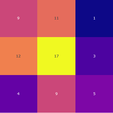
The image is a 3x3 heatmap displaying numerical values within each cell. The color intensity corresponds to the magnitude of the number, with darker colors representing lower values and brighter colors representing higher values.
### Components/Axes
* **Grid:** A 3x3 grid structure.
* **Color Scale:** The color intensity varies, indicating the magnitude of the numbers.
* **Numerical Values:** Each cell contains a numerical value.
### Detailed Analysis
Here's a breakdown of the numerical values and their corresponding cell positions:
* **Top-Left:** 9 (Pink)
* **Top-Center:** 11 (Orange-Pink)
* **Top-Right:** 1 (Dark Blue)
* **Middle-Left:** 12 (Orange)
* **Middle-Center:** 17 (Yellow)
* **Middle-Right:** 3 (Dark Purple)
* **Bottom-Left:** 4 (Purple)
* **Bottom-Center:** 9 (Pink)
* **Bottom-Right:** 5 (Purple-Pink)
### Key Observations
* The highest value (17) is located in the center cell.
* The lowest value (1) is located in the top-right cell.
* The values generally increase towards the center of the grid.
### Interpretation
The heatmap visually represents the distribution of numerical values across a 3x3 grid. The color gradient allows for a quick assessment of the relative magnitudes of the numbers. The central cell having the highest value suggests a concentration or focal point in that area. The heatmap could represent various data, such as website click-through rates, temperature distribution, or any other data that can be represented in a grid format.