## Heatmap Grid: 3x3 Numerical Value Distribution
### Overview
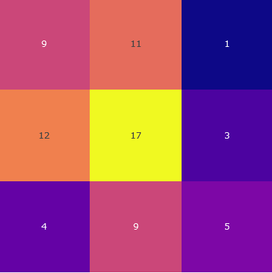
The image displays a 3x3 grid of colored squares, each containing a numerical value. The grid functions as a simple heatmap or categorical value chart, where distinct background colors are associated with specific integer values. There are no explicit axis labels, titles, or a legend provided within the image itself.
### Components/Axes
* **Structure:** A 3x3 grid (3 rows, 3 columns).
* **Elements:** Nine individual cells. Each cell has a solid background color and a centered numerical label in a light, sans-serif font.
* **Legend/Key:** No legend is present. The relationship between color and value must be inferred from the data presented.
* **Spatial Layout:**
* **Top Row (Left to Right):** Pinkish-red cell, Orange-red cell, Dark blue cell.
* **Middle Row (Left to Right):** Orange cell, Bright yellow cell, Purple cell.
* **Bottom Row (Left to Right):** Dark purple cell, Pinkish-red cell, Purple cell.
### Detailed Analysis
The following table reconstructs the grid's content, listing each cell's approximate position, inferred color description, and exact numerical value.
| Position (Row, Column) | Approximate Color Description | Numerical Value |
| :--- | :--- | :--- |
| Top-Left (1,1) | Pinkish-red / Magenta | 9 |
| Top-Center (1,2) | Orange-red / Coral | 11 |
| Top-Right (1,3) | Dark Blue / Navy | 1 |
| Middle-Left (2,1) | Orange | 12 |
| Middle-Center (2,2) | Bright Yellow | 17 |
| Middle-Right (2,3) | Purple / Violet | 3 |
| Bottom-Left (3,1) | Dark Purple / Indigo | 4 |
| Bottom-Center (3,2) | Pinkish-red / Magenta | 9 |
| Bottom-Right (3,3) | Purple / Violet | 5 |
**Trend Verification (Color-Value Relationship):**
* The **brightest color** (Yellow) corresponds to the **highest value** (17).
* The **darkest color** (Dark Blue) corresponds to the **lowest value** (1).
* There is a general, though not perfectly linear, correlation where warmer/brighter colors (yellows, oranges, pinks) represent higher values, and cooler/darker colors (blues, purples) represent lower values.
* The two cells with the same color (Pinkish-red at Top-Left and Bottom-Center) both contain the value 9, suggesting a consistent color-to-value mapping for that specific hue.
### Key Observations
1. **Central Peak:** The highest value (17) is located in the absolute center of the grid (2,2), highlighted by the most visually prominent color (bright yellow).
2. **Low-Value Corner:** The lowest value (1) is in the top-right corner (1,3), marked by the darkest color.
3. **Color Consistency:** The color used for the value 9 appears twice (positions 1,1 and 3,2), indicating a deliberate design choice rather than random coloring.
4. **Value Range:** The values range from 1 to 17, with a notable cluster of mid-range values (9, 11, 12) in the upper-left quadrant.
### Interpretation
This grid visually encodes numerical data through color intensity, creating an immediate spatial understanding of value distribution. The design suggests a **central tendency or hotspot**, with the maximum value at the core, surrounded by generally decreasing values towards the periphery, particularly the top-right corner.
The lack of axis labels or a legend means the context is entirely abstract. The data could represent anything from survey responses and frequency counts to performance metrics or spatial measurements. The primary informational takeaway is the **relative comparison** between cells: the center is "most" of something, the top-right is "least," and the left side generally holds higher values than the right side. The consistent color for the value 9 implies a categorical or binned grouping, where values around 9 are considered a distinct tier. Without external context, the chart's purpose is to demonstrate a pattern of concentration and dissipation across a 2D space.