## Heatmap: Unlabeled Numerical Distribution Grid
### Overview
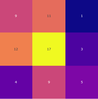
The image displays a 3x3 heatmap with numerical values embedded in colored cells. Colors transition from purple (low values) to yellow (high values), with no axis labels, legends, or contextual text present. The grid structure suggests a categorical comparison across rows and columns, though specific dimensions (e.g., time, categories) are undefined.
### Components/Axes
- **Grid Structure**: 3 rows × 3 columns.
- **Color Gradient**:
- Purple → Orange → Yellow (increasing magnitude).
- Dark blue appears for the lowest value (1).
- **No Labels**: Rows, columns, or legend are unlabeled, limiting interpretability of categories.
### Detailed Analysis
| Row \ Column | 1 | 2 | 3 |
|--------------|-------|-------|-------|
| **1** | 9 | 11 | 1 |
| **2** | 12 | 17 | 3 |
| **3** | 4 | 9 | 5 |
- **Color Consistency**:
- Highest value (17) is yellow (center cell).
- Lowest value (1) is dark blue (top-right cell).
- Intermediate values use orange/purple gradients.
### Key Observations
1. **Central Peak**: The middle cell (17) is the maximum value, surrounded by lower magnitudes.
2. **Lowest Value**: Top-right cell (1) is an outlier, significantly smaller than adjacent cells.
3. **Row Totals**:
- Row 1: 21 (9 + 11 + 1)
- Row 2: 32 (12 + 17 + 3) – **highest total**.
- Row 3: 18 (4 + 9 + 5).
4. **Column Totals**:
- Column 1: 25 (9 + 12 + 4)
- Column 2: 37 (11 + 17 + 9) – **highest total**.
- Column 3: 9 (1 + 3 + 5).
### Interpretation
- **Data Distribution**: The heatmap reveals a **centralized peak** (17) with diminishing values toward the edges, suggesting a focal point of intensity. The top-right cell (1) is an anomalous outlier, potentially indicating an error or unique condition.
- **Row/Column Dynamics**:
- Row 2 dominates in magnitude, while Row 3 has the lowest aggregate.
- Column 2 (middle) contains the two highest values (11, 17), reinforcing its central importance.
- **Color Utility**: The gradient effectively visualizes magnitude, though the absence of a legend prevents precise quantification of color-to-value mapping.
- **Contextual Limitations**: Without axis labels or legends, the grid’s purpose (e.g., time-series, categorical comparison) remains ambiguous. The data structure alone suggests a matrix of interrelated metrics, but external context is required for deeper analysis.