## Stacked Bar Chart: Questions Answered by Attempt
### Overview
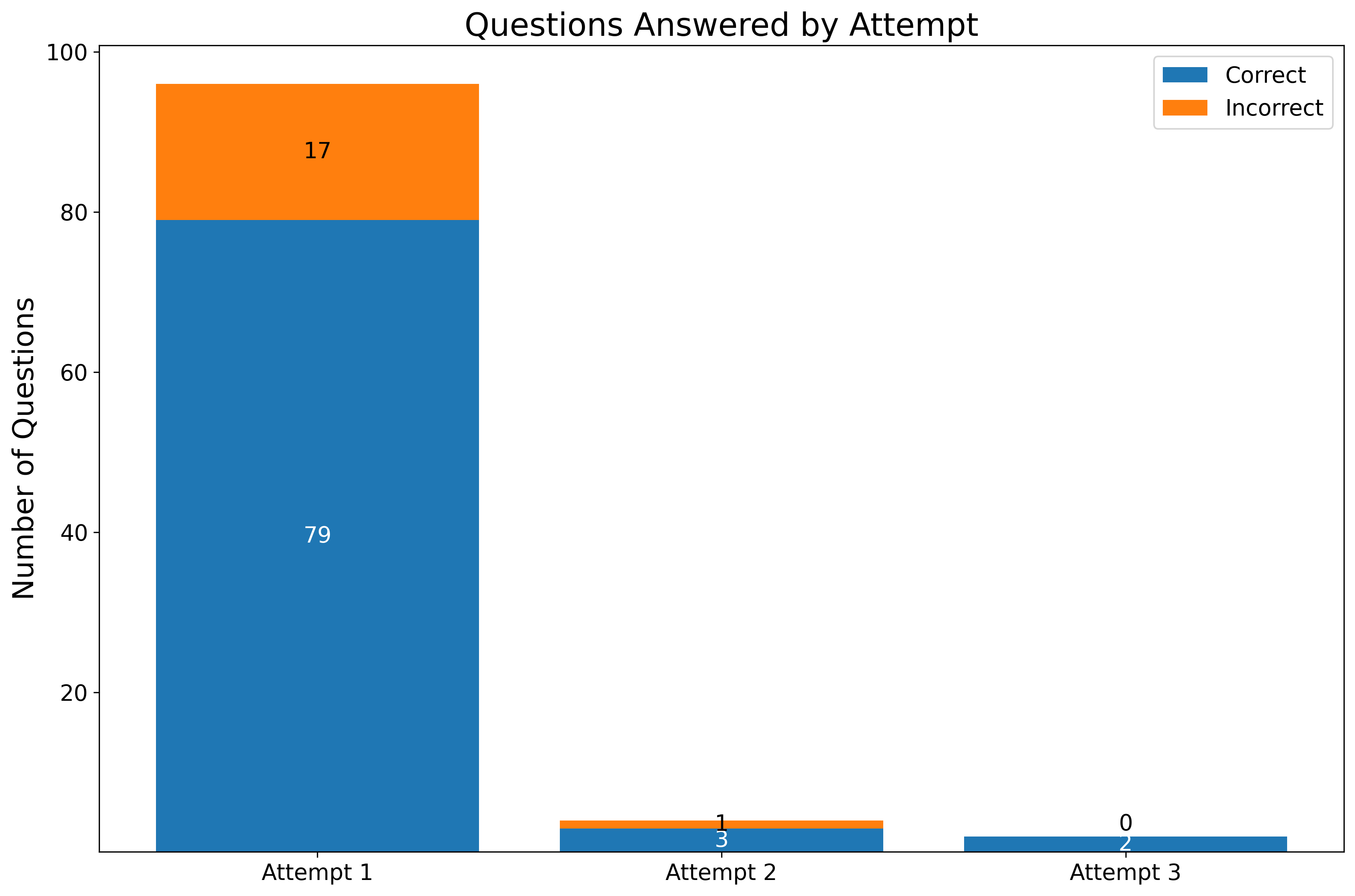
The image is a stacked bar chart showing the number of questions answered correctly and incorrectly across three attempts. The y-axis represents the number of questions, and the x-axis represents the attempt number. Each bar is divided into two segments: a blue segment representing the number of correctly answered questions and an orange segment representing the number of incorrectly answered questions.
### Components/Axes
* **Title:** Questions Answered by Attempt
* **Y-axis Label:** Number of Questions
* **Y-axis Scale:** 0 to 100, with tick marks at intervals of 20.
* **X-axis Labels:** Attempt 1, Attempt 2, Attempt 3
* **Legend:** Located in the top-right corner.
* Blue: Correct
* Orange: Incorrect
### Detailed Analysis
* **Attempt 1:**
* Correct: 79
* Incorrect: 17
* Total: 96
* **Attempt 2:**
* Correct: 3
* Incorrect: 1
* Total: 4
* **Attempt 3:**
* Correct: 2
* Incorrect: 0
* Total: 2
### Key Observations
* The number of questions answered correctly decreases significantly from Attempt 1 to Attempt 2 and then remains low for Attempt 3.
* The number of questions answered incorrectly also decreases from Attempt 1 to Attempt 2, and is zero for Attempt 3.
* Attempt 1 has the highest number of questions answered, both correctly and incorrectly.
### Interpretation
The chart suggests that most questions are answered correctly on the first attempt. Subsequent attempts show a drastic reduction in both correct and incorrect answers, implying that either the questions are not being attempted or that the students are not improving their scores on subsequent attempts. The high number of incorrect answers on the first attempt suggests a need for improvement in initial understanding or test-taking strategy. The low numbers for Attempts 2 and 3 could indicate a lack of engagement or a different approach to answering questions on later attempts.