\n
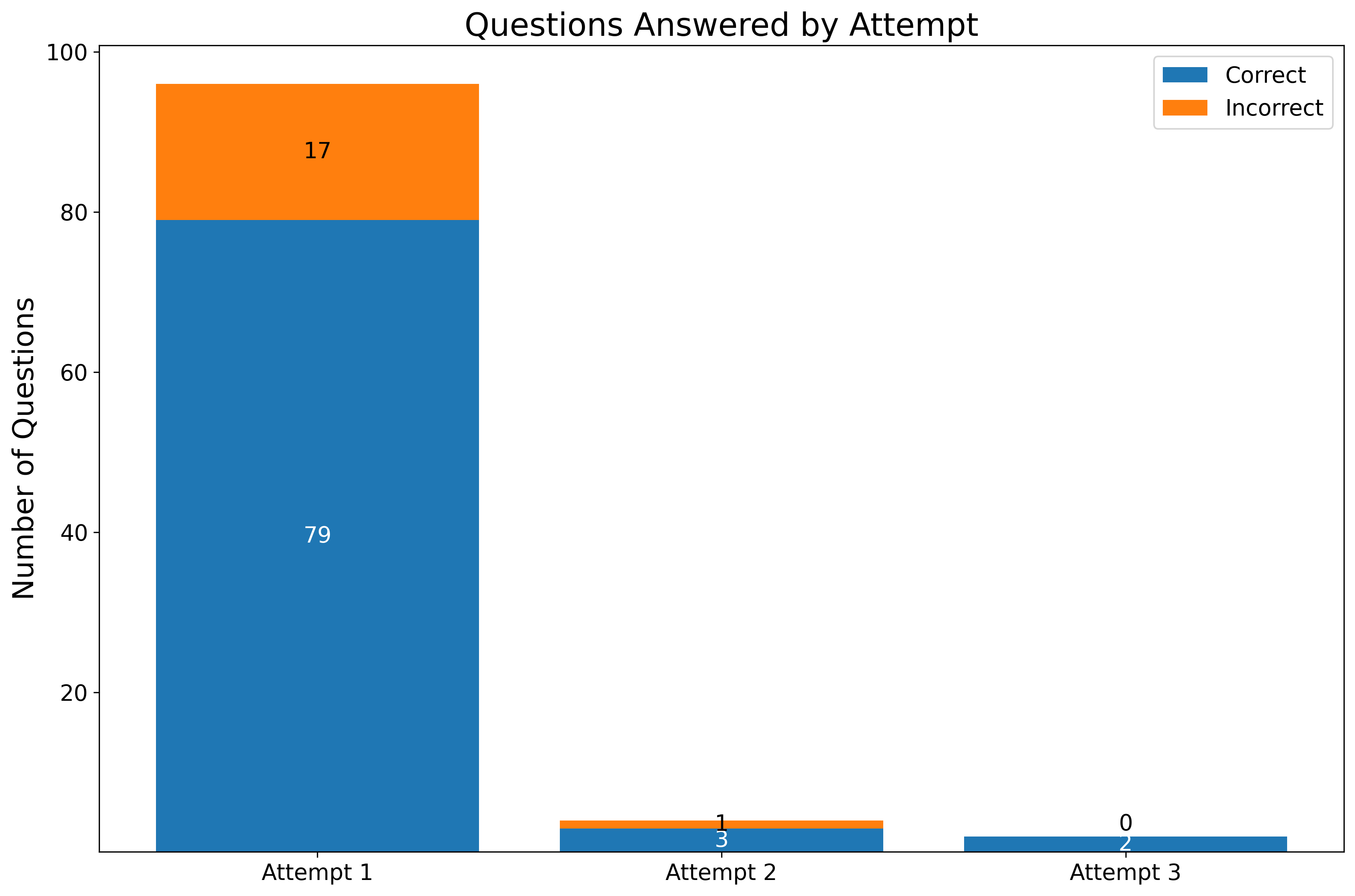
## Stacked Bar Chart: Questions Answered by Attempt
### Overview
The image presents a stacked bar chart visualizing the number of questions answered correctly and incorrectly across three attempts. The chart displays the distribution of correct and incorrect answers for each attempt, allowing for a comparison of performance over time.
### Components/Axes
* **Title:** "Questions Answered by Attempt" (centered at the top)
* **X-axis:** "Attempt" with markers for Attempt 1, Attempt 2, and Attempt 3.
* **Y-axis:** "Number of Questions" with a scale ranging from 0 to 100, incrementing by 20.
* **Legend:** Located in the top-right corner, distinguishing between "Correct" (blue) and "Incorrect" (orange).
### Detailed Analysis
The chart consists of three stacked bars, one for each attempt.
* **Attempt 1:**
* Correct answers: Approximately 79 questions (represented by a blue segment).
* Incorrect answers: Approximately 17 questions (represented by an orange segment).
* Total questions attempted: 79 + 17 = 96 questions.
* **Attempt 2:**
* Correct answers: Approximately 1 question (represented by a blue segment).
* Incorrect answers: Approximately 3 questions (represented by an orange segment).
* Total questions attempted: 1 + 3 = 4 questions.
* **Attempt 3:**
* Correct answers: Approximately 0 questions (represented by a blue segment).
* Incorrect answers: Approximately 2 questions (represented by an orange segment).
* Total questions attempted: 0 + 2 = 2 questions.
### Key Observations
* The majority of questions were attempted on Attempt 1, with a high number of correct answers.
* The number of questions attempted significantly decreased with each subsequent attempt.
* The proportion of incorrect answers appears to increase relative to correct answers in later attempts, although the small sample sizes in Attempts 2 and 3 make this observation less reliable.
* Attempt 3 had the lowest number of questions attempted, with no correct answers.
### Interpretation
The data suggests a decline in engagement or a successful completion of the task after the first attempt. The initial attempt shows a strong performance, with a large number of questions answered correctly. The subsequent attempts indicate a diminishing need for further attempts, potentially because the user achieved their desired outcome or lost interest. The low number of attempts in the later stages makes it difficult to draw definitive conclusions about performance trends. The chart highlights a significant drop in activity after the first attempt, which could be due to various factors, such as the task being completed, the user finding an alternative solution, or a lack of motivation to continue. The data could be used to assess the effectiveness of the task or identify areas where users may be struggling.