\n
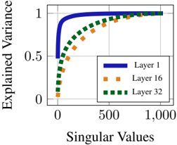
## Chart: Explained Variance vs. Singular Values
### Overview
The image presents a line chart illustrating the relationship between Singular Values and Explained Variance for three different layers (Layer 1, Layer 16, and Layer 32). The chart aims to demonstrate how much variance in the data is explained as more singular values are considered.
### Components/Axes
* **X-axis:** Labeled "Singular Values", ranging from approximately 0 to 1,000.
* **Y-axis:** Labeled "Explained Variance", ranging from 0 to 1.
* **Legend:** Located in the top-right corner, identifying three data series:
* Layer 1 (represented by a solid blue line)
* Layer 16 (represented by an orange dashed line with square markers)
* Layer 32 (represented by a dark green dashed line with square markers)
* **Gridlines:** Present to aid in reading values.
### Detailed Analysis
The chart displays three curves, each representing a different layer.
* **Layer 1 (Blue Line):** This line starts at approximately 0.4 explained variance at a singular value of 0, and rapidly increases to nearly 1 explained variance by a singular value of approximately 200. It then plateaus, with minimal further increase in explained variance as singular values increase beyond 200.
* **Layer 16 (Orange Line):** This line begins at approximately 0.1 explained variance at a singular value of 0. It increases more gradually than Layer 1, reaching approximately 0.8 explained variance at a singular value of 500. It continues to increase, but at a slower rate, reaching approximately 0.95 explained variance at a singular value of 1,000.
* **Layer 32 (Green Line):** This line starts at approximately 0.05 explained variance at a singular value of 0. It exhibits a similar trend to Layer 16, but with a slower initial increase. It reaches approximately 0.8 explained variance at a singular value of 700 and continues to increase, reaching approximately 0.95 explained variance at a singular value of 1,000.
### Key Observations
* Layer 1 explains variance much more quickly than Layers 16 and 32. A relatively small number of singular values (around 200) are sufficient to explain almost all the variance in Layer 1.
* Layers 16 and 32 require significantly more singular values to achieve a comparable level of explained variance.
* The explained variance curves for Layers 16 and 32 are relatively close to each other, suggesting similar behavior in terms of variance explanation.
* All three layers demonstrate diminishing returns in explained variance as the number of singular values increases.
### Interpretation
The chart suggests that Layer 1 is more efficient at capturing the essential variance in the data compared to Layers 16 and 32. This could indicate that Layer 1 is a more compact or informative representation of the underlying data. The slower increase in explained variance for Layers 16 and 32 might imply that these layers contain more noise or less relevant information. The diminishing returns observed in all layers suggest that beyond a certain point, adding more singular values provides only marginal improvements in explained variance. This information is valuable for dimensionality reduction or feature selection, as it helps identify the number of singular values needed to retain a sufficient amount of variance in the data. The differences between the layers could be related to the specific features or patterns learned by each layer during a training process.