## Line Chart with Scatter Points: Test Accuracy vs. Parameter t
### Overview
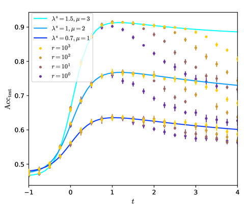
The image is a scientific line chart plotting test accuracy (`Acc_test`) against a parameter `t`. It displays three continuous trend lines, each corresponding to a different combination of parameters `λ*` and `μ`. Overlaid on these lines are scatter points representing data for different values of a parameter `r`. The chart illustrates how accuracy evolves with `t` under various model or experimental conditions.
### Components/Axes
* **X-Axis:** Labeled `t`. The scale is linear, ranging from -1 to 4, with major tick marks at -1, 0, 1, 2, 3, and 4.
* **Y-Axis:** Labeled `Acc_test`. The scale is linear, ranging from 0.5 to 0.9, with major tick marks at 0.5, 0.6, 0.7, 0.8, and 0.9.
* **Legend (Top-Left Corner):** Contains two sections.
* **Lines Section:** Lists three colored lines with their parameters:
* Cyan line: `λ* = 1.5, μ = 3`
* Medium blue line: `λ* = 1, μ = 2`
* Dark blue line: `λ* = 0.7, μ = 1`
* **Scatter Points Section:** Lists four colored markers representing different `r` values:
* Yellow circle: `r = 10³`
* Orange circle: `r = 10²`
* Brown circle: `r = 10¹`
* Purple circle: `r = 10⁰`
### Detailed Analysis
**Trend Lines:**
1. **Cyan Line (`λ* = 1.5, μ = 3`):** This is the highest-performing series. It starts at approximately `Acc_test = 0.48` at `t = -1`. It rises steeply, crossing `Acc_test ≈ 0.8` near `t = 0.2`, and reaches a peak plateau of approximately `Acc_test = 0.92` between `t = 0.8` and `t = 1.5`. After `t = 1.5`, it shows a very gradual decline, ending at approximately `Acc_test = 0.88` at `t = 4`.
2. **Medium Blue Line (`λ* = 1, μ = 2`):** This is the middle-performing series. It starts at approximately `Acc_test = 0.49` at `t = -1`. It rises steadily, crossing `Acc_test ≈ 0.7` near `t = 0.3`, and reaches a peak of approximately `Acc_test = 0.77` near `t = 1.0`. It then declines gradually, ending at approximately `Acc_test = 0.73` at `t = 4`.
3. **Dark Blue Line (`λ* = 0.7, μ = 1`):** This is the lowest-performing series. It starts at approximately `Acc_test = 0.50` at `t = -1`. It rises more slowly, crossing `Acc_test ≈ 0.6` near `t = 0.4`, and reaches a peak of approximately `Acc_test = 0.64` near `t = 0.8`. It then declines gradually, ending at approximately `Acc_test = 0.60` at `t = 4`.
**Scatter Points (Data Distribution):**
The scatter points show the variance of individual data points around the trend lines for different `r` values.
* **General Pattern:** For a given `t`, points with higher `r` values (yellow, `r=10³`) are consistently positioned higher on the y-axis (higher accuracy) and cluster more tightly around the trend lines. Points with lower `r` values (purple, `r=10⁰`) are positioned lower and show greater vertical spread (higher variance).
* **Spatial Grounding & Cross-Reference:**
* At `t ≈ 0.5`, yellow points (`r=10³`) are near `Acc_test ≈ 0.85` (close to the cyan line), while purple points (`r=10⁰`) are near `Acc_test ≈ 0.75`.
* At `t ≈ 2.0`, the spread is very clear. For the cyan line region: yellow points cluster near `0.90`, orange near `0.87`, brown near `0.83`, and purple near `0.78`.
* The vertical ordering of colors (yellow > orange > brown > purple) is consistent across the entire `t` range for all three trend line regions.
### Key Observations
1. **Performance Hierarchy:** There is a clear and consistent performance hierarchy: `λ*=1.5, μ=3` > `λ*=1, μ=2` > `λ*=0.7, μ=1`. Higher values of `λ*` and `μ` correlate with higher test accuracy.
2. **Peak and Decline:** All three trend lines exhibit a similar shape: an initial rise to a peak between `t=0.8` and `t=1.5`, followed by a slow, steady decline as `t` increases further.
3. **Impact of `r`:** The parameter `r` has a strong, monotonic effect on accuracy and variance. Higher `r` yields higher accuracy and lower variance (tighter clustering). Lower `r` yields lower accuracy and higher variance (wider scatter).
4. **Convergence at Low `t`:** At very low `t` values (`t < -0.5`), the three trend lines and all scatter points converge to a similar accuracy range (~0.48-0.52), suggesting the parameters `λ*`, `μ`, and `r` have minimal differentiating effect in this regime.
### Interpretation
This chart likely visualizes the results of a machine learning or statistical model evaluation. The parameter `t` could represent a training step, a regularization strength, or a temperature parameter. The parameters `λ*` and `μ` appear to be hyperparameters controlling model complexity or learning dynamics, where more aggressive settings (higher values) lead to better peak performance.
The parameter `r` likely represents a resource such as sample size, resolution, or number of Monte Carlo samples. The clear stratification shows that increasing this resource (`r`) directly improves both the expected accuracy and the reliability (lower variance) of the model's predictions. The peak-and-decline shape of the curves suggests an optimal value for `t` exists; moving beyond this point (increasing `t` further) leads to overfitting, degradation, or diminishing returns.
The convergence at low `t` indicates a baseline or underfitting regime where model specifics don't matter. The divergence as `t` increases shows where the choices of `λ*`, `μ`, and `r` become critical for performance. The chart effectively communicates that achieving high, stable accuracy requires both well-tuned hyperparameters (`λ*`, `μ`) and sufficient resources (`r`).