## Bar Chart: Inference Time per Module Across Methods
### Overview
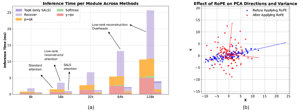
The bar chart compares inference times (in milliseconds) for different methods across varying input sizes (k = 8k, 16k, 32k, 64k, 128k). Each bar is segmented into four methods: TopK (only SALS), Recover, Softmax, and p=qk. Annotations highlight key components like "Low-rank reconstruction" and "SALS attention."
### Components/Axes
- **X-axis**: Input size (k) labeled as 8k, 16k, 32k, 64k, 128k.
- **Y-axis**: Inference Time (ms), ranging from 0 to 25.
- **Legend**:
- Purple: TopK (only SALS)
- Green: Softmax
- Red: y=pv
- Orange: p=qk
- **Annotations**:
- "Low-rank reconstruction" (arrow pointing to Recover method at 64k and 128k).
- "SALS attention" (arrow pointing to TopK at 16k).
- "Low-rank reconstructed attention" (arrow pointing to Recover at 32k).
### Detailed Analysis
- **TopK (only SALS)**:
- Inference time remains consistently low (~1-2 ms) across all k values.
- At 128k, the bar is ~1.5 ms.
- **Recover**:
- Dominates inference time at larger k values.
- At 64k: ~12 ms (with ~8 ms attributed to "Low-rank reconstruction").
- At 128k: ~25 ms (with ~15 ms attributed to "Low-rank reconstruction").
- **Softmax**:
- Minimal contribution (~0.5-1 ms) across all k values.
- **p=qk**:
- Moderate contribution (~2-3 ms) at 16k and 32k, increasing to ~5 ms at 64k and 128k.
### Key Observations
- **Recover method** has the highest inference time, especially at 64k and 128k, due to "Low-rank reconstruction" overheads.
- **TopK (only SALS)** is the most efficient, with minimal time increases as k grows.
- "SALS attention" contributes ~1-2 ms to TopK at 16k.
### Interpretation
The chart demonstrates that the **Recover method** introduces significant computational overhead, particularly for large k values, due to low-rank reconstruction. In contrast, **TopK (only SALS)** remains efficient, suggesting it is optimized for scalability. The annotations imply that "Low-rank reconstruction" is a critical bottleneck in the Recover method, while "SALS attention" adds minor overhead to TopK. This highlights trade-offs between model complexity and inference efficiency.
---
## Scatter Plot: Effect of RoPE on PCA Directions and Variance
### Overview
The scatter plot compares PCA directions and variance before and after applying RoPE (Rotary Positional Encoding). Blue points represent data before RoPE, and red points represent data after RoPE. Trend lines are fitted to each dataset.
### Components/Axes
- **X-axis**: X (PCA direction 1), ranging from -10 to 25.
- **Y-axis**: Y (PCA direction 2), ranging from -15 to 20.
- **Legend**:
- Blue: Before Applying RoPE
- Red: After Applying RoPE
- **Trend Lines**:
- Blue line (before RoPE) slopes upward (~0.5 slope).
- Red line (after RoPE) slopes downward (~-0.3 slope).
### Detailed Analysis
- **Before RoPE (Blue)**:
- Points are clustered around the origin, with a positive correlation (slope ~0.5).
- Variance is lower, with points concentrated in a narrow band.
- **After RoPE (Red)**:
- Points are more dispersed, with a negative correlation (slope ~-0.3).
- Variance increases, as red points spread further from the origin.
### Key Observations
- **RoPE application** reduces the positive correlation (blue trend line) and introduces a negative correlation (red trend line).
- **Variance increases** after RoPE, as red points are more spread out.
- The blue trend line is steeper, indicating stronger linear relationships before RoPE.
### Interpretation
The scatter plot suggests that **RoPE reduces variance** in PCA directions and alters the directionality of components. The negative slope after RoPE implies that positional encoding introduces rotational invariance, which may improve model generalization. However, the increased variance could indicate a trade-off between robustness and computational efficiency. The blue trend line’s steeper slope highlights that pre-RoPE data had stronger linear dependencies, which RoPE disrupts to enhance model flexibility.