# Technical Document Extraction: KPIRoot+ Workflow Architecture
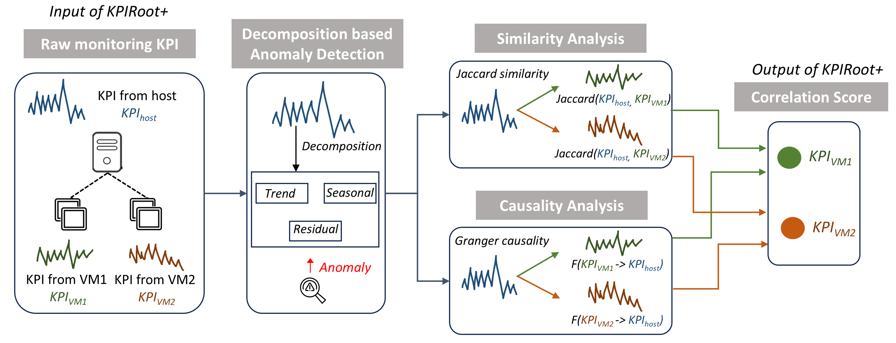
This document provides a comprehensive technical breakdown of the provided architectural diagram for **KPIRoot+**, a system designed for anomaly detection and correlation analysis in virtualized environments.
---
## 1. High-Level Process Overview
The diagram illustrates a four-stage pipeline that transforms raw monitoring data into correlation scores to identify root causes of anomalies.
* **Input:** Raw monitoring Key Performance Indicators (KPIs) from hosts and Virtual Machines (VMs).
* **Processing:** Decomposition-based anomaly detection followed by parallel Similarity and Causality analyses.
* **Output:** Correlation scores for specific VMs.
---
## 2. Component Segmentation and Flow
### Region 1: Input of KPIRoot+ (Raw monitoring KPI)
This section represents the data collection layer.
* **Components:**
* **Host Server Icon:** Connected via dashed lines to two sets of VM icons.
* **KPI Data Series:**
* **Blue Line Chart:** Labeled "$KPI_{host}$" (KPI from host).
* **Green Line Chart:** Labeled "$KPI_{VM1}$" (KPI from VM1).
* **Orange Line Chart:** Labeled "$KPI_{VM2}$" (KPI from VM2).
* **Flow:** All raw KPI data is aggregated and passed to the next stage via a rightward-pointing arrow.
### Region 2: Decomposition based Anomaly Detection
This stage focuses on signal processing and identifying deviations.
* **Process:** The input signal undergoes "**Decomposition**".
* **Sub-components:** The signal is broken down into three distinct mathematical components:
1. **Trend**
2. **Seasonal**
3. **Residual**
* **Detection:** An upward red arrow points to the word "**Anomaly**" in red text, accompanied by a magnifying glass icon containing a warning symbol. This indicates that anomalies are detected within the decomposed components (likely the Residual).
### Region 3: Parallel Analysis (Similarity & Causality)
The output of the anomaly detection stage splits into two concurrent analytical paths.
#### A. Similarity Analysis
* **Method:** **Jaccard similarity**.
* **Logic:** The host KPI (blue) is compared against VM KPIs.
* **Path 1 (Green Arrow):** $Jaccard(KPI_{host}, KPI_{VM1})$ comparing the blue host signal to the green VM1 signal.
* **Path 2 (Orange Arrow):** $Jaccard(KPI_{host}, KPI_{VM2})$ comparing the blue host signal to the orange VM2 signal.
#### B. Causality Analysis
* **Method:** **Granger causality**.
* **Logic:** Determines the directional influence between VM KPIs and the host KPI.
* **Path 1 (Green Arrow):** $F(KPI_{VM1} \rightarrow KPI_{host})$ - Testing if VM1 causes the host anomaly.
* **Path 2 (Orange Arrow):** $F(KPI_{VM2} \rightarrow KPI_{host})$ - Testing if VM2 causes the host anomaly.
### Region 4: Output of KPIRoot+ (Correlation Score)
The final stage aggregates the results from the Similarity and Causality analyses.
* **Structure:** A vertical container receiving four inputs (two green, two orange).
* **Results:**
* **Green Circle:** Labeled "$KPI_{VM1}$". This represents the final correlation/root-cause score for Virtual Machine 1.
* **Orange Circle:** Labeled "$KPI_{VM2}$". This represents the final correlation/root-cause score for Virtual Machine 2.
---
## 3. Data and Label Transcription
| Category | Label / Variable | Description |
| :--- | :--- | :--- |
| **Header 1** | Input of KPIRoot+ | Entry point of the system. |
| **Header 2** | Decomposition based Anomaly Detection | Primary processing stage. |
| **Header 3** | Similarity Analysis | Statistical comparison stage. |
| **Header 4** | Causality Analysis | Directional influence stage. |
| **Header 5** | Output of KPIRoot+ | Final result stage. |
| **KPI Source** | $KPI_{host}$ | Blue signal; reference point for the host. |
| **KPI Source** | $KPI_{VM1}$ | Green signal; data from the first VM. |
| **KPI Source** | $KPI_{VM2}$ | Orange signal; data from the second VM. |
| **Math Function** | $Jaccard(x, y)$ | Used for similarity measurement. |
| **Math Function** | $F(x \rightarrow y)$ | Used for Granger causality measurement. |
---
## 4. Visual Trend and Logic Verification
* **Signal Consistency:** The color coding is strictly maintained throughout the diagram. **Blue** always represents the Host, **Green** always represents VM1, and **Orange** always represents VM2.
* **Trend Check:** The line charts for $KPI_{host}$, $KPI_{VM1}$, and $KPI_{VM2}$ all show high-frequency fluctuations (noise/activity), which justifies the need for "Decomposition" to extract the "Trend" and "Seasonal" patterns from the "Residual" noise where anomalies typically reside.
* **Spatial Logic:** The diagram flows linearly from left to right, with a logical fork in the center to show that Similarity and Causality are independent metrics used to calculate the final Correlation Score.