# KPIRoot+ Technical Workflow Diagram
## Diagram Overview
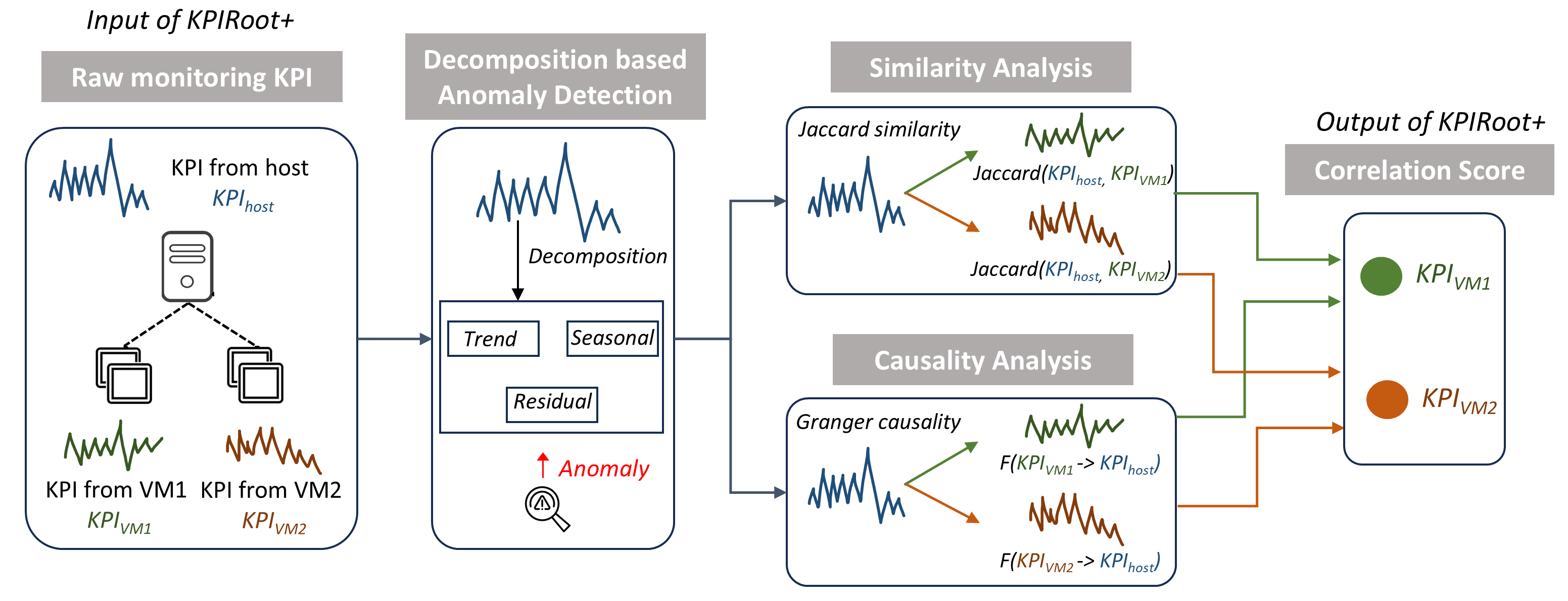
This flowchart illustrates the KPIRoot+ system architecture for monitoring and analyzing Key Performance Indicators (KPIs) across a host and virtual machines (VMs). The process involves anomaly detection, similarity analysis, and causality evaluation to generate correlation scores.
---
## Component Breakdown
### 1. Input of KPIRoot+
**Title**: Raw monitoring KPI
**Components**:
- **KPI from host** (`KPI_host`): Represented by a waveform icon
- **KPI from VM1** (`KPI_VM1`): Green waveform icon
- **KPI from VM2** (`KPI_VM2`): Orange waveform icon
- **Host representation**: Server icon with three horizontal lines
### 2. Decomposition-based Anomaly Detection
**Title**: Decomposition-based Anomaly Detection
**Process Flow**:
1. **Input**: `KPI_host` waveform
2. **Decomposition** (arrow labeled "Decomposition"):
- **Trend**: Horizontal box
- **Seasonal**: Horizontal box
- **Residual**: Horizontal box
3. **Anomaly Detection**: Red arrow pointing to magnifying glass icon with "Anomaly" label
### 3. Similarity Analysis
**Title**: Similarity Analysis
**Components**:
- **Jaccard Similarity Calculations**:
- `Jaccard(KPI_host, KPI_VM1)`: Green arrow
- `Jaccard(KPI_host, KPI_VM2)`: Orange arrow
- **Visual Representation**: Two waveform comparisons with triangular similarity indicators
### 4. Causality Analysis
**Title**: Causality Analysis
**Components**:
- **Granger Causality Tests**:
- `F(KPI_VM1 -> KPI_host)`: Green arrow
- `F(KPI_VM2 -> KPI_host)`: Orange arrow
- **Visual Representation**: Waveform comparisons with directional arrows
### 5. Output of KPIRoot+
**Title**: Correlation Score
**Components**:
- **KPI_VM1**: Green circle
- **KPI_VM2**: Orange circle
- **Correlation Score**: Final output box with bidirectional arrows from similarity and causality analyses
---
## Key Observations
1. **Color Coding**:
- Green (#4CAF50) represents VM1 components
- Orange (#FF5722) represents VM2 components
- Blue (#2196F3) used for system components and arrows
2. **Flow Direction**:
- Left-to-right processing sequence
- Divergent paths for VM1 and VM2 analyses
- Convergent output for correlation score
3. **Mathematical Notations**:
- Jaccard similarity function: `Jaccard(KPI_host, KPI_VMx)`
- Granger causality function: `F(KPI_VMx -> KPI_host)`
4. **Anomaly Detection**:
- Explicitly marked with red arrow and warning symbol
- Positioned after decomposition step
---
## Technical Notes
- The system processes raw KPI data through three analytical stages:
1. Temporal decomposition for anomaly detection
2. Statistical similarity measurement
3. Causality testing for correlation scoring
- No numerical data points or time-series values are explicitly shown
- All KPI comparisons are relative to the host system's metrics
This diagram represents a decision flowchart rather than a data visualization chart, focusing on process flow rather than quantitative analysis.