## Scatter Plot: NSGA-II with N=n+1 on OneMinMax
### Overview
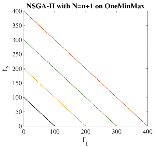
The image is a scatter plot showing the relationship between two variables, f1 and f2, resulting from an NSGA-II optimization with N=n+1 on the OneMinMax problem. There are four distinct data series plotted, each represented by a different color: black, yellow/gold, green, and brown/orange. Each series forms a roughly linear, downward-sloping trend.
### Components/Axes
* **Title:** NSGA-II with N=n+1 on OneMinMax
* **X-axis (f1):** Ranges from 0 to 400, with tick marks at intervals of 100.
* **Y-axis (f2):** Ranges from 0 to 400, with tick marks at intervals of 50.
* **Data Series:**
* Black: Bottom-left most series.
* Yellow/Gold: Second from the bottom-left.
* Green: Third from the bottom-left.
* Brown/Orange: Top-right most series.
### Detailed Analysis
* **Black Data Series:**
* Trend: Line slopes downward from approximately (0, 100) to (100, 0).
* Data Points: Concentrated along the line.
* **Yellow/Gold Data Series:**
* Trend: Line slopes downward from approximately (0, 200) to (200, 0).
* Data Points: Concentrated along the line.
* **Green Data Series:**
* Trend: Line slopes downward from approximately (0, 300) to (300, 0).
* Data Points: Concentrated along the line.
* **Brown/Orange Data Series:**
* Trend: Line slopes downward from approximately (0, 400) to (400, 0).
* Data Points: Concentrated along the line.
### Key Observations
* All data series exhibit a negative linear correlation between f1 and f2.
* The data points are clustered tightly around the lines.
* The lines are parallel and equidistant from each other.
* The intercepts on both axes are multiples of 100.
### Interpretation
The plot visualizes the Pareto front obtained by the NSGA-II algorithm on the OneMinMax problem. The four lines likely represent different generations or populations within the optimization process. The negative correlation suggests a trade-off between the two objectives, f1 and f2. As one objective is minimized, the other is maximized, and vice versa. The parallel and equidistant nature of the lines may indicate a consistent improvement in the Pareto front across generations. The clustering of data points around the lines suggests that the algorithm has converged to a set of optimal solutions.