# Technical Data Extraction: Accuracy Comparison Chart (E2E vs. RCA)
## 1. Document Overview
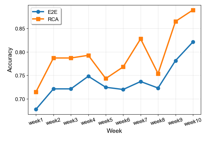
This image is a line graph comparing the performance of two models or processes, labeled **E2E** and **RCA**, over a period of ten weeks. The performance metric used is **Accuracy**.
## 2. Chart Metadata and Axis Definitions
* **Chart Type:** Multi-series Line Graph with markers.
* **X-Axis (Independent Variable):** labeled "**Week**". It contains 10 categorical time points: `week1` through `week10`.
* **Y-Axis (Dependent Variable):** labeled "**Accuracy**". The scale ranges from approximately 0.67 to 0.90, with major numerical markers at `0.70`, `0.75`, `0.80`, and `0.85`.
* **Legend:** Located in the upper-left quadrant (approximate spatial coordinates [x: 0.15, y: 0.10] relative to the chart area).
* **Blue Line with Circular Markers (●):** Represents **E2E**.
* **Orange Line with Square Markers (■):** Represents **RCA**.
---
## 3. Data Series Analysis
### Series 1: RCA (Orange Line, Square Markers)
* **Trend Description:** The RCA series shows a general upward trend with significant volatility. It maintains a consistently higher accuracy than the E2E series throughout the entire 10-week duration. Notable peaks occur at Week 7 and Week 10, with a sharp dip at Week 8.
* **Estimated Data Points:**
* **Week 1:** ~0.715
* **Week 2:** ~0.788
* **Week 3:** ~0.788 (Plateau)
* **Week 4:** ~0.793
* **Week 5:** ~0.743 (Significant drop)
* **Week 6:** ~0.768
* **Week 7:** ~0.828 (Local peak)
* **Week 8:** ~0.754 (Sharp drop)
* **Week 9:** ~0.865 (Sharp recovery)
* **Week 10:** ~0.888 (Series maximum)
### Series 2: E2E (Blue Line, Circular Markers)
* **Trend Description:** The E2E series follows a similar trajectory to the RCA series but at a lower baseline. It shows more stability (smaller fluctuations) between Weeks 2 and 8, followed by a strong upward surge in the final two weeks.
* **Estimated Data Points:**
* **Week 1:** ~0.678 (Series minimum)
* **Week 2:** ~0.722
* **Week 3:** ~0.722 (Plateau)
* **Week 4:** ~0.748
* **Week 5:** ~0.725
* **Week 6:** ~0.720
* **Week 7:** ~0.737
* **Week 8:** ~0.723
* **Week 9:** ~0.781
* **Week 10:** ~0.822
---
## 4. Comparative Summary Table
The following table reconstructs the visual data for technical analysis:
| Week | E2E Accuracy (Blue/Circle) | RCA Accuracy (Orange/Square) | Delta (RCA - E2E) |
| :--- | :--- | :--- | :--- |
| week1 | 0.678 | 0.715 | +0.037 |
| week2 | 0.722 | 0.788 | +0.066 |
| week3 | 0.722 | 0.788 | +0.066 |
| week4 | 0.748 | 0.793 | +0.045 |
| week5 | 0.725 | 0.743 | +0.018 |
| week6 | 0.720 | 0.768 | +0.048 |
| week7 | 0.737 | 0.828 | +0.091 |
| week8 | 0.723 | 0.754 | +0.031 |
| week9 | 0.781 | 0.865 | +0.084 |
| week10 | 0.822 | 0.888 | +0.066 |
---
## 5. Key Observations
1. **Performance Gap:** RCA outperforms E2E in every single time interval. The gap is most pronounced in Week 7 and Week 9.
2. **Correlation:** Both models exhibit a synchronized performance drop in Week 5 and Week 8, suggesting external factors or dataset-specific challenges during those periods.
3. **Final Growth:** Both models show their strongest growth phase between Week 8 and Week 10, ending at their respective highest recorded accuracy levels.