## Line Graphs: ChickenGame Dynamics
### Overview
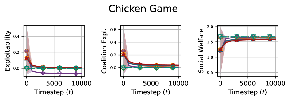
The image contains three line graphs titled "Chicken Game," each tracking different metrics over timesteps (t). The graphs share a common x-axis (Timestep t: 0–10,000) but have distinct y-axes: "Exploitability," "Coalition Expl.," and "Social Welfare." Four data series (red circle, green star, blue triangle, purple diamond) are plotted across all graphs, with shaded confidence intervals around each line.
---
### Components/Axes
1. **X-Axis**:
- Label: "Timestep (t)"
- Scale: 0 to 10,000 (linear increments of 5,000).
2. **Y-Axes**:
- **Left Graph**: "Exploitability" (0–0.4).
- **Middle Graph**: "Coalition Expl." (0–0.6).
- **Right Graph**: "Social Welfare" (0.5–2.0).
3. **Legends**:
- Positioned on the right side of each graph.
- Colors and markers:
- Red circle
- Green star
- Blue triangle
- Purple diamond
4. **Shading**:
- Confidence intervals (light gray bands) around each line.
---
### Detailed Analysis
#### Exploitability Graph (Left)
- **Trend**: All lines start near 0.3–0.4 at t=0, drop sharply to ~0.05–0.1 by t=5,000, and stabilize.
- **Data Points**:
- Red circle: Peaks at ~0.35 (t=0), stabilizes at ~0.08 (t=10,000).
- Green star: Peaks at ~0.32 (t=0), stabilizes at ~0.07 (t=10,000).
- Blue triangle: Peaks at ~0.30 (t=0), stabilizes at ~0.06 (t=10,000).
- Purple diamond: Peaks at ~0.28 (t=0), stabilizes at ~0.05 (t=10,000).
#### Coalition Expl. Graph (Middle)
- **Trend**: Similar to Exploitability but with slightly higher initial values. Lines drop to ~0.05–0.1 by t=5,000 and stabilize.
- **Data Points**:
- Red circle: Peaks at ~0.35 (t=0), stabilizes at ~0.09 (t=10,000).
- Green star: Peaks at ~0.33 (t=0), stabilizes at ~0.08 (t=10,000).
- Blue triangle: Peaks at ~0.31 (t=0), stabilizes at ~0.07 (t=10,000).
- Purple diamond: Peaks at ~0.29 (t=0), stabilizes at ~0.06 (t=10,000).
#### Social Welfare Graph (Right)
- **Trend**: All lines start near 1.2–1.4 at t=0, rise sharply to ~1.6–1.8 by t=5,000, and plateau.
- **Data Points**:
- Red circle: Starts at ~1.3 (t=0), peaks at ~1.7 (t=5,000), stabilizes at ~1.7 (t=10,000).
- Green star: Starts at ~1.4 (t=0), peaks at ~1.8 (t=5,000), stabilizes at ~1.8 (t=10,000).
- Blue triangle: Starts at ~1.5 (t=0), peaks at ~1.9 (t=5,000), stabilizes at ~1.9 (t=10,000).
- Purple diamond: Starts at ~1.6 (t=0), peaks at ~2.0 (t=5,000), stabilizes at ~2.0 (t=10,000).
---
### Key Observations
1. **Initial Drop**: Exploitability and Coalition Expl. metrics decline rapidly in the first 5,000 timesteps, suggesting early instability or competition.
2. **Stabilization**: All metrics stabilize after t=5,000, indicating convergence toward equilibrium.
3. **Social Welfare Growth**: Social Welfare increases monotonically, contrasting with the decline in exploitation metrics.
4. **Marker Consistency**: Red circle and green star lines are consistently higher than blue triangle and purple diamond across all graphs.
---
### Interpretation
The graphs model a multi-agent system (likely a game-theoretic scenario) where:
- **Exploitability/Coalition Expl.**: Represent short-term competitive behaviors that diminish as agents adapt or stabilize strategies.
- **Social Welfare**: Reflects long-term collective benefits, which improve as exploitation decreases.
- **Marker Significance**: The red circle and green star (likely representing dominant strategies or agents) achieve higher social welfare and lower exploitation than blue triangle and purple diamond.
The sharp initial drop in exploitation metrics aligns with the "chicken game" dynamic, where agents avoid mutual defection (exploitation) over time. The stabilization suggests equilibrium, while the Social Welfare growth implies that cooperation or coordination emerges as the system matures.