TECHNICAL ASSET FINGERPRINT
aaa484cad641616a0e719eca
Click to view fullscreen
Press ESC or click to close
FOUND IN PAPERS
EXPERT: healer-alpha-free VERSION 1
RUNTIME: free/openrouter/healer-alpha
INTEL_VERIFIED
\n
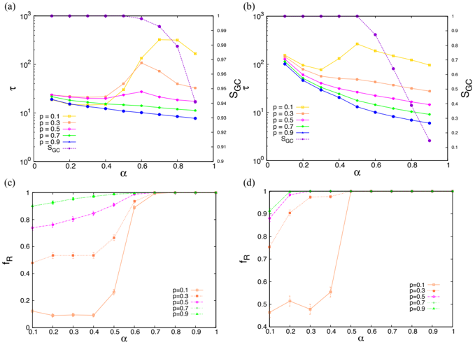
## Multi-Panel Parameter Analysis Chart
### Overview
The image displays a 2x2 grid of scientific plots labeled (a), (b), (c), and (d). Each plot examines the relationship between a parameter **α** (alpha) on the x-axis and various system metrics on the y-axis, across different values of a parameter **p**. The plots use consistent color and marker coding for the `p` values. Plots (a) and (b) feature dual y-axes.
### Components/Axes
* **Common X-Axis (All Plots):** Label: `α` (alpha). Scale: Linear, ranging from 0 to 1. Major ticks at 0, 0.2, 0.4, 0.6, 0.8, 1.0.
* **Legend (Present in all plots):** Located in the bottom-left or center-left of each plot. It defines six data series:
* `p=0.1`: Orange line with circle markers.
* `p=0.3`: Red line with square markers.
* `p=0.5`: Magenta line with diamond markers.
* `p=0.7`: Green line with upward-pointing triangle markers.
* `p=0.9`: Blue line with downward-pointing triangle markers.
* `S_GC`: Purple dashed line with diamond markers (Plots a & b only).
* **Plot (a):**
* **Primary Y-Axis (Left):** Label: `τ` (tau). Scale: Logarithmic (10⁰ to 10³).
* **Secondary Y-Axis (Right):** Label: `S_GC`. Scale: Linear (0.9 to 1.0).
* **Plot (b):**
* **Primary Y-Axis (Left):** Label: `S_GC`. Scale: Logarithmic (10⁰ to 10³).
* **Secondary Y-Axis (Right):** Label: `S_GC`. Scale: Linear (0.1 to 1.0). *Note: The label is repeated, but the scale and data series differ from the primary axis.*
* **Plot (c):**
* **Y-Axis:** Label: `f_R`. Scale: Linear (0 to 1).
* **Plot (d):**
* **Y-Axis:** Label: `f_R`. Scale: Linear (0.4 to 1). This appears to be a zoomed-in view of the upper portion of the data shown in plot (c).
### Detailed Analysis
**Plot (a): τ and S_GC vs. α**
* **Trend for τ (Primary Axis):** For low `p` (0.1, 0.3), `τ` shows a steady, gradual decrease as `α` increases. For mid-range `p` (0.5), `τ` is relatively flat. For high `p` (0.7, 0.9), `τ` initially increases, peaks around `α=0.6-0.7`, and then decreases.
* **Trend for S_GC (Secondary Axis, Purple Dashed Line):** `S_GC` remains very high (~0.995) and stable for `α` from 0 to approximately 0.6. After `α=0.6`, it undergoes a sharp, precipitous drop, falling to ~0.91 by `α=0.9`.
* **Data Point Approximation (Key Points):**
* `p=0.9` (Blue): τ ≈ 20 at α=0.1, decreases to ≈ 8 at α=0.9.
* `p=0.7` (Green): τ ≈ 20 at α=0.1, peaks at ≈ 25 near α=0.6, decreases to ≈ 15 at α=0.9.
* `S_GC` (Purple): ≈ 0.995 for α ≤ 0.6, ≈ 0.97 at α=0.7, ≈ 0.94 at α=0.8, ≈ 0.91 at α=0.9.
**Plot (b): S_GC and τ vs. α**
* **Trend for S_GC (Primary Axis, Log Scale):** All `p` series show a general decreasing trend in `S_GC` as `α` increases. The rate of decrease is more pronounced for lower `p` values. The purple `S_GC` line (plotted against the right linear axis) shows the same sharp drop after α=0.6 as in plot (a).
* **Trend for τ (Secondary Axis):** The data for `τ` is not explicitly plotted with distinct markers in this panel; the primary focus is on the `S_GC` metric.
* **Data Point Approximation (Key Points for S_GC on Log Scale):**
* `p=0.1` (Orange): S_GC ≈ 120 at α=0.1, decreases to ≈ 100 at α=0.9.
* `p=0.9` (Blue): S_GC ≈ 100 at α=0.1, decreases to ≈ 6 at α=0.9.
**Plot (c): f_R vs. α**
* **Trend:** `f_R` generally increases with `α` for all `p`. Higher `p` values lead to higher `f_R` at any given `α` and reach saturation (`f_R ≈ 1.0`) at lower `α` values.
* **Data Point Approximation:**
* `p=0.9` (Green): f_R ≈ 0.95 at α=0.1, reaches ≈ 1.0 by α=0.3.
* `p=0.1` (Orange): f_R ≈ 0.1 at α=0.1, remains low until α=0.4, then increases sharply to ≈ 0.9 by α=0.7, reaching ≈ 1.0 by α=0.8.
**Plot (d): f_R vs. α (Zoomed View)**
* **Trend:** This plot focuses on the high `f_R` region (0.4 to 1.0). It confirms the trends from (c) with greater detail for the transition region. The `p=0.1` (Orange) series shows a notable dip around `α=0.3` before its sharp rise.
* **Data Point Approximation (for p=0.1):** f_R ≈ 0.5 at α=0.1, dips to ≈ 0.48 at α=0.3, rises to ≈ 0.55 at α=0.4, then jumps to ≈ 0.95 at α=0.5.
### Key Observations
1. **Critical Threshold at α ≈ 0.6:** A dramatic change occurs around `α=0.6`. `S_GC` collapses (Plots a, b), while `τ` for high `p` peaks and then falls (Plot a). This suggests a phase transition or critical point in the system.
2. **Inverse Relationship between p and Sensitivity:** Lower `p` values result in higher `S_GC` and `τ` but lower `f_R` at low `α`. They are also more sensitive to changes in `α`, showing steeper declines in `S_GC` (Plot b) and a more delayed, sharper rise in `f_R` (Plots c, d).
3. **Dual Behavior of τ:** The metric `τ` responds non-monotonically to `α` for high `p` values, indicating a complex, possibly competitive, underlying mechanism.
4. **Saturation of f_R:** The metric `f_R` appears to be a recovery or functionality fraction that saturates at 1.0. The speed of saturation is strongly controlled by `p`.
### Interpretation
This figure likely analyzes the robustness and functionality of a networked system (e.g., a communication, power, or social network) under a perturbation or attack parameterized by `α`. The parameter `p` probably represents a property of the nodes or edges, such as connection probability or intrinsic resilience.
* **S_GC** likely represents the size of the Giant Component (the largest connected cluster). Its collapse at `α > 0.6` indicates a percolation threshold where the network fragments.
* **τ** could represent a characteristic time scale (e.g., for information spread or recovery). Its peak for resilient nodes (`high p`) near the threshold suggests maximum dynamical activity or vulnerability at the critical point.
* **f_R** probably measures the fraction of nodes that are functional or recovered. Its delayed rise for low `p` shows that systems with less resilient components require a much stronger perturbation (`high α`) to trigger widespread recovery or adaptation.
The central finding is the identification of a critical perturbation level (`α ≈ 0.6`) where the system's macroscopic connectivity (`S_GC`) breaks down. The parameter `p` governs the system's micro-resilience: higher `p` maintains connectivity and functionality (`f_R`) under weaker perturbations but leads to more complex dynamical responses (`τ`) near the critical point. The plots collectively demonstrate a trade-off between static robustness (maintaining `S_GC`) and dynamic response (`τ`) as a function of component-level resilience (`p`).
DECODING INTELLIGENCE...