\n
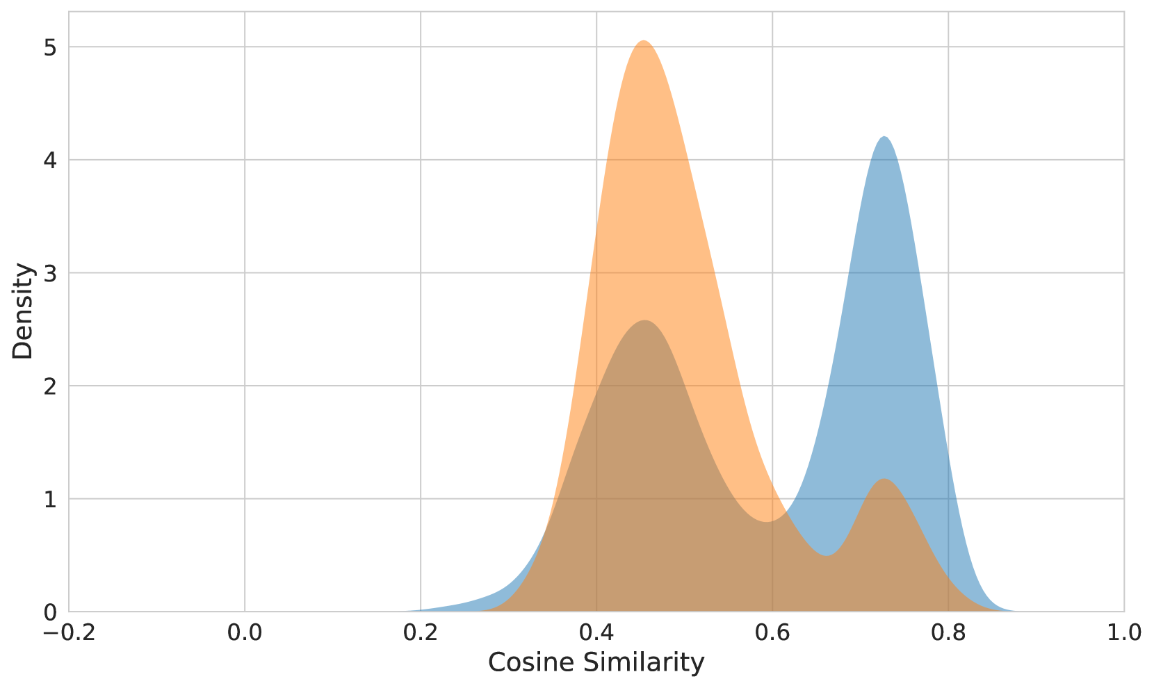
## Density Plot: Cosine Similarity Distribution
### Overview
The image presents a density plot illustrating the distribution of cosine similarity scores. Two overlapping distributions are displayed, one in orange and one in blue. The x-axis represents the cosine similarity, ranging from -0.2 to 1.0, while the y-axis represents the density, ranging from 0 to 5. The plot shows the frequency of different cosine similarity values within the two datasets.
### Components/Axes
* **X-axis Title:** "Cosine Similarity"
* **Y-axis Title:** "Density"
* **X-axis Range:** -0.2 to 1.0
* **Y-axis Range:** 0 to 5
* **Data Series 1:** Orange density curve
* **Data Series 2:** Blue density curve
### Detailed Analysis
The orange distribution is centered around a cosine similarity of approximately 0.45, with a peak density of roughly 4.8. It extends from approximately 0.25 to 0.7. The blue distribution is centered around a cosine similarity of approximately 0.75, with a peak density of roughly 4.2. It extends from approximately 0.55 to 0.95. There is overlap between the two distributions, particularly between 0.6 and 0.8.
Here's a breakdown of approximate data points, noting the inherent uncertainty in reading values from a density plot:
**Orange Distribution (approximate):**
* Cosine Similarity 0.3: Density ~ 0.2
* Cosine Similarity 0.4: Density ~ 1.5
* Cosine Similarity 0.45: Density ~ 4.8
* Cosine Similarity 0.5: Density ~ 3.0
* Cosine Similarity 0.6: Density ~ 1.0
* Cosine Similarity 0.7: Density ~ 0.2
**Blue Distribution (approximate):**
* Cosine Similarity 0.55: Density ~ 0.5
* Cosine Similarity 0.65: Density ~ 2.0
* Cosine Similarity 0.75: Density ~ 4.2
* Cosine Similarity 0.85: Density ~ 3.0
* Cosine Similarity 0.9: Density ~ 1.0
* Cosine Similarity 0.95: Density ~ 0.2
### Key Observations
* The orange distribution is skewed towards lower cosine similarity values, while the blue distribution is skewed towards higher values.
* The two distributions have different central tendencies, suggesting that the two datasets being compared have different characteristics.
* The overlap between the distributions indicates that there is some similarity between the two datasets, but it is not complete.
* The density plot shows that cosine similarity values between 0.6 and 0.8 are relatively common for both datasets.
### Interpretation
The data suggests that two sets of data are being compared based on their cosine similarity. Cosine similarity is a measure of the similarity between two non-zero vectors of attributes in an inner product space. It is often used in information retrieval and text mining to measure the similarity between documents.
The two distributions likely represent the cosine similarity between two different sets of documents or vectors. The fact that the distributions are different suggests that the two sets of data are not identical. The overlap between the distributions suggests that there is some degree of similarity between the two sets of data.
The orange distribution peaking at 0.45 could represent a set of documents that are less related or have less overlap in their content. The blue distribution peaking at 0.75 could represent a set of documents that are more related or have more overlap in their content. The overlap between 0.6 and 0.8 suggests a common ground or shared characteristics between the two sets.
Without further context, it's difficult to determine the specific meaning of the cosine similarity scores. However, the data provides a clear indication that the two datasets being compared are not identical, but they are also not completely dissimilar.