## Density Plot: Cosine Similarity Distributions
### Overview
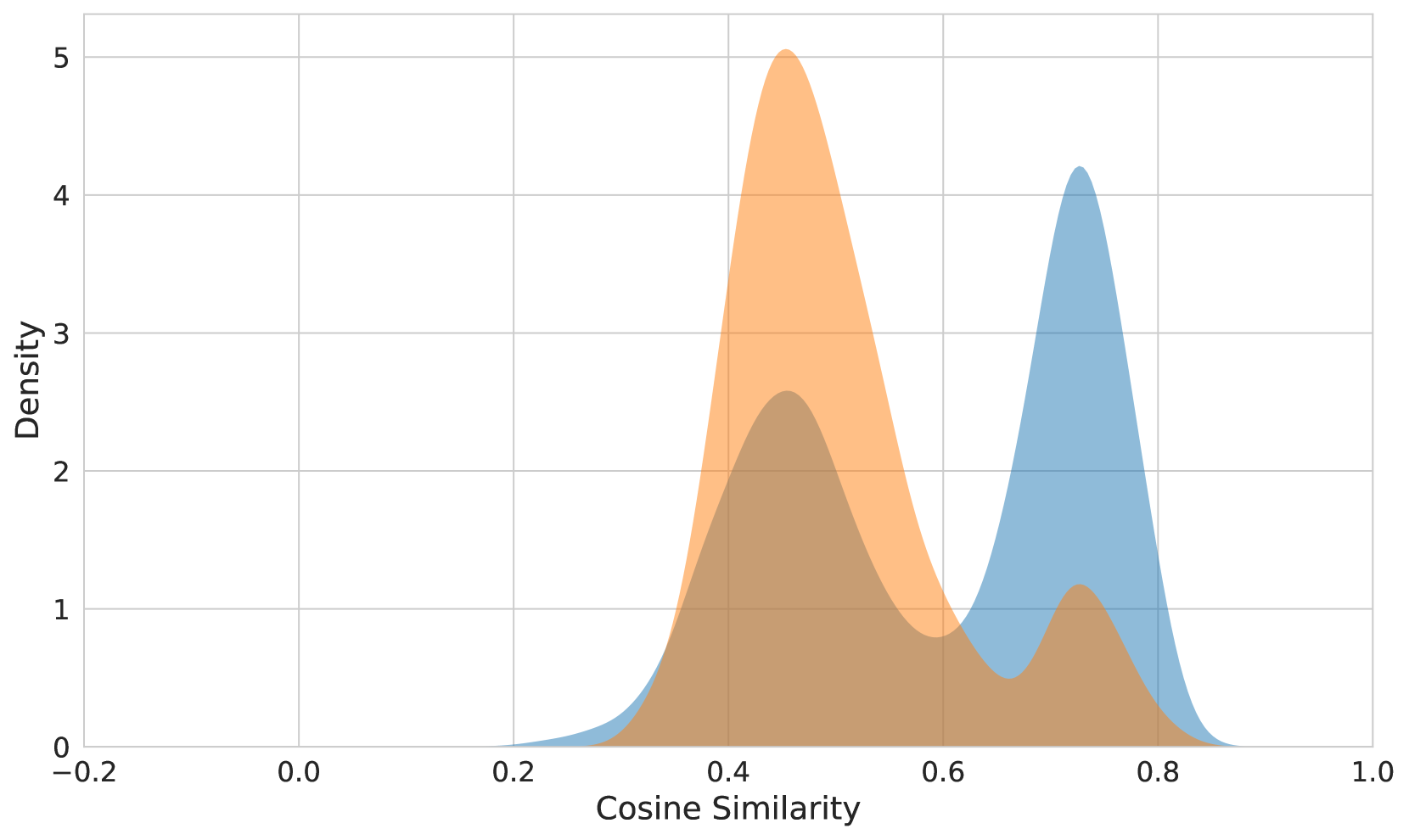
The image displays a density plot comparing two overlapping distributions. The x-axis represents Cosine Similarity values ranging from -0.2 to 1.0, while the y-axis shows Density values from 0 to 5. Two distinct peaks are visible: one orange distribution centered near 0.5 and a blue distribution centered near 0.75. The distributions overlap significantly between 0.4 and 0.8.
### Components/Axes
- **X-axis (Horizontal)**: Labeled "Cosine Similarity," scaled from -0.2 to 1.0 in increments of 0.2.
- **Y-axis (Vertical)**: Labeled "Density," scaled from 0 to 5 in increments of 1.
- **Legend**: Two colors are used:
- **Orange**: Represents the first distribution (peak at ~0.5).
- **Blue**: Represents the second distribution (peak at ~0.75).
- **Gridlines**: Subtle gridlines divide the plot into 0.2 increments on the x-axis and 1.0 increments on the y-axis.
### Detailed Analysis
1. **Orange Distribution**:
- **Peak**: Approximately 0.5 (±0.1).
- **Density**: Reaches a maximum of ~5.0 at the peak.
- **Shape**: Broad, with a gradual decline on both sides of the peak.
- **Range**: Extends from ~0.3 to ~0.7.
2. **Blue Distribution**:
- **Peak**: Approximately 0.75 (±0.1).
- **Density**: Reaches a maximum of ~4.2 at the peak.
- **Shape**: Narrower and sharper than the orange distribution.
- **Range**: Extends from ~0.6 to ~0.9.
3. **Overlap Region**:
- **Range**: Between 0.4 and 0.8.
- **Combined Density**: Peaks at ~3.0–4.0 where the two distributions intersect.
### Key Observations
- The orange distribution has a higher maximum density (~5.0) compared to the blue (~4.2).
- The blue distribution is more concentrated, with a narrower spread (~0.6–0.9) compared to the orange (~0.3–0.7).
- The overlap region (0.4–0.8) suggests significant similarity between the two groups in this range.
- No data points exist below 0.3 (orange) or above 0.9 (blue).
### Interpretation
The plot indicates two distinct groups with differing central tendencies:
1. **Orange Group**: Represents data with lower Cosine Similarity values, centered around 0.5. Its broader spread suggests greater variability in similarity scores.
2. **Blue Group**: Represents data with higher Cosine Similarity values, centered around 0.75. Its sharper peak implies more consistent similarity within this group.
3. The overlap between 0.4 and 0.8 indicates that some data points from both groups share moderate similarity, potentially reflecting shared features or contextual similarities.
The higher density of the orange group suggests it may represent a larger or more diverse dataset, while the blue group’s narrower distribution could indicate a more homogeneous subset. The absence of data below 0.3 and above 0.9 implies a natural boundary in the similarity scores for these groups.