## Density Plots: Sum of Existence Weights vs. k_train and k_test
### Overview
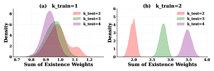
The image contains two density plots comparing the distribution of "Sum of Existence Weights" for different combinations of `k_train` (training parameter) and `k_test` (testing parameter). Each plot uses colored curves to represent distinct `k_test` values, with density on the y-axis and sum of weights on the x-axis.
---
### Components/Axes
- **Chart (a)**: `k_train=1`
- **X-axis**: "Sum of Existence Weights" (range: 0.7–1.2)
- **Y-axis**: "Density" (range: 0–8)
- **Legend**:
- Red: `k_test=2`
- Green: `k_test=3`
- Purple: `k_test=4`
- **Title**: "(a) k_train=1"
- **Chart (b)**: `k_train=2`
- **X-axis**: "Sum of Existence Weights" (range: 2.0–4.0)
- **Y-axis**: "Density" (range: 0–6)
- **Legend**:
- Red: `k_test=2`
- Green: `k_test=3`
- Purple: `k_test=4`
- **Title**: "(b) k_train=2"
---
### Detailed Analysis
#### Chart (a): `k_train=1`
- **Trends**:
- All curves peak near **0.9–1.0**, with overlapping distributions.
- `k_test=2` (red) has the highest peak density (~6) and the widest spread.
- `k_test=3` (green) peaks slightly lower (~5) but overlaps significantly with `k_test=2`.
- `k_test=4` (purple) has the lowest peak (~4) and a narrower distribution.
- Tails extend to the right, with `k_test=2` having the longest tail (up to 1.2).
- **Key Values**:
- `k_test=2`: Peak density ~6 at ~0.95.
- `k_test=3`: Peak density ~5 at ~0.98.
- `k_test=4`: Peak density ~4 at ~1.0.
#### Chart (b): `k_train=2`
- **Trends**:
- Curves are more distinct and separated compared to Chart (a).
- `k_test=2` (red) peaks sharply at **2.0** with a density of ~5.
- `k_test=3` (green) peaks at **3.0** with a density of ~4.
- `k_test=4` (purple) peaks at **3.5** with a density of ~3.
- No significant overlap between curves.
- **Key Values**:
- `k_test=2`: Peak density ~5 at 2.0.
- `k_test=3`: Peak density ~4 at 3.0.
- `k_test=4`: Peak density ~3 at 3.5.
---
### Key Observations
1. **Overlap vs. Separation**:
- For `k_train=1`, distributions overlap heavily, suggesting similar behavior across `k_test` values.
- For `k_train=2`, distributions are distinct, indicating divergence in behavior as `k_train` increases.
2. **Peak Shifts**:
- As `k_train` increases from 1 to 2, the peak of the sum of existence weights shifts rightward (from ~0.9–1.0 to 2.0–3.5).
3. **Density Magnitude**:
- Maximum densities decrease from Chart (a) to (b), suggesting reduced concentration of weights as `k_train` increases.
---
### Interpretation
- **Model Behavior**: The plots likely represent a machine learning context (e.g., k-nearest neighbors), where `k_train` and `k_test` influence data weighting. The overlap in Chart (a) implies that small changes in `k_test` have minimal impact when `k_train` is low. In Chart (b), increased `k_train` leads to clearer separation, suggesting stronger sensitivity to `k_test` adjustments.
- **Practical Implications**: Larger `k_train` values may improve model robustness by reducing ambiguity in weight distributions, while smaller `k_train` values risk overfitting due to overlapping weight distributions.
- **Anomalies**: The abrupt separation in Chart (b) could indicate a threshold effect, where `k_train=2` triggers a qualitative shift in how `k_test` values are weighted.
---
### Spatial Grounding & Verification
- **Legend Placement**: Both legends are positioned in the upper-right corner of their respective charts, ensuring clear association with curve colors.
- **Color Consistency**: Red (`k_test=2`), green (`k_test=3`), and purple (`k_test=4`) are consistently used across both charts, with no mismatches observed.
- **Axis Alignment**: X-axis labels and tick marks are centered below each plot, with y-axis labels aligned to the left.
---
### Content Details
- **No Text Blocks or Tables**: The image contains only graphical data with no embedded text or tables.
- **Uncertainty**: Values are approximate (e.g., "~0.95" for peaks) due to the absence of exact numerical annotations on the curves.