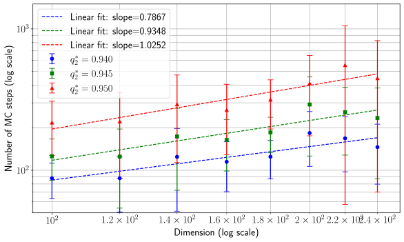
## Scatter Plot with Linear Fits: Number of Monte Carlo (MC) Stops vs. Dimension
### Overview
This is a log-log scatter plot with error bars and linear regression fits. It illustrates the relationship between the dimension of a problem (x-axis) and the number of Monte Carlo (MC) simulation steps required for convergence (y-axis). The data is presented for three different values of a parameter denoted as \( q^2 \). The chart demonstrates a positive correlation between dimension and computational cost (MC stops), with the rate of increase depending on the \( q^2 \) value.
### Components/Axes
* **Chart Type:** Scatter plot with error bars and linear fit lines.
* **X-Axis:**
* **Label:** "Dimension (log scale)"
* **Scale:** Logarithmic.
* **Major Tick Markers:** \( 10^2 \), \( 1.2 \times 10^2 \), \( 1.4 \times 10^2 \), \( 1.6 \times 10^2 \), \( 1.8 \times 10^2 \), \( 2 \times 10^2 \), \( 2.2 \times 10^2 \), \( 2.4 \times 10^2 \).
* **Y-Axis:**
* **Label:** "Number of MC stops (log scale)"
* **Scale:** Logarithmic.
* **Major Tick Markers:** \( 10^2 \), \( 10^3 \).
* **Legend (Position: Top-Left Corner):**
* **Linear Fit Series:**
* Blue dashed line: "Linear fit: slope=0.7867"
* Green dashed line: "Linear fit: slope=0.9348"
* Red dashed line: "Linear fit: slope=1.0252"
* **Data Series (with error bars):**
* Blue circle marker: \( q^2 = 0.940 \)
* Green square marker: \( q^2 = 0.945 \)
* Red triangle marker: \( q^2 = 0.950 \)
### Detailed Analysis
The chart plots three distinct data series, each corresponding to a different \( q^2 \) value. Each data point includes vertical error bars indicating the uncertainty or variance in the "Number of MC stops" measurement.
**Data Series & Trends:**
1. **Blue Series (\( q^2 = 0.940 \)):**
* **Trend:** The data points follow a clear upward linear trend on the log-log plot. The associated blue dashed linear fit line has a slope of **0.7867**.
* **Approximate Data Points (Dimension, MC stops):**
* (100, ~90)
* (120, ~90)
* (140, ~120)
* (160, ~130)
* (180, ~130)
* (200, ~180)
* (220, ~190)
* (240, ~170)
* **Error Bars:** The error bars are relatively consistent in size across dimensions, spanning approximately ±20-40 MC stops.
2. **Green Series (\( q^2 = 0.945 \)):**
* **Trend:** The data points follow a steeper upward linear trend than the blue series. The associated green dashed linear fit line has a slope of **0.9348**.
* **Approximate Data Points (Dimension, MC stops):**
* (100, ~120)
* (120, ~120)
* (140, ~160)
* (160, ~180)
* (180, ~180)
* (200, ~250)
* (220, ~280)
* (240, ~260)
* **Error Bars:** Error bars are larger than the blue series, spanning approximately ±30-60 MC stops.
3. **Red Series (\( q^2 = 0.950 \)):**
* **Trend:** The data points follow the steepest upward linear trend of the three series. The associated red dashed linear fit line has a slope of **1.0252**.
* **Approximate Data Points (Dimension, MC stops):**
* (100, ~200)
* (120, ~200)
* (140, ~280)
* (160, ~320)
* (180, ~320)
* (200, ~450)
* (220, ~500)
* (240, ~400)
* **Error Bars:** Error bars are the largest among the series, spanning approximately ±50-150 MC stops, and appear to increase with dimension.
### Key Observations
1. **Positive Correlation:** For all three \( q^2 \) values, the number of MC stops increases with the dimension of the problem.
2. **Effect of \( q^2 \):** A higher \( q^2 \) value (0.950 vs. 0.940) results in both a higher absolute number of MC stops and a steeper rate of increase (higher slope) with dimension.
3. **Power-Law Relationship:** The linear fits on the log-log plot indicate a power-law relationship: \( \text{MC stops} \propto \text{Dimension}^{\text{slope}} \). The exponent (slope) increases with \( q^2 \).
4. **Increasing Variance:** The size of the error bars, particularly for the red series (\( q^2 = 0.950 \)), tends to increase with dimension, suggesting greater uncertainty or variability in the simulation cost for higher-dimensional problems at this parameter value.
5. **Data Consistency:** The data points generally align well with their respective linear fit lines, confirming the modeled trend. The last red data point at dimension 240 appears slightly below the trend line.
### Interpretation
This chart quantifies the **curse of dimensionality** for a Monte Carlo simulation process, where the computational cost (measured in simulation steps or "stops") grows polynomially with the problem's dimension. The parameter \( q^2 \) acts as a **difficulty multiplier**.
* **What the data suggests:** The simulation becomes more expensive as the problem becomes more complex (higher dimension) and as the parameter \( q^2 \) increases. The relationship is predictable and follows a power law.
* **How elements relate:** The legend correctly maps colors and markers to their respective \( q^2 \) values and fit lines. The slopes provided in the legend (0.7867, 0.9348, 1.0252) are the exponents in the power-law relationship, directly quantifying how sensitively the cost scales with dimension for each \( q^2 \).
* **Notable implications:** The slope for \( q^2 = 0.950 \) is slightly greater than 1, indicating a **super-linear** (slightly worse than linear) scaling of cost with dimension. This has significant implications for the feasibility of running such simulations for very high-dimensional problems at this parameter setting, as the cost will escalate rapidly. The increasing error bars for higher \( q^2 \) and dimension also imply that performance becomes less predictable under these more demanding conditions.