TECHNICAL ASSET FINGERPRINT
ab7e451ba151f1f9f872e3c8
Click to view fullscreen
Press ESC or click to close
FOUND IN PAPERS
EXPERT: healer-alpha-free VERSION 1
RUNTIME: free/openrouter/healer-alpha
INTEL_VERIFIED
\n
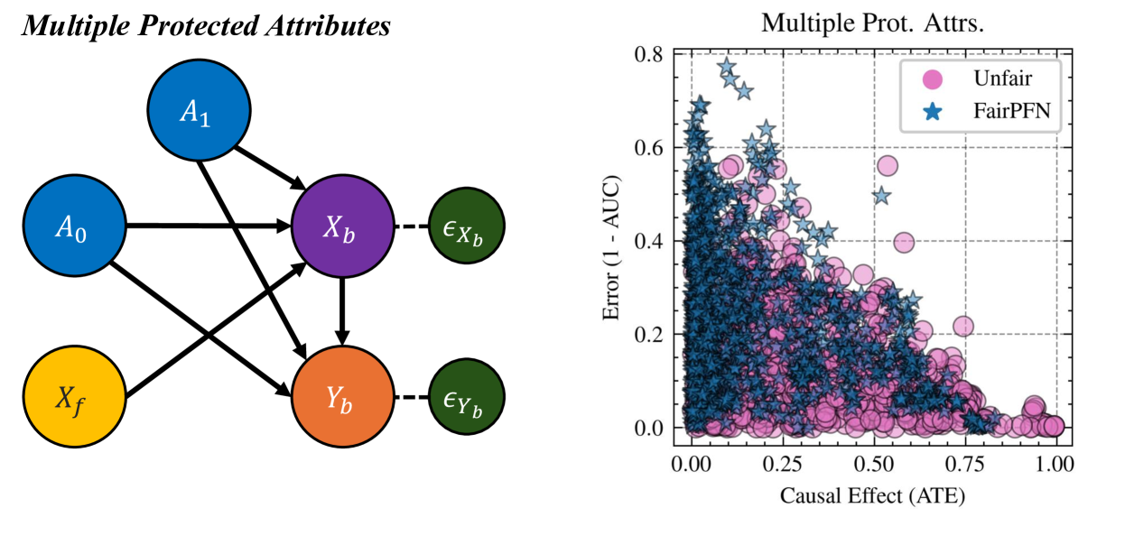
## Causal Diagram and Scatter Plot: Multiple Protected Attributes Analysis
### Overview
The image presents two interconnected technical visualizations. On the left is a causal directed acyclic graph (DAG) illustrating a model with multiple protected attributes. On the right is a scatter plot comparing the performance of two models ("Unfair" and "FairPFN") across two metrics: Causal Effect (Average Treatment Effect - ATE) and Error (1 - AUC). The overall theme is the analysis of algorithmic fairness, specifically examining how protected attributes influence biased features and outcomes, and evaluating a model's ability to mitigate unfairness.
### Components/Axes
**Left: Causal Diagram (DAG)**
* **Title:** "Multiple Protected Attributes" (top-left, italicized).
* **Nodes (Circles):**
* **A0:** Blue circle, labeled "A₀". Positioned middle-left.
* **A1:** Blue circle, labeled "A₁". Positioned top-left.
* **Xf:** Yellow circle, labeled "X_f". Positioned bottom-left.
* **Xb:** Purple circle, labeled "X_b". Positioned center.
* **Yb:** Orange circle, labeled "Y_b". Positioned bottom-center.
* **εXb:** Dark green circle, labeled "ε_{X_b}". Positioned to the right of Xb, connected by a dashed line.
* **εYb:** Dark green circle, labeled "ε_{Y_b}". Positioned to the right of Yb, connected by a dashed line.
* **Edges (Arrows):** Solid black arrows indicate direct causal influence. Dashed lines indicate error/noise terms.
* A₀ → X_b
* A₀ → Y_b
* A₁ → X_b
* A₁ → Y_b
* X_f → X_b
* X_f → Y_b
* X_b → Y_b
* X_b --- ε_{X_b} (dashed)
* Y_b --- ε_{Y_b} (dashed)
**Right: Scatter Plot**
* **Title:** "Multiple Prot. Attrs." (top-center).
* **X-Axis:**
* **Label:** "Causal Effect (ATE)".
* **Scale:** Linear, ranging from 0.00 to 1.00. Major tick marks at 0.00, 0.25, 0.50, 0.75, 1.00.
* **Y-Axis:**
* **Label:** "Error (1 - AUC)".
* **Scale:** Linear, ranging from 0.0 to 0.8. Major tick marks at 0.0, 0.2, 0.4, 0.6, 0.8.
* **Legend:** Located in the top-right corner.
* **Pink Circle:** Labeled "Unfair".
* **Blue Star:** Labeled "FairPFN".
* **Grid:** Dashed gray grid lines are present.
### Detailed Analysis
**Causal Diagram Analysis:**
The diagram models a system where two protected attributes (`A₀`, `A₁`) and a set of fair features (`X_f`) influence both a set of biased features (`X_b`) and the final biased outcome (`Y_b`). The biased features (`X_b`) also directly influence the outcome (`Y_b`). The error terms (`ε_{X_b}`, `ε_{Y_b}`) represent unexplained variance. This structure suggests that bias in the outcome (`Y_b`) can originate directly from protected attributes or indirectly through their influence on the features used for prediction (`X_b`).
**Scatter Plot Data Trends & Points:**
* **"Unfair" Series (Pink Circles):**
* **Trend:** The data points show a broad, diffuse cloud. There is a very weak negative correlation; as the Causal Effect (ATE) increases, the Error (1 - AUC) shows a slight tendency to decrease, but with extremely high variance.
* **Data Distribution:** Points are densely clustered across the entire range of the X-axis (ATE from ~0.0 to 1.0). On the Y-axis (Error), the majority of points fall between 0.0 and 0.4, with a significant number extending up to ~0.6. A few outliers exist near Error=0.0 across various ATE values.
* **"FairPFN" Series (Blue Stars):**
* **Trend:** This series shows a more defined, though still noisy, negative correlation. As the Causal Effect (ATE) increases, the Error (1 - AUC) generally decreases. The slope is steeper than for the "Unfair" series, especially for ATE values below ~0.5.
* **Data Distribution:** The points are also widely distributed but show a clearer concentration. For low ATE values (0.0 - 0.25), Error values are highly variable, ranging from ~0.0 to 0.8. As ATE increases beyond 0.25, the upper bound of the Error range decreases noticeably. The densest cluster of points appears in the region of ATE between 0.1 and 0.6 and Error between 0.0 and 0.3.
### Key Observations
1. **Performance-Fairness Trade-off:** The plot visualizes the classic trade-off between model accuracy (low Error) and fairness (low Causal Effect/ATE). Both series show that achieving very low error often comes with higher causal effect (more unfairness), and vice-versa.
2. **FairPFN's Shift:** The "FairPFN" data cloud is systematically shifted downward and to the left compared to the "Unfair" cloud. This indicates that for a given level of Causal Effect (ATE), FairPFN generally achieves lower Error (1 - AUC). Conversely, for a given Error rate, FairPFN tends to have a lower Causal Effect.
3. **High Variance at Low ATE:** Both models exhibit their highest variance in Error when the Causal Effect (ATE) is low (near 0.0). This suggests that enforcing strong fairness constraints (low ATE) leads to highly unstable model performance.
4. **Diagram-Plot Connection:** The causal diagram provides the theoretical framework for the metrics in the plot. The "Causal Effect (ATE)" on the x-axis likely measures the direct and indirect influence of the protected attributes (`A₀`, `A₁`) on the outcome (`Y_b`) as modeled in the DAG. The "Unfair" model presumably does not account for these paths, while "FairPFN" is designed to mitigate them.
### Interpretation
This composite image presents an empirical evaluation of a fairness-aware machine learning model ("FairPFN") within a defined causal framework.
* **What the Data Demonstrates:** The scatter plot provides evidence that the FairPFN method successfully reduces the average causal effect of protected attributes on outcomes (shifts points left on the x-axis) compared to an "Unfair" baseline, *without* uniformly increasing prediction error. In fact, it often achieves lower error for comparable levels of fairness. This challenges the simplistic notion that fairness and accuracy are always in direct opposition.
* **Relationship Between Elements:** The causal diagram is not merely illustrative; it defines the very quantity (ATE) being measured on the plot's x-axis. It shows that unfairness can be multifaceted, flowing through both direct paths (A→Y) and mediated paths (A→X→Y). The plot then quantifies how well a modeling approach handles this complex structure.
* **Notable Anomalies/Patterns:** The most striking pattern is the dense, downward-sloping corridor of FairPFN points versus the more amorphous cloud of Unfair points. This suggests FairPFN introduces a more consistent and predictable relationship between fairness and performance. The high variance at low ATE for both models is a critical finding, indicating a potential instability or "cost of fairness" region that requires careful navigation in real-world applications. The presence of low-error, low-ATE points for FairPFN (bottom-left quadrant) is the ideal target zone, demonstrating that the method can, in some instances, find models that are both fair and accurate.
DECODING INTELLIGENCE...