## Scatter Plot: Multiple Protected Attributes
### Overview
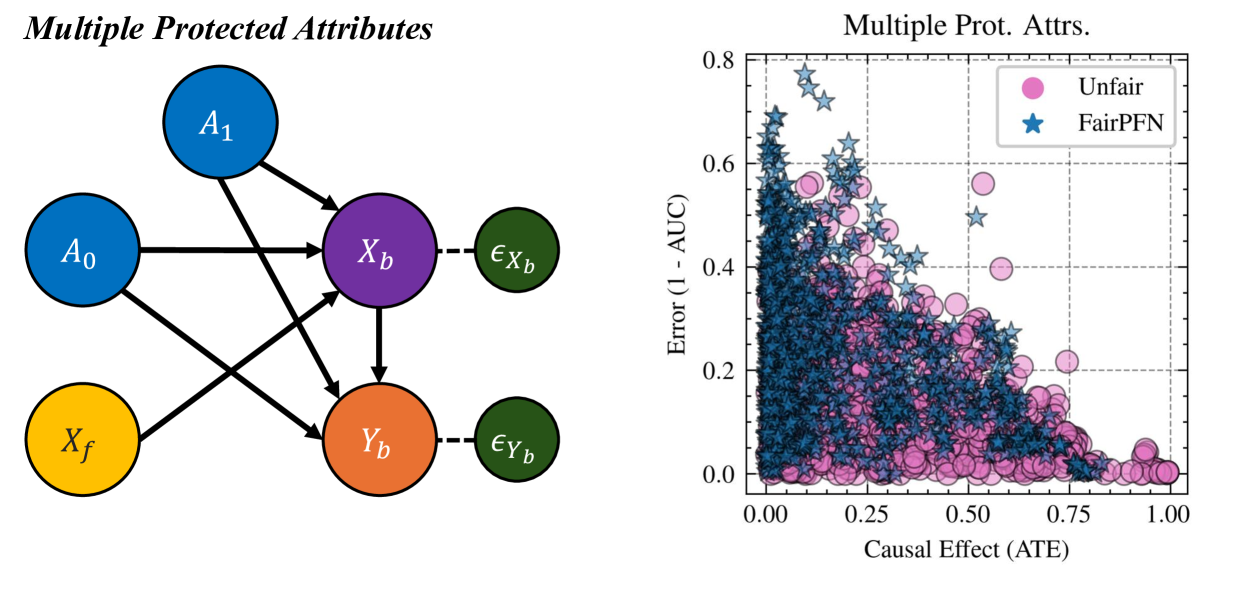
The image contains two components: a causal diagram on the left and a scatter plot on the right. The scatter plot visualizes the relationship between **Causal Effect (ATE)** and **Error (1 - AUC)** for two groups: "Unfair" (pink circles) and "FairPFN" (blue stars). The diagram illustrates relationships between protected attributes, variables, and error terms.
---
### Components/Axes
#### Left Diagram (Causal Model)
- **Nodes**:
- **A₀** (blue circle): Protected attribute 0
- **A₁** (blue circle): Protected attribute 1
- **X_b** (purple circle): Intermediate variable
- **Y_b** (orange circle): Outcome variable
- **X_f** (yellow circle): Feature variable
- **ε_Xb** (green circle): Error term for X_b
- **ε_Yb** (green circle): Error term for Y_b
- **Connections**:
- A₀ → X_b
- A₁ → X_b
- X_b → Y_b
- X_f → Y_b
- ε_Xb → X_b
- ε_Yb → Y_b
#### Right Scatter Plot
- **Axes**:
- **X-axis**: Causal Effect (ATE) (0.00 to 1.00)
- **Y-axis**: Error (1 - AUC) (0.00 to 0.80)
- **Legend**:
- **Pink circles**: Unfair
- **Blue stars**: FairPFN
---
### Detailed Analysis
#### Left Diagram
- **Flow**:
- Protected attributes **A₀** and **A₁** directly influence **X_b**.
- **X_b** propagates its effect to **Y_b**, with **X_f** also contributing to **Y_b**.
- Error terms **ε_Xb** and **ε_Yb** are connected to **X_b** and **Y_b**, respectively, suggesting noise or unobserved factors.
#### Right Scatter Plot
- **Data Distribution**:
- **Unfair (pink circles)**:
- Clustered in the **lower-right quadrant** (high ATE, low error).
- Some outliers extend toward higher error values (e.g., ATE ~0.2, error ~0.6).
- **FairPFN (blue stars)**:
- Concentrated in the **upper-left quadrant** (low ATE, high error).
- A few points overlap with Unfair in the lower-right quadrant.
- **Trends**:
- Both groups show a **negative correlation** between ATE and error (as ATE increases, error decreases).
- **FairPFN** consistently exhibits **lower error** than Unfair for equivalent ATE values.
---
### Key Observations
1. **FairPFN Advantage**: FairPFN achieves lower error (1 - AUC) across most ATE values, indicating better performance.
2. **Unfair Outliers**: A subset of Unfair data points (e.g., ATE ~0.2, error ~0.6) deviates from the general trend, suggesting potential misclassification or edge cases.
3. **Causal Diagram Complexity**: The diagram implies that protected attributes (A₀, A₁) and features (X_f) jointly determine outcomes (Y_b), with error terms introducing variability.
---
### Interpretation
- **Fairness vs. Performance**: The scatter plot highlights a trade-off between fairness (FairPFN) and error rates. FairPFN reduces bias (lower error) but may sacrifice some predictive power (higher ATE in some cases).
- **Causal Relationships**: The diagram suggests that protected attributes (A₀, A₁) and features (X_f) are critical drivers of outcomes (Y_b), with error terms (ε_Xb, ε_Yb) representing external noise or model limitations.
- **Practical Implications**: The Unfair group’s outliers may indicate scenarios where fairness interventions (e.g., FairPFN) fail to generalize, warranting further investigation into model robustness.
---
### Notes on Data Extraction
- **No explicit numerical values** are provided for individual data points; trends are inferred from spatial distribution.
- **Legend alignment**: Pink circles (Unfair) and blue stars (FairPFN) are consistently matched to their respective data clusters.