## Line Chart: Performance Comparison of Different Solution Methods
### Overview
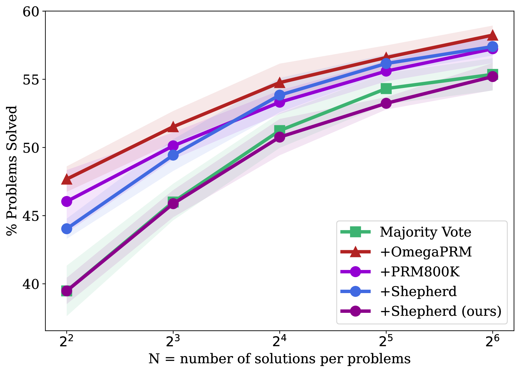
The image is a line chart comparing the performance of five different solution methods for a set of problems. The y-axis represents the percentage of problems solved, while the x-axis represents the number of solutions per problem (N), expressed as powers of 2. The chart displays the performance of each method as N increases from 2^2 to 2^6. Each line has a shaded region around it, representing the uncertainty or variance in the data.
### Components/Axes
* **Title:** There is no explicit title on the chart.
* **X-Axis:**
* Label: "N = number of solutions per problems"
* Scale: 2^2, 2^3, 2^4, 2^5, 2^6
* **Y-Axis:**
* Label: "% Problems Solved" (rotated 90 degrees counter-clockwise)
* Scale: 40, 45, 50, 55, 60
* **Legend:** Located in the bottom-right corner.
* Green square: Majority Vote
* Red triangle: +OmegaPRM
* Purple circle: +PRM800K
* Blue circle: +Shepherd
* Dark Purple circle: +Shepherd (ours)
### Detailed Analysis
**1. Majority Vote (Green Line):**
* Trend: The line slopes upward, indicating improved performance with more solutions.
* Data Points:
* 2^2: ~39%
* 2^3: ~46%
* 2^4: ~52%
* 2^5: ~55%
* 2^6: ~55%
**2. +OmegaPRM (Red Line):**
* Trend: The line slopes upward, indicating improved performance with more solutions.
* Data Points:
* 2^2: ~48%
* 2^3: ~50%
* 2^4: ~55%
* 2^5: ~57%
* 2^6: ~58%
**3. +PRM800K (Purple Line):**
* Trend: The line slopes upward, indicating improved performance with more solutions.
* Data Points:
* 2^2: ~46%
* 2^3: ~50%
* 2^4: ~53%
* 2^5: ~56%
* 2^6: ~57%
**4. +Shepherd (Blue Line):**
* Trend: The line slopes upward, indicating improved performance with more solutions.
* Data Points:
* 2^2: ~44%
* 2^3: ~49%
* 2^4: ~53%
* 2^5: ~56%
* 2^6: ~57%
**5. +Shepherd (ours) (Dark Purple Line):**
* Trend: The line slopes upward, indicating improved performance with more solutions.
* Data Points:
* 2^2: ~39%
* 2^3: ~46%
* 2^4: ~53%
* 2^5: ~53%
* 2^6: ~55%
### Key Observations
* +OmegaPRM generally performs the best across all values of N.
* Majority Vote performs the worst across all values of N.
* All methods show improved performance as the number of solutions per problem (N) increases.
* The performance difference between the methods appears to decrease as N increases, suggesting a convergence in performance.
* The shaded regions around each line indicate the variability in the performance of each method.
### Interpretation
The chart demonstrates the impact of increasing the number of solutions per problem on the performance of different solution methods. The results suggest that increasing the number of solutions generally improves the percentage of problems solved for all methods. +OmegaPRM consistently outperforms the other methods, while Majority Vote lags behind. The convergence in performance at higher values of N suggests that there may be diminishing returns to increasing the number of solutions beyond a certain point. The shaded regions highlight the variability in the performance of each method, which could be due to factors such as the specific problem set or the inherent randomness of the algorithms. The "Shepherd (ours)" method is being compared to the original "Shepherd" method, and the results show that the "ours" version performs similarly.