## Line Chart: Performance Comparison of Solution Methods
### Overview
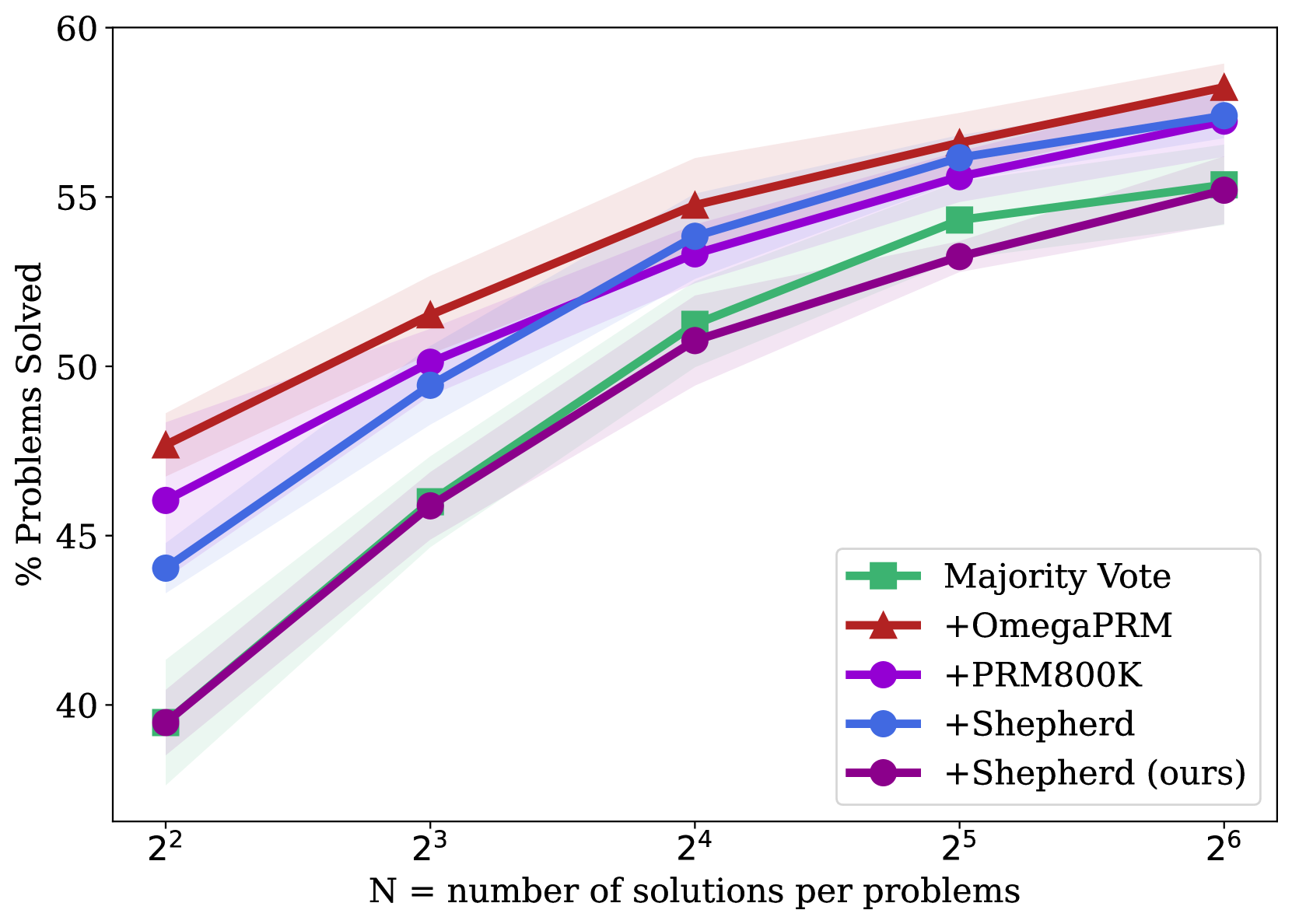
This line chart compares the performance of several solution methods for solving problems, measured by the percentage of problems solved as a function of the number of solutions per problem. The x-axis represents the number of solutions (N), displayed on a logarithmic scale (2^2 to 2^6). The y-axis represents the percentage of problems solved, ranging from approximately 40% to 60%. Each line represents a different solution method, and shaded areas around the lines likely represent standard deviation or confidence intervals.
### Components/Axes
* **X-axis Label:** "N = number of solutions per problem"
* **Y-axis Label:** "% Problems Solved"
* **X-axis Scale:** Logarithmic, with markers at 2^2 (4), 2^3 (8), 2^4 (16), 2^5 (32), and 2^6 (64).
* **Y-axis Scale:** Linear, with markers at 40%, 45%, 50%, 55%, and 60%.
* **Legend:** Located in the bottom-right corner.
* Majority Vote (Green)
* +OmegaPRM (Red)
* +PRM800K (Magenta)
* +Shepherd (Blue)
* +Shepherd (ours) (Black)
### Detailed Analysis
Let's analyze each line's trend and extract approximate data points.
* **Majority Vote (Green):** The line starts at approximately 40% at N=4 and increases steadily, reaching around 53% at N=64.
* N=4: ~40%
* N=8: ~43%
* N=16: ~47%
* N=32: ~50%
* N=64: ~53%
* **+OmegaPRM (Red):** This line shows a steeper upward trend than Majority Vote. It begins at approximately 44% at N=4 and reaches around 57% at N=64.
* N=4: ~44%
* N=8: ~48%
* N=16: ~52%
* N=32: ~55%
* N=64: ~57%
* **+PRM800K (Magenta):** This line starts at approximately 46% at N=4 and increases to around 55% at N=64. It appears to plateau somewhat between N=32 and N=64.
* N=4: ~46%
* N=8: ~49%
* N=16: ~51%
* N=32: ~53%
* N=64: ~55%
* **+Shepherd (Blue):** This line begins at approximately 48% at N=4 and rises to around 56% at N=64. It shows a relatively consistent increase.
* N=4: ~48%
* N=8: ~50%
* N=16: ~52%
* N=32: ~54%
* N=64: ~56%
* **+Shepherd (ours) (Black):** This line starts at approximately 42% at N=4 and increases to around 56% at N=64. It shows a similar trend to +Shepherd (Blue), but starts lower.
* N=4: ~42%
* N=8: ~46%
* N=16: ~49%
* N=32: ~53%
* N=64: ~56%
### Key Observations
* "+OmegaPRM" consistently outperforms the other methods across all values of N.
* "+Shepherd" and "+Shepherd (ours)" perform similarly, with "+Shepherd (ours)" starting slightly lower but converging towards the same performance level as N increases.
* Majority Vote consistently performs the worst.
* The performance gains appear to diminish as N increases, suggesting a point of diminishing returns.
* The shaded areas around the lines indicate variability in performance, but the overall trends are clear.
### Interpretation
The data suggests that increasing the number of solutions per problem generally improves the percentage of problems solved. The "+OmegaPRM" method is the most effective, followed closely by "+Shepherd" and "+Shepherd (ours)". The "Majority Vote" method is the least effective. The "+Shepherd (ours)" method appears to be a refined version of "+Shepherd", potentially incorporating improvements that lead to similar performance at higher values of N. The diminishing returns observed at higher N values suggest that there is a limit to the benefit of increasing the number of solutions, and that other factors may become more important in improving performance beyond a certain point. The shaded areas around the lines indicate that the performance of each method can vary, and that the observed trends may not hold true for all problems. The logarithmic scale on the x-axis emphasizes the impact of increasing N from small values, as the distance between markers becomes smaller at higher values. This chart provides a comparative analysis of different solution methods, allowing for informed decisions about which method to use based on the available resources and desired performance level.