## Line Chart: Performance Scaling of Different Problem-Solving Methods
### Overview
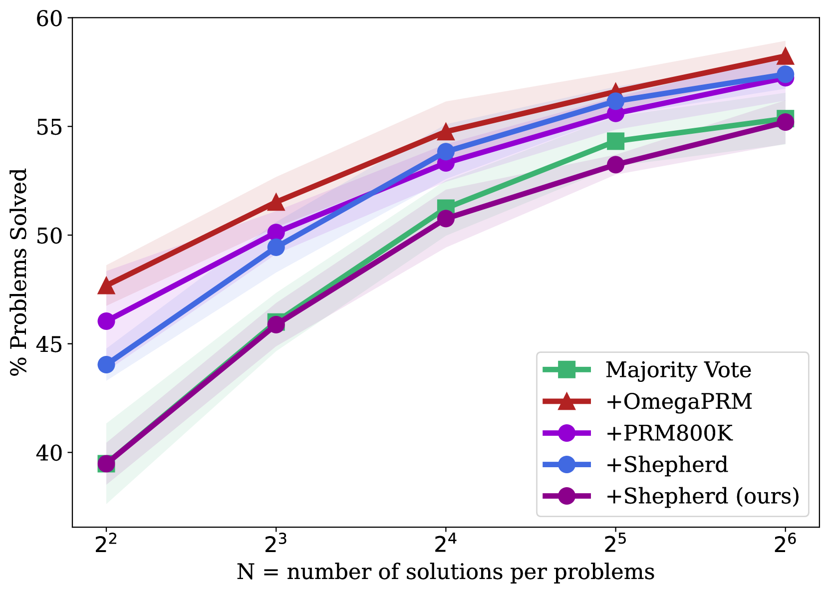
This is a line chart comparing the performance of five different methods or models on a problem-solving task. The chart plots the percentage of problems solved against the number of solutions generated per problem (N), which is presented on a logarithmic scale (base 2). All methods show improved performance as N increases, with one method consistently outperforming the others.
### Components/Axes
* **X-Axis (Horizontal):** Labeled "N = number of solutions per problems". The axis uses a logarithmic scale with base 2, marked at points: 2² (4), 2³ (8), 2⁴ (16), 2⁵ (32), and 2⁶ (64).
* **Y-Axis (Vertical):** Labeled "% Problems Solved". The scale is linear, ranging from 40 to 60, with major tick marks at intervals of 5 (40, 45, 50, 55, 60).
* **Legend:** Located in the bottom-right quadrant of the chart area. It contains five entries, each with a unique color and marker symbol:
1. **Majority Vote:** Green line with square markers (■).
2. **+OmegaPRM:** Red line with upward-pointing triangle markers (▲).
3. **+PRM800K:** Purple line with circle markers (●).
4. **+Shepherd:** Blue line with circle markers (●).
5. **+Shepherd (ours):** Dark purple/magenta line with circle markers (●).
* **Data Series:** Each method is represented by a solid line connecting data points at each x-axis value. Each line is surrounded by a semi-transparent shaded band of the same color, likely representing a confidence interval or standard deviation.
### Detailed Analysis
**Trend Verification:** All five data series exhibit a clear upward, positive trend. As the number of solutions per problem (N) increases, the percentage of problems solved increases for every method. The rate of improvement appears to slow slightly at higher values of N (from 2⁵ to 2⁶).
**Data Point Extraction (Approximate Values):**
| Method (Legend Label) | Color/Marker | N=2² (4) | N=2³ (8) | N=2⁴ (16) | N=2⁵ (32) | N=2⁶ (64) |
| :--- | :--- | :--- | :--- | :--- | :--- | :--- |
| **+OmegaPRM** | Red / ▲ | ~47.5% | ~51.5% | ~54.8% | ~56.5% | ~58.2% |
| **+Shepherd** | Blue / ● | ~44.0% | ~49.5% | ~53.8% | ~56.0% | ~57.5% |
| **+PRM800K** | Purple / ● | ~46.0% | ~50.2% | ~53.2% | ~55.5% | ~57.2% |
| **Majority Vote** | Green / ■ | ~39.5% | ~46.0% | ~51.2% | ~54.2% | ~55.5% |
| **+Shepherd (ours)** | Dark Purple / ● | ~39.5% | ~45.8% | ~50.8% | ~53.2% | ~55.2% |
**Spatial Grounding & Cross-Reference:**
* The **+OmegaPRM** (red triangle) line is the highest at every data point.
* The **+Shepherd** (blue circle) and **+PRM800K** (purple circle) lines are closely clustered in the middle tier, with blue slightly above purple at most points.
* The **Majority Vote** (green square) and **+Shepherd (ours)** (dark purple circle) lines start at the lowest point (near 39.5% at N=4) and remain the two lowest-performing methods throughout, with green consistently slightly above dark purple.
### Key Observations
1. **Consistent Leader:** The **+OmegaPRM** method is the top performer across all tested values of N.
2. **Convergence at Scale:** The performance gap between the methods narrows as N increases. At N=4, the spread between the best and worst is ~8 percentage points. At N=64, the spread is ~3 percentage points.
3. **Method Grouping:** The methods naturally group into three tiers: Top (+OmegaPRM), Middle (+Shepherd, +PRM800K), and Bottom (Majority Vote, +Shepherd (ours)).
4. **Diminishing Returns:** The slope of all lines is steepest between N=4 and N=16, indicating the most significant gains in performance come from initial increases in the number of solutions. The curves begin to flatten between N=32 and N=64.
### Interpretation
This chart demonstrates the efficacy of different techniques for improving problem-solving accuracy through increased sampling (generating more solutions). The data suggests that:
* **Algorithmic Superiority:** The **+OmegaPRM** method provides a consistent and significant advantage over the other techniques, implying its underlying process for selecting or verifying solutions is more effective.
* **Value of Sampling:** All methods benefit from generating more solutions per problem, confirming that "brute-force" sampling combined with a selection mechanism is a viable strategy for boosting performance, though with diminishing returns.
* **Baseline Comparison:** The **Majority Vote** line serves as a baseline. The fact that **+Shepherd (ours)** performs similarly to, but slightly worse than, this baseline suggests that this particular implementation of the Shepherd method may not offer an advantage over simple majority voting for this specific task and metric. In contrast, the other **+Shepherd** (blue) method performs significantly better, indicating that implementation details or model versions are critical.
* **Practical Implication:** For resource-constrained applications, the chart helps identify a potential "sweet spot." For example, increasing N from 4 to 16 yields a large performance boost (~10-12% for most methods), while further increasing N to 64 yields a smaller additional gain (~3-4%). The optimal N would balance computational cost against the desired accuracy.