\n
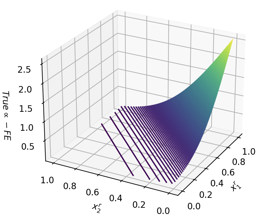
## 3D Surface Plot: True ∝ FE
### Overview
The image depicts a 3D surface plot representing a relationship between three variables: `x₁`, `x₂`, and `True ∝ FE`. The surface is colored with a gradient, transitioning from dark purple to teal to yellow, indicating varying values of `True ∝ FE`. The plot appears to visualize a function where the value of `True ∝ FE` increases as both `x₁` and `x₂` increase, but the relationship is not strictly linear.
### Components/Axes
* **X-axis:** Labeled `x₁`, ranging from approximately 0.0 to 1.0.
* **Y-axis:** Labeled `x₂`, ranging from approximately 0.0 to 1.0.
* **Z-axis:** Labeled `True ∝ FE`, ranging from approximately 0.0 to 2.5.
* **Surface:** The colored surface represents the function being plotted. The color gradient indicates the value of `True ∝ FE`.
* **Grid:** A 3D grid is present, providing a visual reference for the axes and surface.
### Detailed Analysis
The surface starts at a low value of `True ∝ FE` (approximately 0.0) when either `x₁` or `x₂` is close to 0.0. As both `x₁` and `x₂` increase, the value of `True ∝ FE` rises. The maximum value of `True ∝ FE` (approximately 2.5) is reached when both `x₁` and `x₂` are close to 1.0.
The surface is relatively flat near the axes (where either `x₁` or `x₂` is close to 0.0) and becomes steeper as both variables approach 1.0. The color gradient shows:
* Dark purple: `True ∝ FE` values around 0.0 - 0.5
* Blue: `True ∝ FE` values around 0.5 - 1.5
* Teal: `True ∝ FE` values around 1.5 - 2.0
* Yellow: `True ∝ FE` values around 2.0 - 2.5
The surface appears to be smooth and continuous, suggesting that the function is well-defined within the plotted range. There are no visible discontinuities or sharp edges.
### Key Observations
* The value of `True ∝ FE` is positively correlated with both `x₁` and `x₂`.
* The rate of increase in `True ∝ FE` is higher when both `x₁` and `x₂` are closer to 1.0.
* The surface is symmetrical with respect to the axes, suggesting that the function is likely symmetric in `x₁` and `x₂`.
### Interpretation
The plot likely represents a mathematical function where `True ∝ FE` is proportional to the product of `x₁` and `x₂`, or some other function that exhibits similar behavior. The proportionality symbol (∝) suggests that `True ∝ FE` is not necessarily equal to a specific function of `x₁` and `x₂`, but rather varies in a similar manner.
The plot could be used to visualize the relationship between two input variables (`x₁` and `x₂`) and an output variable (`True ∝ FE`). The shape of the surface provides insights into how changes in `x₁` and `x₂` affect the value of `True ∝ FE`. The smooth, continuous nature of the surface suggests a stable and predictable relationship.
The use of a color gradient enhances the visualization by providing an additional dimension of information. The gradient allows for a quick and intuitive understanding of the relative values of `True ∝ FE` across the surface.