\n
## Heatmap: Numerical Grid
### Overview
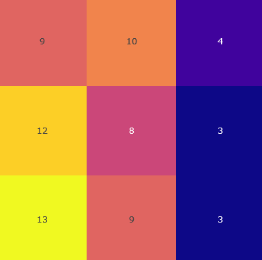
The image presents a 3x3 heatmap displaying numerical values within a grid of colored cells. Each cell is colored based on its corresponding numerical value, with a gradient from yellow (high values) to purple (low values). The values are directly displayed within each cell.
### Components/Axes
The image lacks explicit axes labels or a legend. The data is presented as a grid with 3 rows and 3 columns. The values range from 3 to 13.
### Detailed Analysis or Content Details
The heatmap contains the following data points:
* **Row 1, Column 1:** Value = 9, Color = Red-Orange
* **Row 1, Column 2:** Value = 10, Color = Orange
* **Row 1, Column 3:** Value = 4, Color = Dark Purple
* **Row 2, Column 1:** Value = 12, Color = Yellow
* **Row 2, Column 2:** Value = 8, Color = Pink-Purple
* **Row 2, Column 3:** Value = 3, Color = Dark Blue
* **Row 3, Column 1:** Value = 13, Color = Yellow
* **Row 3, Column 2:** Value = 9, Color = Red-Orange
* **Row 3, Column 3:** Value = 3, Color = Dark Blue
The color gradient appears to be roughly linear, with yellow representing the highest values and purple/blue representing the lowest.
### Key Observations
* The highest values (12 and 13) are located in the first column.
* The lowest values (3 and 4) are located in the third column.
* There is a noticeable difference in values between the left and right sides of the grid.
* The center cell in the second row (value 8) is a relatively low value compared to its neighbors.
### Interpretation
The heatmap suggests a correlation between position within the grid and the numerical value. The data indicates a higher concentration of larger values on the left side of the grid and smaller values on the right. This could represent a spatial distribution of some quantity, where the left side exhibits higher intensity or concentration. The relatively low value in the center of the second row (8) could be an anomaly or represent a localized minimum within the data. Without context, it is difficult to determine the meaning of these values, but the heatmap clearly visualizes a pattern of variation across the grid. The data suggests a gradient or trend from left to right.