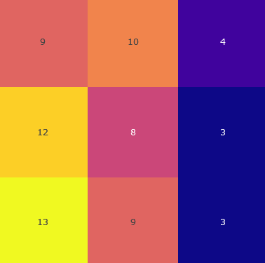
## Heatmap: Unlabeled 3x3 Grid with Numerical Values and Color Coding
### Overview
The image depicts a 3x3 grid where each cell contains a numerical value and is colored differently. There are no axis labels, legends, or explicit titles. The grid appears to represent categorical or comparative data, with color intensity potentially indicating magnitude or grouping.
### Components/Axes
- **Grid Structure**: 3 rows × 3 columns.
- **Cell Contents**: Each cell contains a single integer (3–13) centered in the cell.
- **Color Coding**: Cells are colored in red, orange, purple, yellow, and dark blue. No legend is present to define color-to-value mapping.
- **Absence of Labels**: No axis titles, row/column headers, or legends are visible.
### Detailed Analysis
| Row \ Column | 1 | 2 | 3 |
|--------------|---------|---------|---------|
| **1** | 9 (red) | 10 (orange) | 4 (purple) |
| **2** | 12 (orange) | 8 (purple) | 3 (dark blue) |
| **3** | 13 (yellow) | 9 (red) | 3 (dark blue) |
- **Values**: Numbers range from 3 (lowest) to 13 (highest).
- **Color Distribution**:
- **Red**: 9 (Row 1, Col 1), 9 (Row 3, Col 2).
- **Orange**: 10 (Row 1, Col 2), 12 (Row 2, Col 1).
- **Purple**: 4 (Row 1, Col 3), 8 (Row 2, Col 2).
- **Yellow**: 13 (Row 3, Col 1).
- **Dark Blue**: 3 (Row 2, Col 3), 3 (Row 3, Col 3).
### Key Observations
1. **Highest Value**: The cell with the maximum value (13) is located in the bottom-left corner (Row 3, Col 1), colored yellow.
2. **Lowest Values**: Two cells contain the minimum value (3), both in the bottom-right quadrant (Row 2, Col 3 and Row 3, Col 3), colored dark blue.
3. **Color-Value Relationship**: No clear gradient or pattern links colors to values (e.g., yellow is not consistently the highest, and dark blue is not exclusively the lowest).
4. **Clustering**: The top-left quadrant (Rows 1–2, Cols 1–2) contains higher values (8–12), while the bottom-right quadrant (Rows 2–3, Cols 2–3) has lower values (3–9).
### Interpretation
- **Ambiguity in Color Coding**: Without a legend, the purpose of color differentiation remains unclear. Colors may represent categories (e.g., groups, statuses) or magnitudes, but this cannot be confirmed.
- **Potential Patterns**: The highest value (13) and second-highest (12) are adjacent in the top-left quadrant, suggesting a possible regional or categorical dominance. The repeated low values (3) in the bottom-right quadrant might indicate a shared characteristic or constraint.
- **Uncertainty**: The lack of axis labels, legends, or contextual text prevents definitive interpretation. The grid could represent anything from survey results to performance metrics, but the absence of metadata limits analysis.
### Conclusion
This heatmap provides numerical data in a 3x3 grid with arbitrary color coding. While the values suggest variability, the absence of labels and legends makes it impossible to draw concrete conclusions. Further context is required to determine the grid’s purpose or the significance of its color scheme.