\n
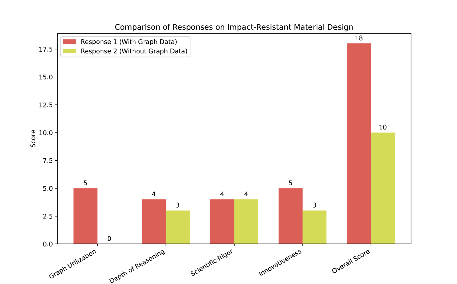
## Bar Chart: Comparison of Responses on Impact-Resistant Material Design
### Overview
This bar chart compares two responses (Response 1 and Response 2) across five categories related to impact-resistant material design: Graph Utilization, Depth of Reasoning, Scientific Rigor, Innovativeness, and Overall Score. The chart uses bar graphs to visually represent the scores for each response in each category.
### Components/Axes
* **Title:** "Comparison of Responses on Impact-Resistant Material Design" (centered at the top)
* **X-axis Label:** Categories (Graph Utilization, Depth of Reasoning, Scientific Rigor, Innovativeness, Overall Score)
* **Y-axis Label:** Score (ranging from 0 to 18, with increments)
* **Legend:** Located in the top-left corner.
* Red: Response 1 (With Graph Data)
* Yellow/Green: Response 2 (Without Graph Data)
### Detailed Analysis
The chart consists of five pairs of bars, one red (Response 1) and one yellow/green (Response 2) for each category.
* **Graph Utilization:** Response 1 has a score of approximately 5, while Response 2 has a score of 0. The red bar is significantly taller than the yellow/green bar.
* **Depth of Reasoning:** Response 1 has a score of approximately 4, while Response 2 has a score of approximately 3. The red bar is slightly taller than the yellow/green bar.
* **Scientific Rigor:** Response 1 has a score of approximately 4, while Response 2 has a score of approximately 3. The red bar is slightly taller than the yellow/green bar.
* **Innovativeness:** Response 1 has a score of approximately 5, while Response 2 has a score of approximately 3. The red bar is taller than the yellow/green bar.
* **Overall Score:** Response 1 has a score of approximately 18, while Response 2 has a score of approximately 10. The red bar is significantly taller than the yellow/green bar.
### Key Observations
* Response 1 consistently scores higher than Response 2 across all categories.
* The most significant difference in scores is observed in "Overall Score" and "Graph Utilization", where Response 1 scores much higher.
* Response 2 consistently receives low scores, particularly in "Graph Utilization".
### Interpretation
The data suggests that Response 1, which included graph data, performed significantly better than Response 2, which did not. This indicates that the inclusion of visual data representation (graphs) positively impacts the quality of the response, particularly in areas like graph utilization and overall score. The higher scores in Depth of Reasoning, Scientific Rigor, and Innovativeness for Response 1 suggest that the use of graphs may also enhance the analytical and creative aspects of the response. The large difference in the Overall Score highlights the substantial benefit of incorporating graph data in this context. The low score of Response 2 in Graph Utilization suggests a lack of understanding or ability to effectively use graphical representations. This chart demonstrates a clear correlation between the use of graph data and the quality of responses related to impact-resistant material design.