## Grouped Bar Chart: Comparison of Responses on Impact-Resistant Material Design
### Overview
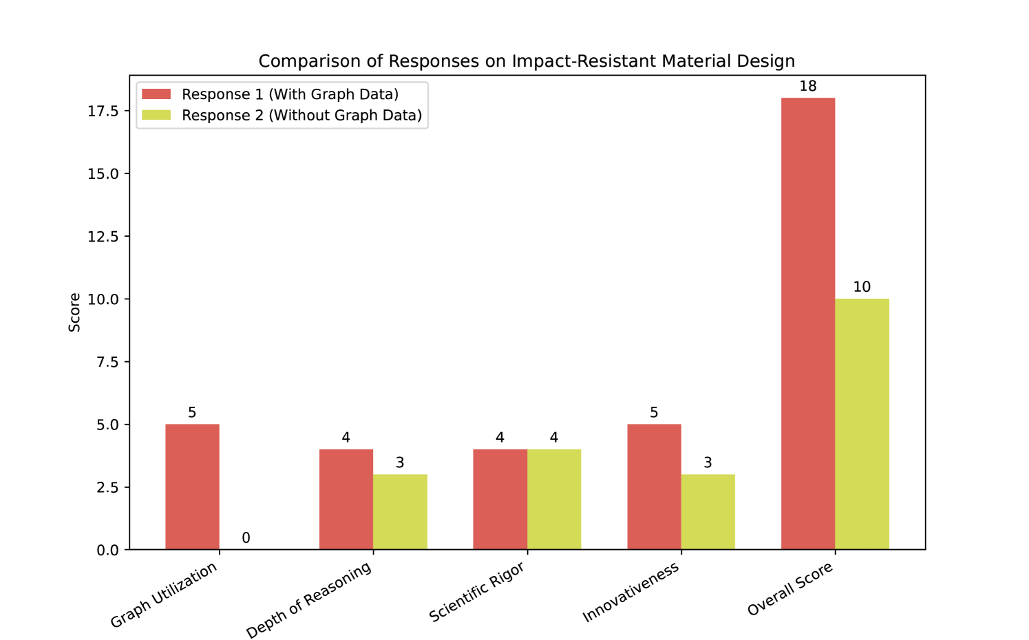
This is a grouped bar chart comparing the performance scores of two different responses ("Response 1" and "Response 2") across five evaluation categories related to impact-resistant material design. The chart visually demonstrates that Response 1, which incorporates graph data, consistently scores equal to or higher than Response 2, which does not use graph data.
### Components/Axes
* **Chart Title:** "Comparison of Responses on Impact-Resistant Material Design" (centered at the top).
* **Y-Axis:**
* **Label:** "Score" (rotated vertically on the left side).
* **Scale:** Linear scale from 0 to 17.5, with major tick marks at intervals of 2.5 (0, 2.5, 5.0, 7.5, 10.0, 12.5, 15.0, 17.5).
* **X-Axis:**
* **Categories (from left to right):** "Graph Utilization", "Depth of Reasoning", "Scientific Rigor", "Innovativeness", "Overall Score".
* The category labels are rotated approximately 30 degrees for readability.
* **Legend:** Located in the top-left corner of the plot area.
* **Red Square:** "Response 1 (With Graph Data)"
* **Yellow Square:** "Response 2 (Without Graph Data)"
* **Data Series:** Two series of vertical bars, one for each response, grouped by category.
* **Response 1 (Red Bars):** Positioned as the left bar in each category group.
* **Response 2 (Yellow Bars):** Positioned as the right bar in each category group.
* **Data Labels:** Numerical values are displayed directly above each bar.
### Detailed Analysis
The following table reconstructs the data presented in the chart. All values are exact as labeled.
| Category | Response 1 (With Graph Data) Score | Response 2 (Without Graph Data) Score | Difference (R1 - R2) |
| :--- | :---: | :---: | :---: |
| **Graph Utilization** | 5 | 0 | +5 |
| **Depth of Reasoning** | 4 | 3 | +1 |
| **Scientific Rigor** | 4 | 4 | 0 |
| **Innovativeness** | 5 | 3 | +2 |
| **Overall Score** | 18 | 10 | +8 |
**Trend Verification per Category:**
1. **Graph Utilization:** The red bar (R1) is significantly taller than the yellow bar (R2), which is at the baseline (0).
2. **Depth of Reasoning:** The red bar (R1) is slightly taller than the yellow bar (R2).
3. **Scientific Rigor:** The red (R1) and yellow (R2) bars are of equal height.
4. **Innovativeness:** The red bar (R1) is moderately taller than the yellow bar (R2).
5. **Overall Score:** The red bar (R1) is dramatically taller than the yellow bar (R2), representing the largest absolute difference on the chart.
### Key Observations
* **Dominant Performance:** Response 1 outperforms or matches Response 2 in every single category.
* **Maximum Disparity:** The greatest performance gap is in "Graph Utilization" (5 vs. 0), which is the defining characteristic separating the two responses.
* **Parity Point:** The only category where the responses are equal is "Scientific Rigor" (both score 4).
* **Aggregate Score:** The "Overall Score" (18 vs. 10) shows that the cumulative advantage of Response 1 is substantial, nearly double that of Response 2.
* **Visual Hierarchy:** The "Overall Score" bars are the tallest and most visually prominent element, drawing immediate attention to the final comparison.
### Interpretation
The data strongly suggests that the inclusion of graph data ("Response 1") has a positive and measurable impact on the evaluation of a response concerning impact-resistant material design. The advantage is not uniform but is most pronounced in the category directly related to the differentiating factor ("Graph Utilization").
The parity in "Scientific Rigor" indicates that both responses may be grounded in similar foundational knowledge or methodology. However, the superior scores for Response 1 in "Depth of Reasoning" and "Innovativeness" imply that the graph data does more than just fulfill a requirement; it likely enables deeper analysis and facilitates more creative or novel solutions. The "Overall Score" confirms that these incremental advantages across multiple dimensions compound into a significantly stronger final product.
From a Peircean perspective, the chart itself is an icon of the performance gap, and the numerical labels are indices pointing to specific magnitudes. The interpretation is that visual data representation (graphs) is not merely an add-on but a critical tool for enhancing reasoning, innovation, and overall output quality in technical design contexts. The zero score for Response 2 in "Graph Utilization" is a stark outlier that fundamentally defines the comparison.