## Scatter Plot Comparison: Method Scores vs. Human Factuality Scores
### Overview
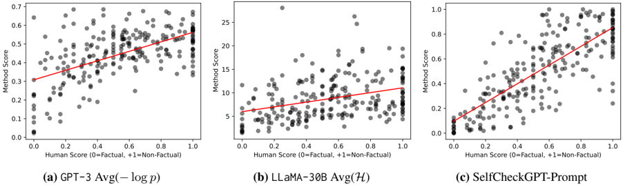
The image displays three horizontally arranged scatter plots, each comparing a different automated "Method Score" against a "Human Score" for factuality assessment. The plots are labeled (a), (b), and (c). Each plot contains a cloud of gray data points and a red linear regression trend line, illustrating the correlation between the human evaluation and the respective automated method's output.
### Components/Axes
* **Common X-Axis (All Plots):** Label: `Human Score (0=Factual, 1=Non-Factual)`. Scale: 0.0 to 1.0, with major ticks at 0.0, 0.2, 0.4, 0.6, 0.8, 1.0.
* **Common Y-Axis Label (All Plots):** `Method Score`.
* **Plot-Specific Y-Axis Scales:**
* **(a) GPT-3 Avg(-log p):** Scale from 0.0 to 0.7, with major ticks at 0.0, 0.1, 0.2, 0.3, 0.4, 0.5, 0.6, 0.7.
* **(b) LLaMA-30B Avg(H):** Scale from 0 to 25, with major ticks at 0, 5, 10, 15, 20, 25.
* **(c) SelfCheckGPT-Prompt:** Scale from 0.0 to 1.0, with major ticks at 0.0, 0.2, 0.4, 0.6, 0.8, 1.0.
* **Plot Titles (Centered below each plot):**
* (a) `GPT-3 Avg(-log p)`
* (b) `LLaMA-30B Avg(H)`
* (c) `SelfCheckGPT-Prompt`
* **Data Elements:**
* **Gray Dots:** Individual data points representing a single evaluation pair (Human Score, Method Score).
* **Red Line:** A linear regression trend line fitted to the data points in each plot.
### Detailed Analysis
**Trend Verification & Data Point Description:**
* **Plot (a) GPT-3 Avg(-log p):**
* **Visual Trend:** The red trend line shows a clear, moderate positive slope. As the Human Score increases from 0 to 1, the Method Score increases from approximately 0.3 to 0.6.
* **Data Distribution:** Data points are widely scattered. There is a dense cluster of points with Human Scores between 0.0 and 0.4 and Method Scores between 0.0 and 0.4. Another cluster exists at Human Score ~1.0, with Method Scores ranging from ~0.4 to ~0.7. The spread indicates significant variance in the method's scoring for a given human judgment.
* **Plot (b) LLaMA-30B Avg(H):**
* **Visual Trend:** The red trend line has a very shallow positive slope. It starts at a Method Score of ~5 (at Human Score 0) and rises only to ~11 (at Human Score 1).
* **Data Distribution:** The data is heavily concentrated at the lower end of the Method Score scale. A very dense vertical cluster of points exists at Human Score 0.0, with Method Scores mostly between 0 and 5. Points are sparse across the middle range. There are notable high-value outliers: one point near (Human Score 0.2, Method Score ~28) and another near (Human Score 0.7, Method Score ~26). The weak trend and high outliers suggest this method has a poor correlation with human factuality scores and high instability.
* **Plot (c) SelfCheckGPT-Prompt:**
* **Visual Trend:** The red trend line shows a strong, steep positive slope. It runs from near (0,0) to near (1, ~0.85).
* **Data Distribution:** The data points cluster much more tightly around the trend line compared to the other plots. At Human Score 0.0, most Method Scores are between 0.0 and 0.2. At Human Score 1.0, most Method Scores are between 0.7 and 1.0. This indicates a strong linear relationship where the method's score closely tracks the human's non-factual rating.
### Key Observations
1. **Correlation Strength:** The strength of the positive correlation increases dramatically from plot (a) to (b) to (c). Plot (c) shows the strongest linear relationship, while plot (b) shows the weakest.
2. **Scale and Variance:** The y-axis scales differ by an order of magnitude. Plot (b)'s method produces scores on a much larger scale (0-25) but with high variance and weak correlation. Plot (c)'s method uses a 0-1 scale similar to the human score and achieves tight alignment.
3. **Outliers:** Plot (b) contains extreme outliers with very high Method Scores (~26-28) that are not present in the other plots.
4. **Endpoint Behavior:** In plot (c), the data points at the extremes (Human Score 0 and 1) form tight vertical clusters, showing high agreement among method scores for clearly factual or non-factual items. This clustering is less pronounced in plots (a) and (b).
### Interpretation
This image presents a comparative evaluation of three automated factuality scoring methods against human judgments. The data suggests:
* **SelfCheckGPT-Prompt (c)** is the most effective method among the three. Its strong, tight correlation indicates it reliably assigns low scores to factually correct text and high scores to non-factual text, mirroring human assessment.
* **GPT-3 Avg(-log p) (a)** shows a moderate ability to distinguish factuality, but with substantial noise. Its scores are less decisive and have a narrower range (0-0.7) compared to the human scale.
* **LLaMA-30B Avg(H) (b)** performs poorly as a direct correlate for human factuality judgment. The weak trend and extreme outliers suggest its scoring mechanism (Avg(H)) is either measuring a different property or is highly unstable, making it an unreliable standalone metric for this task.
The progression from (a) to (c) likely illustrates the development or selection of a more aligned scoring technique. The investigation reveals that method design critically impacts alignment with human judgment, with plot (c) representing a successful calibration.