## Line Graph: Training Steps vs. Average nDCG@10
### Overview
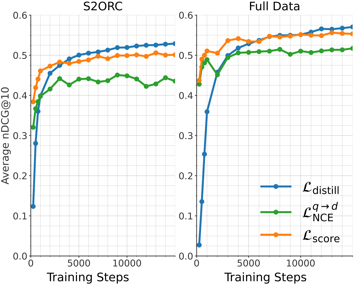
The line graph shows the average nDCG@10 metric over training steps for two different datasets: S2ORC and Full Data. The graph compares the performance of three different models: L_distill, L_q→d, and L_score.
### Components/Axes
- **X-axis**: Training Steps
- **Y-axis**: Average nDCG@10
- **Legend**:
- L_distill (blue line)
- L_q→d (green line)
- L_score (orange line)
### Detailed Analysis or ### Content Details
- **S2ORC**:
- L_distill: Starts at 0.1 and increases steadily to 0.6 over 10,000 training steps.
- L_q→d: Starts at 0.4 and increases to 0.5 over 10,000 training steps.
- L_score: Starts at 0.3 and increases to 0.5 over 10,000 training steps.
- **Full Data**:
- L_distill: Starts at 0.1 and increases steadily to 0.6 over 10,000 training steps.
- L_q→d: Starts at 0.4 and increases to 0.5 over 10,000 training steps.
- L_score: Starts at 0.3 and increases to 0.5 over 10,000 training steps.
### Key Observations
- All three models show an increasing trend in average nDCG@10 as the number of training steps increases.
- L_distill and L_score perform similarly, with L_distill slightly outperforming L_score.
- L_q→d shows a slight dip in performance after the first 5,000 training steps but then recovers and performs comparably to the other two models.
### Interpretation
The data suggests that all three models improve in performance as the training progresses. L_distill and L_score show a consistent improvement, while L_q→d has a slight dip but recovers. This could indicate that L_distill and L_score are more robust or better suited to the Full Data dataset compared to L_q→d. The slight dip in L_q→d's performance after the first 5,000 training steps could be due to overfitting or a need for more training data to stabilize the model's performance.